Category Archives: Data Visualization

Data Visualization

Understanding indicators used to measure health quality

Justetc Social Services (non-profit)

Justetc Social Services (non-profit)Jan 31 · 16 min read

This code works with the data on the excel file: indicator-methodology.xls

Purpose:

  1. Find out prominant indicators — this might also mean the critical aspect of health
  2. Find out the measurements that are used to find the quality

Code Reference: This code heavily makes use of the code provided on the Text Visualization Lab. The methods might have been used as is i.e used as libraries

# COMMENT IF PACKAGES ALREADY INSTALLED (if pip does not work use pip3)
# !pip install nltk
# !pip install wordcloud
# !pip install pytagcloud
# !pip install pygame
# !pip install simplejson
# !pip install bs4
# !pip install networkx
# !pip install gensimimport nltk
#nltkownload() ##choose stopwords to download
from nltk.corpus import stopwords
from nltk.util import ngrams
from bs4 import BeautifulSoup
# import urllib2
import urllib.request as urllib2
import re
from collections import Counter
from wordcloud import WordCloud
import matplotlib.pyplot as plt
%matplotlib inline
from pytagcloud import create_tag_image, make_tags, LAYOUT_MIX
import operator
from IPython.display import Image
import nltk.data
import networkx as nx
import sys
sys.setrecursionlimit(10000)
nltk.download('stopwords')
nltk.download('punkt')
# nltk.download() ## download stopwords and punkt

import networkx as nx
import randompygame 1.9.4
Hello from the pygame community. https://www.pygame.org/contribute.html


[nltk_data] Downloading package stopwords to C:\Users\Sayed
[nltk_data] Ahmed\AppData\Roaming\nltk_data...
[nltk_data] Package stopwords is already up-to-date!
[nltk_data] Downloading package punkt to C:\Users\Sayed
[nltk_data] Ahmed\AppData\Roaming\nltk_data...
[nltk_data] Package punkt is already up-to-date!# https://www.kaggle.com/c/word2vec-nlp-tutorial/details/part-1-for-beginners-bag-of-words
def clean_text( raw_review ):
# Function to convert a raw review to a string of words
# The input is a single string (a raw movie review), and
# the output is a single string (a preprocessed movie review)
#
# 1. Remove HTML
review_text = BeautifulSoup(raw_review)
#Remove javascript elements
for script in review_text(["script", "style"]):
script.extract() # rip it out

# get text
review_text = review_text.get_text()
# 2. Remove non-letters
letters_only = re.sub("[^a-zA-Z]", " ", review_text)
#
# 3. Convert to lower case, split into individual words
words = letters_only.lower().split()
#
# 4. In Python, searching a set is much faster than searching
# a list, so convert the stop words to a set
stops = set(stopwords.words("english"))
#
# 5. Remove stop words
meaningful_words = [w for w in words if not w in stops]
#
# 6. Join the words back into one string separated by space,
# and return the result.
return( " ".join( meaningful_words ))


def constructtree(lst,tree,factor, parent=None):
if lst==[]:
return {}
else:
word =lst[0]
if parent:
edges.append((parent, word))
else:
edges.append(('root', word))
if not word in tree.keys(): #tree.has_key(word): for python 2
tree[word]={'name':word,'value':1/factor,"children":{}}
tree[word]["children"]=constructtree(lst[1:],tree[word]["children"],factor, word)
else:
#print 22
tree[word]["value"]+=1/factor
tree[word]["children"]=constructtree(lst[1:],tree[word]["children"],factor, word)
return tree

def doall(wl,tree):
for x in wl:
# print (11,x) #
# print()
tree2=constructtree(x,tree,1)
tree=tree2
# print (1,tree) #
# print()
return tree, edges


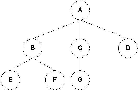
def hierarchy_pos(G, root=None, width=10., vert_gap = 0.2, vert_loc = 0, xcenter = 0.5):

'''
From Joel's answer at https://stackoverflow.com/a/29597209/2966723

If the graph is a tree this will return the positions to plot this in a
hierarchical layout.

G: the graph (must be a tree)

root: the root node of current branch
- if the tree is directed and this is not given, the root will be found and used
- if the tree is directed and this is given, then the positions will be just for the descendants of this node.
- if the tree is undirected and not given, then a random choice will be used.

width: horizontal space allocated for this branch - avoids overlap with other branches

vert_gap: gap between levels of hierarchy

vert_loc: vertical location of root

xcenter: horizontal location of root
'''
if not nx.is_tree(G):
raise TypeError('cannot use hierarchy_pos on a graph that is not a tree')

if root is None:
if isinstance(G, nx.DiGraph):
root = next(iter(nx.topological_sort(G))) #allows back compatibility with nx version 1.11
else:
root = random.choice(list(G.nodes))

def _hierarchy_pos(G, root, width=1., vert_gap = 0.2, vert_loc = 0, xcenter = 0.5, pos = None, parent = None):
'''
see hierarchy_pos docstring for most arguments

pos: a dict saying where all nodes go if they have been assigned
parent: parent of this branch. - only affects it if non-directed

'''

if pos is None:
pos = {root:(xcenter,vert_loc)}
else:
pos[root] = (xcenter, vert_loc)
children = list(G.neighbors(root))
if not isinstance(G, nx.DiGraph) and parent is not None:
children.remove(parent)
if len(children)!=0:
dx = width/len(children)
nextx = xcenter - width/2 - dx/2
for child in children:
nextx += dx
pos = _hierarchy_pos(G,child, width = dx, vert_gap = vert_gap,
vert_loc = vert_loc-vert_gap, xcenter=nextx,
pos=pos, parent = root)
return pos


return _hierarchy_pos(G, root, width, vert_gap, vert_loc, xcenter)

Fetch Indicator Data i.e. indicator methodology

This will give an idea what are the primary indicators used to measure healthcare quality

import pandas as pdindicator_methodology = pd.read_excel('../data/indicator-methodology.xls')
indicator_methodology.columns
indicator_methodology.head()
png
indicator_methodology['Indicator definition'][:5]0    Number of deaths due to cancer per 100,000 fem...
1 Number of deaths due to cancer per 100,000 males.
2 Number of deaths due to ischemic heart disease...
3 Number of deaths due to cerebrovascular diseas...
4 Number of deaths due to transport accidents \n...
Name: Indicator definition, dtype: object# get all indicators in a raw text variable
raw_indicator = ''
raw_measure = ''

for aRow in range(indicator_methodology.shape[0]):
raw_indicator += ' ' + indicator_methodology['Indicator label'][aRow] + str('')
raw_measure += ' ' + str(indicator_methodology['Indicator definition'][aRow])

#raw = pd.merge(indicator_methodology['Indicator label'], indicator_methodology['Indicator definition'])

raw_indicator[:100], raw_measure[:100]
raw_measure' Number of deaths due to cancer per 100,000 females. Number of deaths due to cancer per 100,000 males. Number of deaths due to ischemic heart disease \nper 100,000 population.Number of deaths due to ischemic heart disease \nper 100,000 population.Number of deaths due to ischemic heart disease \nper 100,000 population.Number of deaths due to ischemic heart disease \nper 100,000 population. Number of deaths due to cerebrovascular diseases \nper 100,000 population.Number of deaths due to cerebrovascular diseases \nper 100,000 population.Number of deaths due to cerebrovascular diseases \nper 100,000 population.Number of deaths due to cerebrovascular diseases \nper 100,000 population. Number of deaths due to transport accidents \nper 100,000 females.Number of deaths due to transport accidents \nper 100,000 females.Number of deaths due to transport accidents \nper 100,000 females.Number of deaths due to transport accidents \nper 100,000 females. Number of deaths due to transport accidents \nper 100,000 males.Number of deaths due to transport accidents \nper 100,000 males.Number of deaths due to transport accidents \nper 100,000 males.Number of deaths due to transport accidents \nper 100,000 males. Number of deaths due to suicide per 100,000 females. Number of deaths due to suicide per 100,000 males. Deaths of children younger than 1 year per 1,000 live births. Percentage of the population age 15+ who report their health to be “good” or better. Average number of years that a female can be expected to live, assuming that age-specific mortality levels remain constant. Average number of years that a male can be expected to live, assuming that age-specific mortality levels remain constant. Percentage of the population age 15+ who report eating fruit at least once per day. Percentage of the population age 15+ who report eating vegetables at least once per day. Percentage of the female population age 15+ who report that they are daily smokers. Percentage of the male population age 15+ who report that they are daily smokers. Average annual alcohol consumption in litres per capita \n(age 15+).Average annual alcohol consumption in litres per capita \n(age 15+).Average annual alcohol consumption in litres per capita \n(age 15+). Percentage of adults who are obese (body mass index higher than 30 kg/m²), self-report. Median wait time (in days) from specialist assessment \n(booking date) to cataract surgery.Median wait time (in days) from specialist assessment \n(booking date) to cataract surgery.Median wait time (in days) from specialist assessment \n(booking date) to cataract surgery. Median wait time (in days) from specialist assessment \n(booking date) to hip replacement.Median wait time (in days) from specialist assessment \n(booking date) to hip replacement.Median wait time (in days) from specialist assessment \n(booking date) to hip replacement. Median wait time (in days) from specialist assessment \n(booking date) to knee replacement.Median wait time (in days) from specialist assessment \n(booking date) to knee replacement.Median wait time (in days) from specialist assessment \n(booking date) to knee replacement. Percentage of people able to get an appointment to see a doctor or a nurse on the same or next day last time they were sick or needed medical attention. Percentage of people who needed care after hours and reported difficulty getting medical care in the evenings, on weekends or on holidays without going to the hospital emergency department/emergency room. Percentage of adults who waited for 4 weeks or more after they were advised to see or decided to see a specialist. Percentage of people who had a medical problem but did not consult/visit a doctor because of the cost. Percentage of people with a regular doctor or place of care. Percentage of adults age 65+ who received an influenza vaccination within the past year. Number of hospital discharges for COPD of people age 15 and older per 100,000 population. Number of hospital discharges for asthma of people age 15 and older per 100,000 population. Number of hospital discharges for diabetes of people age 15 and older per 100,000 population. Percentage of adults who report that their regular doctor always or often spent enough time with them. Percentage of adults who report that their regular doctor always or often explains things in a way that is easy to\xa0understand. Percentage of older adults (age 55+) who report that their regular doctor always or often gave them an opportunity to ask questions or raise concerns. Percentage of adults who report that their regular doctor always or often involved them as much as they wanted in decisions about their care and treatment. 5-year relative survival rate for breast cancer. Number of deaths due to breast cancer, per 100,000 females. 5-year relative survival rate for cervical cancer. Number of deaths due to cervical cancer, per 100,000 females. 5-year relative survival rate for colorectal cancer. Number of deaths due to colorectal cancer, \nper 100,000 population.Number of deaths due to colorectal cancer, \nper 100,000 population. Percentage of patients (age 45+) who die in hospital within 30 days of being admitted with a primary diagnosis of acute myocardial infarction (AMI). Percentage of patients (age 45+) who die in hospital within 30 days of being admitted with a primary diagnosis of \nischemic stroke.Percentage of patients (age 45+) who die in hospital within 30 days of being admitted with a primary diagnosis of \nischemic stroke. Rate of a foreign body left inside the patient’s body during a procedure, per 100,000 hospital discharges (age 15+). Rate of post-operative pulmonary embolism, per 100,000 discharges for hip and knee replacement (age 15+). Rate of post-operative sepsis, per 100,000 discharges for abdominal surgery (age 15+). Percentage of vaginal deliveries with third- or fourth-degree obstetric trauma, per 100 instrument-assisted vaginal deliveries. Percentage of vaginal deliveries with third- or fourth-degree obstetric trauma, per 100 vaginal deliveries without instrument\xa0assistance. Percentage of patients with diabetes with prescription of first-choice antihypertensive medication. Number per 1,000 patients age 65+ with prescriptions of more than 365 daily doses of benzodiazepines or related drugs. Number per 1,000 patients age 65+ with at least one prescription of long-acting benzodiazepines or related drugs. Total volume of antibiotics prescribed for systemic use, in defined daily doses per 1,000 population per day. Volume of second-line antibiotics as a percentage of all antibiotics prescribed. nan nan nan'

Clean data

text = clean_text(raw_indicator)

# I wrote similar code as part of NLP assignments
# remove punctuations
from nltk.tokenize import RegexpTokenizer
tokenizer = RegexpTokenizer("[\w]+")
text = tokenizer.tokenize(text)

text


# get the list of stop words
from nltk.corpus import stopwords
stops = set(stopwords.words('english'))
print ('stop word count', len(stops) )

# just to show a partial list of stop words
stop_l = list(stops)
stop_l[:5]


# remove stopwords
text_list = [] #text.split(" ")
for aTok in text:
if aTok not in stops:
text_list.append(aTok)

text_liststop word count 179


['cancer',
'mortality',
'f',
'cancer',
'mortality',
'heart',
'disease',
'mortality',
'stroke',
'mortality',
'transport',
'accident',
'mortality',
'f',
'transport',
'accident',
'mortality',
'suicide',
'f',
'suicide',
'infant',
'mortality',
'perceived',
'health',
'status',
'life',
'expectancy',
'birth',
'f',
'life',
'expectancy',
'birth',
'fruit',
'consumption',
'adults',
'vegetable',
'consumption',
'adults',
'smoking',
'adults',
'f',
'smoking',
'adults',
'alcohol',
'consumption',
'adults',
'obesity',
'reported',
'adults',
'wait',
'time',
'cataract',
'surgery',
'wait',
'time',
'hip',
'replacement',
'wait',
'time',
'knee',
'replacement',
'next',
'day',
'appt',
'poor',
'weekend',
'evening',
'care',
'wait',
'time',
'specialist',
'inability',
'pay',
'medical',
'bills',
'regular',
'doctor',
'influenza',
'vaccination',
'avoidable',
'admissions',
'copd',
'avoidable',
'admissions',
'asthma',
'avoidable',
'admissions',
'diabetes',
'time',
'spent',
'doctor',
'easy',
'understand',
'doctor',
'know',
'important',
'medical',
'history',
'involvement',
'decisions',
'breast',
'cancer',
'survival',
'breast',
'cancer',
'mortality',
'cervical',
'cancer',
'survival',
'cervical',
'cancer',
'mortality',
'colorectal',
'cancer',
'survival',
'colorectal',
'cancer',
'mortality',
'day',
'hospital',
'fatality',
'ami',
'day',
'hospital',
'fatality',
'ischemic',
'stroke',
'foreign',
'body',
'left',
'post',
'op',
'pe',
'hip',
'knee',
'post',
'op',
'sepsis',
'abdominal',
'ob',
'trauma',
'instrument',
'ob',
'trauma',
'instrument',
'diabetes',
'high',
'blood',
'pressure',
'medication',
'benzodiazepines',
'chronic',
'use',
'benzodiazepines',
'long',
'acting',
'antibiotics',
'total',
'volume',
'systemic',
'use',
'antibiotics',
'proportion',
'second',
'line',
'notes',
'oecd',
'organisation',
'economic',
'co',
'operation',
'development',
'province',
'determined',
'patient',
'residence',
'indicators',
'except',
'patient',
'safety',
'dimension',
'calculated',
'facility',
'province']# find all unigrams


unigrams = ngrams(text_list, 1) # resulting object is an iterator
# bigrams = ngrams(text_list, 2) #
unigrams = list(ngrams(text_list, 1)) # resulting object is an iterator

#for uni in unigrams: #
#print(uni); #

freq = Counter(unigrams)
#print(freq) #

topN = freq.most_common()[1:20] #top frequent 20 words
#print(topN) #
wordscount = {w[0]:f for w, f in topN}
sorted_wordscount = sorted(wordscount.items(), key=operator.itemgetter(1),reverse=True)
#print(sorted_wordscount) #


## use pytag package
create_tag_image(make_tags(sorted_wordscount[:],maxsize=40), 'filename.png', size=(250,200), background=(0, 0, 0, 255), layout=LAYOUT_MIX, fontname='Molengo', rectangular=True)
Image("filename.png")
png
text_again = ''
for aWord in text_list:
if len(aWord) > 2:
text_again += ' ' + aWord

text_again' cancer mortality cancer mortality heart disease mortality stroke mortality transport accident mortality transport accident mortality suicide suicide infant mortality perceived health status life expectancy birth life expectancy birth fruit consumption adults vegetable consumption adults smoking adults smoking adults alcohol consumption adults obesity reported adults wait time cataract surgery wait time hip replacement wait time knee replacement next day appt poor weekend evening care wait time specialist inability pay medical bills regular doctor influenza vaccination avoidable admissions copd avoidable admissions asthma avoidable admissions diabetes time spent doctor easy understand doctor know important medical history involvement decisions breast cancer survival breast cancer mortality cervical cancer survival cervical cancer mortality colorectal cancer survival colorectal cancer mortality day hospital fatality ami day hospital fatality ischemic stroke foreign body left post hip knee post sepsis abdominal trauma instrument trauma instrument diabetes high blood pressure medication benzodiazepines chronic use benzodiazepines long acting antibiotics total volume systemic use antibiotics proportion second line notes oecd organisation economic operation development province determined patient residence indicators except patient safety dimension calculated facility province'## using wordcloud package
wordcloud = WordCloud(max_font_size=40).generate(text_again)
plt.figure()
plt.imshow(wordcloud)
plt.axis("off")
plt.show()

## use custom scoring
wordscount = {w[0]:f for w, f in topN}

wordcloud = WordCloud(max_font_size=40)
wordcloud.fit_words(wordscount)
plt.figure()
plt.imshow(wordcloud)
plt.axis("off")
plt.show()
png
png

Word Association

# split text into sentences
# each sentence is a "market basket"
tokenizer = nltk.data.load('tokenizers/punkt/english.pickle')
#tokenizer = nltk.data.load('tokenizers/punkt/english.pickle')
#review_text = BeautifulSoup(raw_indicator)
review_text = BeautifulSoup(raw_indicator)
for script in review_text(["script", "style"]):
script.extract() # rip it out
# get text
review_text = review_text.get_text()
sentences = tokenizer.tokenize(review_text)


##naive implementation
word_association = Counter()
for sent in sentences:
bigrams = Counter(ngrams([w for w in sent.lower().split(" ") if not w in stopwords.words('english')], 2))
word_association.update(bigrams)

topN = word_association.most_common()[1:20]

G = nx.Graph()
for edge in topN:
G.add_edge(edge[0][0], edge[0][1], weight=edge[1])
pos=nx.circular_layout(G)

plt.figure(3,figsize=(6,6))
nx.draw(G, pos, with_labels = True, font_size=10, edge_color='blue', node_color='white', font_weight='bold')
plt.show()

# http://stackoverflow.com/questions/13429094/implementing-a-word-tree-using-nested-dictionaries-in-python
edges = []


word_sents_arrays = []
for sent in sentences[1:5]:
word_sents_arrays.append(clean_text(sent).split())
print(sentences[1:5])


mnn, edges= doall(word_sents_arrays,{})


G=nx.Graph()
G.add_edges_from(edges)
G1 = nx.Graph(nx.minimum_spanning_edges(G))
pos = hierarchy_pos(G1,'root')

plt.figure(3,figsize=(10,10))
nx.draw(G1, pos=pos, with_labels=True, edge_color='blue', node_size=30, font_size=10, node_color='white')
plt.show()
png
['Province is determined by patient residence for all indicators except those in the patient safety dimension, which are calculated by facility province.']
png

Understanding what are measured

text = clean_text(raw_measure)

# I wrote similar code as part of NLP assignments
# remove punctuations
from nltk.tokenize import RegexpTokenizer
tokenizer = RegexpTokenizer("[\w]+")
text = tokenizer.tokenize(text)

text


# get the list of stop words
from nltk.corpus import stopwords
stops = set(stopwords.words('english'))
print ('stop word count', len(stops) )

# just to show a partial list of stop words
stop_l = list(stops)
stop_l[:5]


# remove stopwords
text_list = [] #text.split(" ")
for aTok in text:
if aTok not in stops:
text_list.append(aTok)

text_liststop word count 179


['number',
'deaths',
'due',
'cancer',
'per',
'females',
'number',
'deaths',
'due',
'cancer',
'per',
'males',
'number',
'deaths',
'due',
'ischemic',
'heart',
'disease',
'per',
'population',
'number',
'deaths',
'due',
'ischemic',
'heart',
'disease',
'per',
'population',
'number',
'deaths',
'due',
'ischemic',
'heart',
'disease',
'per',
'population',
'number',
'deaths',
'due',
'ischemic',
'heart',
'disease',
'per',
'population',
'number',
'deaths',
'due',
'cerebrovascular',
'diseases',
'per',
'population',
'number',
'deaths',
'due',
'cerebrovascular',
'diseases',
'per',
'population',
'number',
'deaths',
'due',
'cerebrovascular',
'diseases',
'per',
'population',
'number',
'deaths',
'due',
'cerebrovascular',
'diseases',
'per',
'population',
'number',
'deaths',
'due',
'transport',
'accidents',
'per',
'females',
'number',
'deaths',
'due',
'transport',
'accidents',
'per',
'females',
'number',
'deaths',
'due',
'transport',
'accidents',
'per',
'females',
'number',
'deaths',
'due',
'transport',
'accidents',
'per',
'females',
'number',
'deaths',
'due',
'transport',
'accidents',
'per',
'males',
'number',
'deaths',
'due',
'transport',
'accidents',
'per',
'males',
'number',
'deaths',
'due',
'transport',
'accidents',
'per',
'males',
'number',
'deaths',
'due',
'transport',
'accidents',
'per',
'males',
'number',
'deaths',
'due',
'suicide',
'per',
'females',
'number',
'deaths',
'due',
'suicide',
'per',
'males',
'deaths',
'children',
'younger',
'year',
'per',
'live',
'births',
'percentage',
'population',
'age',
'report',
'health',
'good',
'better',
'average',
'number',
'years',
'female',
'expected',
'live',
'assuming',
'age',
'specific',
'mortality',
'levels',
'remain',
'constant',
'average',
'number',
'years',
'male',
'expected',
'live',
'assuming',
'age',
'specific',
'mortality',
'levels',
'remain',
'constant',
'percentage',
'population',
'age',
'report',
'eating',
'fruit',
'least',
'per',
'day',
'percentage',
'population',
'age',
'report',
'eating',
'vegetables',
'least',
'per',
'day',
'percentage',
'female',
'population',
'age',
'report',
'daily',
'smokers',
'percentage',
'male',
'population',
'age',
'report',
'daily',
'smokers',
'average',
'annual',
'alcohol',
'consumption',
'litres',
'per',
'capita',
'age',
'average',
'annual',
'alcohol',
'consumption',
'litres',
'per',
'capita',
'age',
'average',
'annual',
'alcohol',
'consumption',
'litres',
'per',
'capita',
'age',
'percentage',
'adults',
'obese',
'body',
'mass',
'index',
'higher',
'kg',
'self',
'report',
'median',
'wait',
'time',
'days',
'specialist',
'assessment',
'booking',
'date',
'cataract',
'surgery',
'median',
'wait',
'time',
'days',
'specialist',
'assessment',
'booking',
'date',
'cataract',
'surgery',
'median',
'wait',
'time',
'days',
'specialist',
'assessment',
'booking',
'date',
'cataract',
'surgery',
'median',
'wait',
'time',
'days',
'specialist',
'assessment',
'booking',
'date',
'hip',
'replacement',
'median',
'wait',
'time',
'days',
'specialist',
'assessment',
'booking',
'date',
'hip',
'replacement',
'median',
'wait',
'time',
'days',
'specialist',
'assessment',
'booking',
'date',
'hip',
'replacement',
'median',
'wait',
'time',
'days',
'specialist',
'assessment',
'booking',
'date',
'knee',
'replacement',
'median',
'wait',
'time',
'days',
'specialist',
'assessment',
'booking',
'date',
'knee',
'replacement',
'median',
'wait',
'time',
'days',
'specialist',
'assessment',
'booking',
'date',
'knee',
'replacement',
'percentage',
'people',
'able',
'get',
'appointment',
'see',
'doctor',
'nurse',
'next',
'day',
'last',
'time',
'sick',
'needed',
'medical',
'attention',
'percentage',
'people',
'needed',
'care',
'hours',
'reported',
'difficulty',
'getting',
'medical',
'care',
'evenings',
'weekends',
'holidays',
'without',
'going',
'hospital',
'emergency',
'department',
'emergency',
'room',
'percentage',
'adults',
'waited',
'weeks',
'advised',
'see',
'decided',
'see',
'specialist',
'percentage',
'people',
'medical',
'problem',
'consult',
'visit',
'doctor',
'cost',
'percentage',
'people',
'regular',
'doctor',
'place',
'care',
'percentage',
'adults',
'age',
'received',
'influenza',
'vaccination',
'within',
'past',
'year',
'number',
'hospital',
'discharges',
'copd',
'people',
'age',
'older',
'per',
'population',
'number',
'hospital',
'discharges',
'asthma',
'people',
'age',
'older',
'per',
'population',
'number',
'hospital',
'discharges',
'diabetes',
'people',
'age',
'older',
'per',
'population',
'percentage',
'adults',
'report',
'regular',
'doctor',
'always',
'often',
'spent',
'enough',
'time',
'percentage',
'adults',
'report',
'regular',
'doctor',
'always',
'often',
'explains',
'things',
'way',
'easy',
'understand',
'percentage',
'older',
'adults',
'age',
'report',
'regular',
'doctor',
'always',
'often',
'gave',
'opportunity',
'ask',
'questions',
'raise',
'concerns',
'percentage',
'adults',
'report',
'regular',
'doctor',
'always',
'often',
'involved',
'much',
'wanted',
'decisions',
'care',
'treatment',
'year',
'relative',
'survival',
'rate',
'breast',
'cancer',
'number',
'deaths',
'due',
'breast',
'cancer',
'per',
'females',
'year',
'relative',
'survival',
'rate',
'cervical',
'cancer',
'number',
'deaths',
'due',
'cervical',
'cancer',
'per',
'females',
'year',
'relative',
'survival',
'rate',
'colorectal',
'cancer',
'number',
'deaths',
'due',
'colorectal',
'cancer',
'per',
'population',
'number',
'deaths',
'due',
'colorectal',
'cancer',
'per',
'population',
'percentage',
'patients',
'age',
'die',
'hospital',
'within',
'days',
'admitted',
'primary',
'diagnosis',
'acute',
'myocardial',
'infarction',
'ami',
'percentage',
'patients',
'age',
'die',
'hospital',
'within',
'days',
'admitted',
'primary',
'diagnosis',
'ischemic',
'stroke',
'percentage',
'patients',
'age',
'die',
'hospital',
'within',
'days',
'admitted',
'primary',
'diagnosis',
'ischemic',
'stroke',
'rate',
'foreign',
'body',
'left',
'inside',
'patient',
'body',
'procedure',
'per',
'hospital',
'discharges',
'age',
'rate',
'post',
'operative',
'pulmonary',
'embolism',
'per',
'discharges',
'hip',
'knee',
'replacement',
'age',
'rate',
'post',
'operative',
'sepsis',
'per',
'discharges',
'abdominal',
'surgery',
'age',
'percentage',
'vaginal',
'deliveries',
'third',
'fourth',
'degree',
'obstetric',
'trauma',
'per',
'instrument',
'assisted',
'vaginal',
'deliveries',
'percentage',
'vaginal',
'deliveries',
'third',
'fourth',
'degree',
'obstetric',
'trauma',
'per',
'vaginal',
'deliveries',
'without',
'instrument',
'assistance',
'percentage',
'patients',
'diabetes',
'prescription',
'first',
'choice',
'antihypertensive',
'medication',
'number',
'per',
'patients',
'age',
'prescriptions',
'daily',
'doses',
'benzodiazepines',
'related',
'drugs',
'number',
'per',
'patients',
'age',
'least',
'one',
'prescription',
'long',
'acting',
'benzodiazepines',
'related',
'drugs',
'total',
'volume',
'antibiotics',
'prescribed',
'systemic',
'use',
'defined',
'daily',
'doses',
'per',
'population',
'per',
'day',
'volume',
'second',
'line',
'antibiotics',
'percentage',
'antibiotics',
'prescribed',
'nan',
'nan',
'nan']# text = clean_text(raw_measure)
# text_list = text.split(" ")


# print(text_list) #
unigrams = ngrams(text_list, 1) # resulting object is an iterator
# bigrams = ngrams(text_list, 2) #
unigrams = list(ngrams(text_list, 1)) # resulting object is an iterator

#for uni in unigrams: #
#print(uni); #

freq = Counter(unigrams)
#print(freq) #

topN = freq.most_common()[1:20] #top frequent 20 words
#print(topN) #
wordscount = {w[0]:f for w, f in topN}
sorted_wordscount = sorted(wordscount.items(), key=operator.itemgetter(1),reverse=True)
#print(sorted_wordscount) #


## use pytag package
create_tag_image(make_tags(sorted_wordscount[:],maxsize=40), 'filename.png', size=(250,200), background=(0, 0, 0, 255), layout=LAYOUT_MIX, fontname='Molengo', rectangular=True)
Image("filename.png")
png
text_again = ''
for aWord in text_list:
if len(aWord) > 2:
text_again += ' ' + aWord

text_again

## using wordcloud package
wordcloud = WordCloud(max_font_size=40).generate(text_again)
plt.figure()
plt.imshow(wordcloud)
plt.axis("off")
plt.show()

## use custom scoring
wordscount = {w[0]:f for w, f in topN}

wordcloud = WordCloud(max_font_size=40)
wordcloud.fit_words(wordscount)
plt.figure()
plt.imshow(wordcloud)
plt.axis("off")
plt.show()
png
png
# split text into sentences
# each sentence is a "market basket"
tokenizer = nltk.data.load('tokenizers/punkt/english.pickle')
#tokenizer = nltk.data.load('tokenizers/punkt/english.pickle')
review_text = BeautifulSoup(raw_measure)
for script in review_text(["script", "style"]):
script.extract() # rip it out
# get text
review_text = review_text.get_text()
sentences = tokenizer.tokenize(review_text)


##naive implementation
word_association = Counter()
for sent in sentences:
bigrams = Counter(ngrams([w for w in sent.lower().split(" ") if not w in stopwords.words('english')], 2))
word_association.update(bigrams)

topN = word_association.most_common()[1:20]

G = nx.Graph()
for edge in topN:
G.add_edge(edge[0][0], edge[0][1], weight=edge[1])
pos=nx.circular_layout(G)

plt.figure(3,figsize=(6,6))
nx.draw(G, pos, with_labels = True, font_size=10, edge_color='blue', node_color='white', font_weight='bold')
plt.show()

# http://stackoverflow.com/questions/13429094/implementing-a-word-tree-using-nested-dictionaries-in-python
edges = []

word_sents_arrays = []
for sent in sentences[1:5]:
word_sents_arrays.append(clean_text(sent).split())
print(sentences[1:5])


mnn, edges= doall(word_sents_arrays,{})


G=nx.Graph()
G.add_edges_from(edges)
G1 = nx.Graph(nx.minimum_spanning_edges(G))
pos = hierarchy_pos(G1,'root')

plt.figure(3,figsize=(10,10))
nx.draw(G1, pos=pos, with_labels=True, edge_color='blue', node_size=30, font_size=10, node_color='white')
plt.show()
png
['Number of deaths due to cancer per 100,000 males.', 'Number of deaths due to ischemic heart disease \nper 100,000 population.Number of deaths due to ischemic heart disease \nper 100,000 population.Number of deaths due to ischemic heart disease \nper 100,000 population.Number of deaths due to ischemic heart disease \nper 100,000 population.', 'Number of deaths due to cerebrovascular diseases \nper 100,000 population.Number of deaths due to cerebrovascular diseases \nper 100,000 population.Number of deaths due to cerebrovascular diseases \nper 100,000 population.Number of deaths due to cerebrovascular diseases \nper 100,000 population.', 'Number of deaths due to transport accidents \nper 100,000 females.Number of deaths due to transport accidents \nper 100,000 females.Number of deaths due to transport accidents \nper 100,000 females.Number of deaths due to transport accidents \nper 100,000 females.']
png

reference:

  1. pd.merge reference: https://www.shanelynn.ie/merge-join-dataframes-python-pandas-index-1/ : though I could just read and string concatenate in a loop

Quality of Care, Health System Performance, Canada and Other Countries

Justetc Social Services (non-profit)

Justetc Social Services (non-profit)Jan 31 · 5 min read

import pandas as pd
import matplotlib.pyplot as plt
%matplotlib inlinefrom __future__ import print_function
from ipywidgets import interact, interactive, fixed, interact_manual
import ipywidgets as widgetsquality_of_care = pd.read_excel('../data/quality-of-care.xls')
quality_of_care.head()
png
# find all indicators
quality_of_care.set_index(['Indicator'])
indicators = pd.Index(quality_of_care['Indicator']).unique()

# find all years
years = quality_of_care['Data year'].dropna().unique()
indicators[0], years('30-Day In-Hospital Fatality: AMI',
array([2015, 2014, 2013, 'Not applicable', '2013', '2014', '2015',
'2012 to 2014', '2013 to 2015', '2010 to 2014', '2003 to 2008',
'2006 to 2011', '2008 to 2013', '2007 to 2012', '2004 to 2009',
2016, '2016'], dtype=object))# sort years
years = [ int(aYear) for aYear in years if (aYear != 'Not applicable') and len( str(aYear).split(' ')) <= 1 ]
years = sorted(years)
years

all_years = [0] + years
all_years[0, 2013, 2013, 2014, 2014, 2015, 2015, 2016, 2016]plt.rcParams['figure.figsize'] = [10, 10]
def plot_quality_of_care(year, indicator, bubble_scale, all_years=all_years):
# print('year, indicator', year, indicator)
plt.ion()
f = plt.figure()
ax = f.gca()
f.show()

#indicator_data = health_status.loc[ (health_status['Indicator'] == indicators[0] ) ]
if ( year > 1 ):
indicator_data = quality_of_care.loc[ (quality_of_care['Indicator'] == indicator) & (quality_of_care['Data year'] == year) ]
ax.scatter(indicator_data['Data year'], indicator_data['Region'], s=indicator_data['Value'] * bubble_scale )
plt.show()

else:
for aYear in all_years:
indicator_data = quality_of_care.loc[ (quality_of_care['Indicator'] == indicator) & (quality_of_care['Data year'] == aYear) ]
ax.scatter(indicator_data['Data year'], indicator_data['Region'], s = indicator_data['Value'] * bubble_scale )
f.canvas.draw()# create the interactive interface
def f(x):
return x


indicator = interactive(f, x=indicators);
display(indicator)
indicator.result

year = interactive(f, x=all_years);
display(year)
year.result


bubble_scale = interactive(f, x=(0, 100, 1));
display(bubble_scale)
bubble_scale.resultinteractive(children=(Dropdown(description='x', options=('30-Day In-Hospital Fatality: AMI', '30-Day In-Hospit…


interactive(children=(Dropdown(description='x', options=(0, 2013, 2013, 2014, 2014, 2015, 2015, 2016, 2016), v…


interactive(children=(IntSlider(value=50, description='x'), Output()), _dom_classes=('widget-interact',))


50plot_quality_of_care(year.result, indicator.result, bubble_scale.result)C:\ProgramData\Anaconda3\lib\site-packages\matplotlib\figure.py:445: UserWarning: Matplotlib is currently using module://ipykernel.pylab.backend_inline, which is a non-GUI backend, so cannot show the figure.
% get_backend())
png
plt.rcParams['figure.figsize'] = [20, 10]
def plot_quality_of_care_by_regions(year, indicator, bubble_scale, all_years=all_years):
#print('year, indicator', year, indicator)
plt.ion()
f = plt.figure()
ax = f.gca()
f.show()

#indicator_data = health_status.loc[ (health_status['Indicator'] == indicators[0] ) ]

if ( year > 1 ):
#indicator_data = indicator_data [ indicator_data['Data year'] == year]
indicator_data = quality_of_care.loc[ (quality_of_care['Indicator'] == indicator) & (quality_of_care['Data year'] == year) ]
#print(indicator_data)
ax.scatter(indicator_data['Region'], indicator_data['Value'], s=indicator_data['Value'] * bubble_scale )
plt.show()

else:
for aYear in all_years:
indicator_data = quality_of_care.loc[ (quality_of_care['Indicator'] == indicator) & (quality_of_care['Data year'] == aYear) ]
ax.scatter(indicator_data['Region'], indicator_data['Value'], s = indicator_data['Value'] * bubble_scale )
f.canvas.draw()print('Select parameter to visualize across countries over years')
# create the interactive interface
def f(x):
return x


indicator = interactive(f, x=indicators);
display(indicator)
indicator.result

year = interactive(f, x=all_years);
display(year)
year.result


bubble_scale = interactive(f, x=(0, 100, 1));
display(bubble_scale)
bubble_scale.resultSelect parameter to visualize across countries over years


interactive(children=(Dropdown(description='x', options=('30-Day In-Hospital Fatality: AMI', '30-Day In-Hospit…


interactive(children=(Dropdown(description='x', options=(0, 2013, 2013, 2014, 2014, 2015, 2015, 2016, 2016), v…


interactive(children=(IntSlider(value=50, description='x'), Output()), _dom_classes=('widget-interact',))


50plot_quality_of_care_by_regions(year.result, indicator.result, bubble_scale.result)
png
plt.rcParams['figure.figsize'] = [20, 10]
def plot_quality_of_care_by_countries(year, indicator, bubble_scale, selected_countries, all_years=all_years):
#print('year, indicator', year, indicator)
plt.ion()
f = plt.figure()
ax = f.gca()
f.show()

#indicator_data = health_status.loc[ (health_status['Indicator'] == indicators[0] ) ]

if ( year > 1 ):
#indicator_data = indicator_data [ indicator_data['Data year'] == year]
indicator_data = quality_of_care.loc[ (quality_of_care['Indicator'] == indicator) & (quality_of_care['Data year'] == str(year) ) & (quality_of_care['Type of region'] == 'Country' ) ]
#print(indicator_data)

if ( len(selected_countries) > 1 ):
indicator_data = indicator_data[ indicator_data['Region'].isin(selected_countries)]

ax.scatter(indicator_data['Region'], indicator_data['Value'], s=indicator_data['Value'] * bubble_scale )
plt.show()

else:
for aYear in all_years:
indicator_data = quality_of_care.loc[ (quality_of_care['Indicator'] == indicator) & (quality_of_care['Data year'] == str(aYear) ) & (quality_of_care['Type of region'] == 'Country' ) ]
if ( len(selected_countries) > 1 ):
indicator_data = indicator_data[ indicator_data['Region'].isin(selected_countries)]

#print(indicator_data)
ax.scatter(indicator_data['Region'], indicator_data['Value'], s = indicator_data['Value'] * bubble_scale )
f.canvas.draw()countries = quality_of_care[ quality_of_care['Type of region'] == 'Country' ]['Region']
countries = sorted (countries.unique())
#countries = ['Canada'] + countries
if 'Canada' in countries:
countries = ['Canada'] + countries

#countriesprint('Select parameters to visualize across countries over years\n')
# create the interactive interface
def f(x):
return x

print('Select chart type:')
chart_types = ['Bubble', 'Bar', 'Pie', 'Line']
chart = interactive(f, x=chart_types);
display(chart)
chart.result

print('Select Indicator')
indicator_country = interactive(f, x=indicators);
display(indicator_country)
indicator_country.result

print('Select Year: 0 = all years')
year_country = interactive(f, x=all_years);
display(year_country)
year_country.result

print('Select bubble size')
bubble_scale_country = interactive(f, x=(0, 100, 1));
display(bubble_scale_country)
bubble_scale_country.result

print('Max country count to compare with')
country_count = interactive(f, x=range(1, 20));
display(country_count)
country_count.result

print('Select countries')
print('Compare with Canada')
all_countries = interactive(f, x=True);
display(all_countries)
all_countries.result

country_0 = interactive(f, x = countries);
country_1 = interactive(f, x = countries);
#country_str = "var%d = interactive(f, x = countries)"
display(country_0)
display(country_1)
country_0.result

print('Compare with Canada')
compare_canada = interactive(f, x=True);
display(compare_canada)
compare_canada.resultSelect parameters to visualize across countries over years

Select chart type:


interactive(children=(Dropdown(description='x', options=('Bubble', 'Bar', 'Pie', 'Line'), value='Bubble'), Out…


Select Indicator


interactive(children=(Dropdown(description='x', options=('30-Day In-Hospital Fatality: AMI', '30-Day In-Hospit…


Select Year: 0 = all years


interactive(children=(Dropdown(description='x', options=(0, 2013, 2013, 2014, 2014, 2015, 2015, 2016, 2016), v…


Select bubble size


interactive(children=(IntSlider(value=50, description='x'), Output()), _dom_classes=('widget-interact',))


Max country count to compare with


interactive(children=(Dropdown(description='x', options=(1, 2, 3, 4, 5, 6, 7, 8, 9, 10, 11, 12, 13, 14, 15, 16…


Select countries
Compare with Canada


interactive(children=(Checkbox(value=True, description='x'), Output()), _dom_classes=('widget-interact',))


interactive(children=(Dropdown(description='x', options=('Austria', 'Belgium', 'Chile', 'Czech Republic', 'Den…


interactive(children=(Dropdown(description='x', options=('Austria', 'Belgium', 'Chile', 'Czech Republic', 'Den…


Compare with Canada


interactive(children=(Checkbox(value=True, description='x'), Output()), _dom_classes=('widget-interact',))


Truecountry_0.result'Austria'selected_countries = []
if (all_countries.result == False):
selected_countries = [country_0.result, country_1.result]

#print(year_country.result, indicator_country.result, bubble_scale_country.result)
plot_quality_of_care_by_countries(year_country.result, indicator_country.result, bubble_scale_country.result, selected_countries)
#print(country_0, country_1)
png
quality_of_care.loc[  (quality_of_care['Indicator'] == indicators[0])  & (quality_of_care['Data year'] == '2013') & (quality_of_care['Type of region'] == 'Country')     ]
png

Appendix

"""
print('Select countries')
for i in range(country_count.result):
#country_str = interactive(f, x = countries);
country_str = "var%d = interactive(f, x = countries)"
display(country)
country.result
"""

for i in range(country_count.result):
country_str = "var%d = interactive(f, x = countries)" %(i)

exec(country_str)
country_str

for i in [0, 2]:
'var' + str(i)

primary-prescribing, Health System Performance, Canada and Others

Justetc Social Services (non-profit)

Justetc Social Services (non-profit)Jan 31 · 5 min read

import pandas as pd
import matplotlib.pyplot as plt
%matplotlib inlinefrom __future__ import print_function
from ipywidgets import interact, interactive, fixed, interact_manual
import ipywidgets as widgetsprescribing_primary = pd.read_excel('../data/prescribing-primary.xls')
prescribing_primary.head()
png
# find all indicators
prescribing_primary.set_index(['Indicator'])
indicators = pd.Index(prescribing_primary['Indicator']).unique()

# find all years
years = prescribing_primary['Data year'].dropna().unique()
indicators[0], years('Antibiotics: Proportion of Second Line',
array(['2015', '2014', 2015, 'Not applicable', 2014], dtype=object))# sort years
years = [ int(aYear) for aYear in years if (aYear != 'Not applicable') and len( str(aYear).split(' ')) <= 1 and (len(str(aYear)) <= 4) ]
print(years)
#years_ = [aYear for aYear in years if str(aYear).replace('-', '') ]

#print(years_)
years = sorted(years)
years

all_years = [0] + years
all_years[2015, 2014, 2015, 2014]


[0, 2014, 2014, 2015, 2015]plt.rcParams['figure.figsize'] = [10, 10]
def plot_prescribing_primary(year, indicator, bubble_scale, all_years=all_years):
# print('year, indicator', year, indicator)
plt.ion()
f = plt.figure()
ax = f.gca()
f.show()

#indicator_data = health_status.loc[ (health_status['Indicator'] == indicators[0] ) ]
if ( year > 1 ):
indicator_data = prescribing_primary.loc[ (prescribing_primary['Indicator'] == indicator) & (prescribing_primary['Data year'] == year) ]
ax.scatter(indicator_data['Data year'], indicator_data['Region'], s=indicator_data['Value'] * bubble_scale )
plt.show()

else:
for aYear in all_years:
indicator_data = prescribing_primary.loc[ (prescribing_primary['Indicator'] == indicator) & (prescribing_primary['Data year'] == aYear) ]
ax.scatter(indicator_data['Data year'], indicator_data['Region'], s = indicator_data['Value'] * bubble_scale )
f.canvas.draw()# create the interactive interface
def f(x):
return x


indicator = interactive(f, x=indicators);
display(indicator)
indicator.result

year = interactive(f, x=all_years);
display(year)
year.result


bubble_scale = interactive(f, x=(0, 100, 1));
display(bubble_scale)
bubble_scale.resultinteractive(children=(Dropdown(description='x', options=('Antibiotics: Proportion of Second Line', 'Antibiotic…


interactive(children=(Dropdown(description='x', options=(0, 2014, 2014, 2015, 2015), value=0), Output()), _dom…


interactive(children=(IntSlider(value=50, description='x'), Output()), _dom_classes=('widget-interact',))


50plot_prescribing_primary(year.result, indicator.result, bubble_scale.result)C:\ProgramData\Anaconda3\lib\site-packages\matplotlib\figure.py:445: UserWarning: Matplotlib is currently using module://ipykernel.pylab.backend_inline, which is a non-GUI backend, so cannot show the figure.
% get_backend())
png
plt.rcParams['figure.figsize'] = [20, 10]
def plot_prescribing_primary_by_regions(year, indicator, bubble_scale, all_years=all_years):
#print('year, indicator', year, indicator)
plt.ion()
f = plt.figure()
ax = f.gca()
f.show()

#indicator_data = health_status.loc[ (health_status['Indicator'] == indicators[0] ) ]

if ( year > 1 ):
#indicator_data = indicator_data [ indicator_data['Data year'] == year]
indicator_data = prescribing_primary.loc[ (prescribing_primary['Indicator'] == indicator) & (prescribing_primary['Data year'] == year) ]
#print(indicator_data)
ax.scatter(indicator_data['Region'], indicator_data['Value'], s=indicator_data['Value'] * bubble_scale )
plt.show()

else:
for aYear in all_years:
indicator_data = prescribing_primary.loc[ (prescribing_primary['Indicator'] == indicator) & (prescribing_primary['Data year'] == aYear) ]
ax.scatter(indicator_data['Region'], indicator_data['Value'], s = indicator_data['Value'] * bubble_scale )
f.canvas.draw()print('Select parameter to visualize across countries over years')
# create the interactive interface
def f(x):
return x


indicator = interactive(f, x=indicators);
display(indicator)
indicator.result

year = interactive(f, x=all_years);
display(year)
year.result


bubble_scale = interactive(f, x=(0, 100, 1));
display(bubble_scale)
bubble_scale.resultSelect parameter to visualize across countries over years


interactive(children=(Dropdown(description='x', options=('Antibiotics: Proportion of Second Line', 'Antibiotic…


interactive(children=(Dropdown(description='x', options=(0, 2014, 2014, 2015, 2015), value=0), Output()), _dom…


interactive(children=(IntSlider(value=50, description='x'), Output()), _dom_classes=('widget-interact',))


50plot_prescribing_primary_by_regions(year.result, indicator.result, bubble_scale.result)
png
plt.rcParams['figure.figsize'] = [20, 10]
def plot_prescribing_primary_by_countries(year, indicator, bubble_scale, selected_countries, all_years=all_years):
#print('year, indicator', year, indicator)
plt.ion()
f = plt.figure()
ax = f.gca()
f.show()

#indicator_data = health_status.loc[ (health_status['Indicator'] == indicators[0] ) ]

if ( year > 1 ):
#indicator_data = indicator_data [ indicator_data['Data year'] == year]
indicator_data = prescribing_primary.loc[ (prescribing_primary['Indicator'] == indicator) & (prescribing_primary['Data year'] == str(year) ) & (prescribing_primary['Type of region'] == 'Country' ) ]
#print(indicator_data)

if ( len(selected_countries) > 1 ):
indicator_data = indicator_data[ indicator_data['Region'].isin(selected_countries)]

ax.scatter(indicator_data['Region'], indicator_data['Value'], s=indicator_data['Value'] * bubble_scale )
plt.show()

else:
for aYear in all_years:
indicator_data = prescribing_primary.loc[ (prescribing_primary['Indicator'] == indicator) & (prescribing_primary['Data year'] == str(aYear) ) & (prescribing_primary['Type of region'] == 'Country' ) ]
if ( len(selected_countries) > 1 ):
indicator_data = indicator_data[ indicator_data['Region'].isin(selected_countries)]

#print(indicator_data)
ax.scatter(indicator_data['Region'], indicator_data['Value'], s = indicator_data['Value'] * bubble_scale )
f.canvas.draw()countries = prescribing_primary[ prescribing_primary['Type of region'] == 'Country' ]['Region']
countries = sorted (countries.unique())
#countries = ['Canada'] + countries
if 'Canada' in countries:
countries = ['Canada'] + countries

#countriesprint('Select parameters to visualize across countries over years\n')
# create the interactive interface
def f(x):
return x

print('Select chart type:')
chart_types = ['Bubble', 'Bar', 'Pie', 'Line']
chart = interactive(f, x=chart_types);
display(chart)
chart.result

print('Select Indicator')
indicator_country = interactive(f, x=indicators);
display(indicator_country)
indicator_country.result

print('Select Year: 0 = all years')
year_country = interactive(f, x=all_years);
display(year_country)
year_country.result

print('Select bubble size')
bubble_scale_country = interactive(f, x=(0, 100, 1));
display(bubble_scale_country)
bubble_scale_country.result

print('Max country count to compare with')
country_count = interactive(f, x=range(1, 20));
display(country_count)
country_count.result

print('Select countries')
print('Compare with Canada')
all_countries = interactive(f, x=True);
display(all_countries)
all_countries.result

country_0 = interactive(f, x = countries);
country_1 = interactive(f, x = countries);
#country_str = "var%d = interactive(f, x = countries)"
display(country_0)
display(country_1)
country_0.result

print('Compare with Canada')
compare_canada = interactive(f, x=True);
display(compare_canada)
compare_canada.resultSelect parameters to visualize across countries over years

Select chart type:


interactive(children=(Dropdown(description='x', options=('Bubble', 'Bar', 'Pie', 'Line'), value='Bubble'), Out…


Select Indicator


interactive(children=(Dropdown(description='x', options=('Antibiotics: Proportion of Second Line', 'Antibiotic…


Select Year: 0 = all years


interactive(children=(Dropdown(description='x', options=(0, 2014, 2014, 2015, 2015), value=0), Output()), _dom…


Select bubble size


interactive(children=(IntSlider(value=50, description='x'), Output()), _dom_classes=('widget-interact',))


Max country count to compare with


interactive(children=(Dropdown(description='x', options=(1, 2, 3, 4, 5, 6, 7, 8, 9, 10, 11, 12, 13, 14, 15, 16…


Select countries
Compare with Canada


interactive(children=(Checkbox(value=True, description='x'), Output()), _dom_classes=('widget-interact',))


interactive(children=(Dropdown(description='x', options=('Austria', 'Belgium', 'Czech Republic', 'Denmark', 'E…


interactive(children=(Dropdown(description='x', options=('Austria', 'Belgium', 'Czech Republic', 'Denmark', 'E…


Compare with Canada


interactive(children=(Checkbox(value=True, description='x'), Output()), _dom_classes=('widget-interact',))


Truecountry_0.result'Austria'selected_countries = []
if (all_countries.result == False):
selected_countries = [country_0.result, country_1.result]

#print(year_country.result, indicator_country.result, bubble_scale_country.result)
plot_prescribing_primary_by_countries(year_country.result, indicator_country.result, bubble_scale_country.result, selected_countries)
#print(country_0, country_1)
png
prescribing_primary.loc[  (prescribing_primary['Indicator'] == indicators[0])  & (prescribing_primary['Data year'] == '2013') & (prescribing_primary['Type of region'] == 'Country')     ]
png

Appendix

"""
print('Select countries')
for i in range(country_count.result):
#country_str = interactive(f, x = countries);
country_str = "var%d = interactive(f, x = countries)"
display(country)
country.result
"""

for i in range(country_count.result):
country_str = "var%d = interactive(f, x = countries)" %(i)

exec(country_str)
country_str

for i in [0, 2]:
'var' + str(i)

patient-safety, Health System Performance, Canada and Others

Justetc Social Services (non-profit)

Justetc Social Services (non-profit)Jan 31 · 5 min read

import pandas as pd
import matplotlib.pyplot as plt
%matplotlib inlinefrom __future__ import print_function
from ipywidgets import interact, interactive, fixed, interact_manual
import ipywidgets as widgetspatient_safety = pd.read_excel('../data/patient-safety.xls')
patient_safety.head()
png
# find all indicators
patient_safety.set_index(['Indicator'])
indicators = pd.Index(patient_safety['Indicator']).unique()

# find all years
years = patient_safety['Data year'].dropna().unique()
indicators[0], years('Foreign Body Left In',
array([2015, '2014–2015', 'Not applicable', 2014], dtype=object))# sort years
years = [ aYear for aYear in years if (aYear != 'Not applicable') and len( str(aYear).split(' ')) <= 1 and (len(str(aYear)) <= 4) ]
#years_ = [aYear for aYear in years if str(aYear).replace('-', '') ]

#print(years_)
years = sorted(years)
years

all_years = [0] + years
all_years[0, 2014, 2015]len(str('2014-2015').split('-'))2plt.rcParams['figure.figsize'] = [10, 10]
def plot_patient_safety(year, indicator, bubble_scale, all_years=all_years):
# print('year, indicator', year, indicator)
plt.ion()
f = plt.figure()
ax = f.gca()
f.show()

#indicator_data = health_status.loc[ (health_status['Indicator'] == indicators[0] ) ]
if ( year > 1 ):
indicator_data = patient_safety.loc[ (patient_safety['Indicator'] == indicator) & (patient_safety['Data year'] == year) ]
ax.scatter(indicator_data['Data year'], indicator_data['Region'], s=indicator_data['Value'] * bubble_scale )
plt.show()

else:
for aYear in all_years:
indicator_data = patient_safety.loc[ (patient_safety['Indicator'] == indicator) & (patient_safety['Data year'] == aYear) ]
ax.scatter(indicator_data['Data year'], indicator_data['Region'], s = indicator_data['Value'] * bubble_scale )
f.canvas.draw()# create the interactive interface
def f(x):
return x


indicator = interactive(f, x=indicators);
display(indicator)
indicator.result

year = interactive(f, x=all_years);
display(year)
year.result


bubble_scale = interactive(f, x=(0, 100, 1));
display(bubble_scale)
bubble_scale.resultinteractive(children=(Dropdown(description='x', options=('Foreign Body Left In', 'OB Trauma: Instrument', 'OB …


interactive(children=(Dropdown(description='x', options=(0, 2014, 2015), value=0), Output()), _dom_classes=('w…


interactive(children=(IntSlider(value=50, description='x'), Output()), _dom_classes=('widget-interact',))


50plot_patient_safety(year.result, indicator.result, bubble_scale.result)C:\ProgramData\Anaconda3\lib\site-packages\matplotlib\figure.py:445: UserWarning: Matplotlib is currently using module://ipykernel.pylab.backend_inline, which is a non-GUI backend, so cannot show the figure.
% get_backend())
png
plt.rcParams['figure.figsize'] = [20, 10]
def plot_patient_safety_by_regions(year, indicator, bubble_scale, all_years=all_years):
#print('year, indicator', year, indicator)
plt.ion()
f = plt.figure()
ax = f.gca()
f.show()

#indicator_data = health_status.loc[ (health_status['Indicator'] == indicators[0] ) ]

if ( year > 1 ):
#indicator_data = indicator_data [ indicator_data['Data year'] == year]
indicator_data = patient_safety.loc[ (patient_safety['Indicator'] == indicator) & (patient_safety['Data year'] == year) ]
#print(indicator_data)
ax.scatter(indicator_data['Region'], indicator_data['Value'], s=indicator_data['Value'] * bubble_scale )
plt.show()

else:
for aYear in all_years:
indicator_data = patient_safety.loc[ (patient_safety['Indicator'] == indicator) & (patient_safety['Data year'] == aYear) ]
ax.scatter(indicator_data['Region'], indicator_data['Value'], s = indicator_data['Value'] * bubble_scale )
f.canvas.draw()print('Select parameter to visualize across countries over years')
# create the interactive interface
def f(x):
return x


indicator = interactive(f, x=indicators);
display(indicator)
indicator.result

year = interactive(f, x=all_years);
display(year)
year.result


bubble_scale = interactive(f, x=(0, 100, 1));
display(bubble_scale)
bubble_scale.resultSelect parameter to visualize across countries over years


interactive(children=(Dropdown(description='x', options=('Foreign Body Left In', 'OB Trauma: Instrument', 'OB …


interactive(children=(Dropdown(description='x', options=(0, 2014, 2015), value=0), Output()), _dom_classes=('w…


interactive(children=(IntSlider(value=50, description='x'), Output()), _dom_classes=('widget-interact',))


50plot_patient_safety_by_regions(year.result, indicator.result, bubble_scale.result)
png
plt.rcParams['figure.figsize'] = [20, 10]
def plot_patient_safety_by_countries(year, indicator, bubble_scale, selected_countries, all_years=all_years):
#print('year, indicator', year, indicator)
plt.ion()
f = plt.figure()
ax = f.gca()
f.show()

#indicator_data = health_status.loc[ (health_status['Indicator'] == indicators[0] ) ]

if ( year > 1 ):
#indicator_data = indicator_data [ indicator_data['Data year'] == year]
indicator_data = patient_safety.loc[ (patient_safety['Indicator'] == indicator) & (patient_safety['Data year'] == str(year) ) & (patient_safety['Type of region'] == 'Country' ) ]
#print(indicator_data)

if ( len(selected_countries) > 1 ):
indicator_data = indicator_data[ indicator_data['Region'].isin(selected_countries)]

ax.scatter(indicator_data['Region'], indicator_data['Value'], s=indicator_data['Value'] * bubble_scale )
plt.show()

else:
for aYear in all_years:
indicator_data = patient_safety.loc[ (patient_safety['Indicator'] == indicator) & (patient_safety['Data year'] == str(aYear) ) & (patient_safety['Type of region'] == 'Country' ) ]
if ( len(selected_countries) > 1 ):
indicator_data = indicator_data[ indicator_data['Region'].isin(selected_countries)]

#print(indicator_data)
ax.scatter(indicator_data['Region'], indicator_data['Value'], s = indicator_data['Value'] * bubble_scale )
f.canvas.draw()countries = patient_safety[ patient_safety['Type of region'] == 'Country' ]['Region']
countries = sorted (countries.unique())
#countries = ['Canada'] + countries
if 'Canada' in countries:
countries = ['Canada'] + countries

#countriesprint('Select parameters to visualize across countries over years\n')
# create the interactive interface
def f(x):
return x

print('Select chart type:')
chart_types = ['Bubble', 'Bar', 'Pie', 'Line']
chart = interactive(f, x=chart_types);
display(chart)
chart.result

print('Select Indicator')
indicator_country = interactive(f, x=indicators);
display(indicator_country)
indicator_country.result

print('Select Year: 0 = all years')
year_country = interactive(f, x=all_years);
display(year_country)
year_country.result

print('Select bubble size')
bubble_scale_country = interactive(f, x=(0, 100, 1));
display(bubble_scale_country)
bubble_scale_country.result

print('Max country count to compare with')
country_count = interactive(f, x=range(1, 20));
display(country_count)
country_count.result

print('Select countries')
print('Compare with Canada')
all_countries = interactive(f, x=True);
display(all_countries)
all_countries.result

country_0 = interactive(f, x = countries);
country_1 = interactive(f, x = countries);
#country_str = "var%d = interactive(f, x = countries)"
display(country_0)
display(country_1)
country_0.result

print('Compare with Canada')
compare_canada = interactive(f, x=True);
display(compare_canada)
compare_canada.resultSelect parameters to visualize across countries over years

Select chart type:


interactive(children=(Dropdown(description='x', options=('Bubble', 'Bar', 'Pie', 'Line'), value='Bubble'), Out…


Select Indicator


interactive(children=(Dropdown(description='x', options=('Foreign Body Left In', 'OB Trauma: Instrument', 'OB …


Select Year: 0 = all years


interactive(children=(Dropdown(description='x', options=(0, 2014, 2015), value=0), Output()), _dom_classes=('w…


Select bubble size


interactive(children=(IntSlider(value=50, description='x'), Output()), _dom_classes=('widget-interact',))


Max country count to compare with


interactive(children=(Dropdown(description='x', options=(1, 2, 3, 4, 5, 6, 7, 8, 9, 10, 11, 12, 13, 14, 15, 16…


Select countries
Compare with Canada


interactive(children=(Checkbox(value=True, description='x'), Output()), _dom_classes=('widget-interact',))


interactive(children=(Dropdown(description='x', options=('Belgium', 'Denmark', 'Estonia', 'Finland', 'Ireland'…


interactive(children=(Dropdown(description='x', options=('Belgium', 'Denmark', 'Estonia', 'Finland', 'Ireland'…


Compare with Canada


interactive(children=(Checkbox(value=True, description='x'), Output()), _dom_classes=('widget-interact',))


Truecountry_0.result'Belgium'selected_countries = []
if (all_countries.result == False):
selected_countries = [country_0.result, country_1.result]

#print(year_country.result, indicator_country.result, bubble_scale_country.result)
plot_patient_safety_by_countries(year_country.result, indicator_country.result, bubble_scale_country.result, selected_countries)
#print(country_0, country_1)
png
patient_safety.loc[  (patient_safety['Indicator'] == indicators[0])  & (patient_safety['Data year'] == '2013') & (patient_safety['Type of region'] == 'Country')     ]
png

Appendix

"""
print('Select countries')
for i in range(country_count.result):
#country_str = interactive(f, x = countries);
country_str = "var%d = interactive(f, x = countries)"
display(country)
country.result
"""

for i in range(country_count.result):
country_str = "var%d = interactive(f, x = countries)" %(i)

exec(country_str)
country_str

for i in [0, 2]:
'var' + str(i)

non_med_determinants_visualizations, Health System Performance, Canada and Others

Justetc Social Services (non-profit)

Justetc Social Services (non-profit)Jan 31 · 5 min read

import pandas as pd
import matplotlib.pyplot as plt
%matplotlib inlinefrom __future__ import print_function
from ipywidgets import interact, interactive, fixed, interact_manual
import ipywidgets as widgetsnon_med_determinants = pd.read_excel('../data/non-med-determinants.xls')
non_med_determinants.head()
png
# find all indicators
non_med_determinants.set_index(['Indicator'])
indicators = pd.Index(non_med_determinants['Indicator']).unique()

# find all years
years = non_med_determinants['Data year'].dropna().unique()
indicators[0], years('Alcohol Consumption: Adults',
array(['2014', '2015', '2013', 2015, 'Not applicable', '2016'],
dtype=object))# sort years
years = [ int(aYear) for aYear in years if (aYear != 'Not applicable') and len( str(aYear).split(' ')) <= 1 ]
years = sorted(years)
years

all_years = [0] + years
all_years[0, 2013, 2014, 2015, 2015, 2016]plt.rcParams['figure.figsize'] = [10, 10]
def plot_non_med_determinants(year, indicator, bubble_scale, all_years=all_years):
# print('year, indicator', year, indicator)
plt.ion()
f = plt.figure()
ax = f.gca()
f.show()

#indicator_data = health_status.loc[ (health_status['Indicator'] == indicators[0] ) ]

if ( year > 1 ):
indicator_data = non_med_determinants.loc[ (non_med_determinants['Indicator'] == indicator) & (non_med_determinants['Data year'] == year) ]
ax.scatter(indicator_data['Data year'], indicator_data['Region'], s=indicator_data['Value'] * bubble_scale )
plt.show()

else:
for aYear in all_years:
indicator_data = non_med_determinants.loc[ (non_med_determinants['Indicator'] == indicator) & (non_med_determinants['Data year'] == aYear) ]
ax.scatter(indicator_data['Data year'], indicator_data['Region'], s = indicator_data['Value'] * bubble_scale )
f.canvas.draw()# create the interactive interface
def f(x):
return x


indicator = interactive(f, x=indicators);
display(indicator)
indicator.result

year = interactive(f, x=all_years);
display(year)
year.result


bubble_scale = interactive(f, x=(0, 100, 1));
display(bubble_scale)
bubble_scale.resultinteractive(children=(Dropdown(description='x', options=('Alcohol Consumption: Adults', 'Fruit Consumption: Ad…


interactive(children=(Dropdown(description='x', options=(0, 2013, 2014, 2015, 2015, 2016), value=0), Output())…


interactive(children=(IntSlider(value=50, description='x'), Output()), _dom_classes=('widget-interact',))


50plot_non_med_determinants(year.result, indicator.result, bubble_scale.result)C:\ProgramData\Anaconda3\lib\site-packages\matplotlib\figure.py:445: UserWarning: Matplotlib is currently using module://ipykernel.pylab.backend_inline, which is a non-GUI backend, so cannot show the figure.
% get_backend())
png
plt.rcParams['figure.figsize'] = [20, 10]
def plot_non_med_determinants_by_regions(year, indicator, bubble_scale, all_years=all_years):
#print('year, indicator', year, indicator)
plt.ion()
f = plt.figure()
ax = f.gca()
f.show()

#indicator_data = health_status.loc[ (health_status['Indicator'] == indicators[0] ) ]

if ( year > 1 ):
#indicator_data = indicator_data [ indicator_data['Data year'] == year]
indicator_data = non_med_determinants.loc[ (non_med_determinants['Indicator'] == indicator) & (non_med_determinants['Data year'] == year) ]
#print(indicator_data)
ax.scatter(indicator_data['Region'], indicator_data['Value'], s=indicator_data['Value'] * bubble_scale )
plt.show()

else:
for aYear in all_years:
indicator_data = non_med_determinants.loc[ (non_med_determinants['Indicator'] == indicator) & (non_med_determinants['Data year'] == aYear) ]
ax.scatter(indicator_data['Region'], indicator_data['Value'], s = indicator_data['Value'] * bubble_scale )
f.canvas.draw()print('Select parameter to visualize across countries over years')
# create the interactive interface
def f(x):
return x


indicator = interactive(f, x=indicators);
display(indicator)
indicator.result

year = interactive(f, x=all_years);
display(year)
year.result


bubble_scale = interactive(f, x=(0, 100, 1));
display(bubble_scale)
bubble_scale.resultSelect parameter to visualize across countries over years


interactive(children=(Dropdown(description='x', options=('Alcohol Consumption: Adults', 'Fruit Consumption: Ad…


interactive(children=(Dropdown(description='x', options=(0, 2013, 2014, 2015, 2015, 2016), value=0), Output())…


interactive(children=(IntSlider(value=50, description='x'), Output()), _dom_classes=('widget-interact',))


50plot_non_med_determinants_by_regions(year.result, indicator.result, bubble_scale.result)
png
plt.rcParams['figure.figsize'] = [20, 10]
def plot_non_med_determinants_by_countries(year, indicator, bubble_scale, selected_countries, all_years=all_years):
#print('year, indicator', year, indicator)
plt.ion()
f = plt.figure()
ax = f.gca()
f.show()

#indicator_data = health_status.loc[ (health_status['Indicator'] == indicators[0] ) ]

if ( year > 1 ):
#indicator_data = indicator_data [ indicator_data['Data year'] == year]
indicator_data = non_med_determinants.loc[ (non_med_determinants['Indicator'] == indicator) & (non_med_determinants['Data year'] == str(year) ) & (non_med_determinants['Type of region'] == 'Country' ) ]
#print(indicator_data)

if ( len(selected_countries) > 1 ):
indicator_data = indicator_data[ indicator_data['Region'].isin(selected_countries)]

ax.scatter(indicator_data['Region'], indicator_data['Value'], s=indicator_data['Value'] * bubble_scale )
plt.show()

else:
for aYear in all_years:
indicator_data = non_med_determinants.loc[ (non_med_determinants['Indicator'] == indicator) & (non_med_determinants['Data year'] == str(aYear) ) & (non_med_determinants['Type of region'] == 'Country' ) ]
if ( len(selected_countries) > 1 ):
indicator_data = indicator_data[ indicator_data['Region'].isin(selected_countries)]

#print(indicator_data)
ax.scatter(indicator_data['Region'], indicator_data['Value'], s = indicator_data['Value'] * bubble_scale )
f.canvas.draw()countries = non_med_determinants[ non_med_determinants['Type of region'] == 'Country' ]['Region']
countries = sorted (countries.unique())
#countries = ['Canada'] + countries
if 'Canada' in countries:
countries = ['Canada'] + countries

#countriesprint('Select parameters to visualize across countries over years\n')
# create the interactive interface
def f(x):
return x

print('Select chart type:')
chart_types = ['Bubble', 'Bar', 'Pie', 'Line']
chart = interactive(f, x=chart_types);
display(chart)
chart.result

print('Select Indicator')
indicator_country = interactive(f, x=indicators);
display(indicator_country)
indicator_country.result

print('Select Year: 0 = all years')
year_country = interactive(f, x=all_years);
display(year_country)
year_country.result

print('Select bubble size')
bubble_scale_country = interactive(f, x=(0, 100, 1));
display(bubble_scale_country)
bubble_scale_country.result

print('Max country count to compare with')
country_count = interactive(f, x=range(1, 20));
display(country_count)
country_count.result

print('Select countries')
print('Compare with Canada')
all_countries = interactive(f, x=True);
display(all_countries)
all_countries.result

country_0 = interactive(f, x = countries);
country_1 = interactive(f, x = countries);
#country_str = "var%d = interactive(f, x = countries)"
display(country_0)
display(country_1)
country_0.result

print('Compare with Canada')
compare_canada = interactive(f, x=True);
display(compare_canada)
compare_canada.resultSelect parameters to visualize across countries over years

Select chart type:


interactive(children=(Dropdown(description='x', options=('Bubble', 'Bar', 'Pie', 'Line'), value='Bubble'), Out…


Select Indicator


interactive(children=(Dropdown(description='x', options=('Alcohol Consumption: Adults', 'Fruit Consumption: Ad…


Select Year: 0 = all years


interactive(children=(Dropdown(description='x', options=(0, 2013, 2014, 2015, 2015, 2016), value=0), Output())…


Select bubble size


interactive(children=(IntSlider(value=50, description='x'), Output()), _dom_classes=('widget-interact',))


Max country count to compare with


interactive(children=(Dropdown(description='x', options=(1, 2, 3, 4, 5, 6, 7, 8, 9, 10, 11, 12, 13, 14, 15, 16…


Select countries
Compare with Canada


interactive(children=(Checkbox(value=True, description='x'), Output()), _dom_classes=('widget-interact',))


interactive(children=(Dropdown(description='x', options=('Austria', 'Belgium', 'Chile', 'Czech Republic', 'Den…


interactive(children=(Dropdown(description='x', options=('Austria', 'Belgium', 'Chile', 'Czech Republic', 'Den…


Compare with Canada


interactive(children=(Checkbox(value=True, description='x'), Output()), _dom_classes=('widget-interact',))


Truecountry_0.result'Austria'selected_countries = []
if (all_countries.result == False):
selected_countries = [country_0.result, country_1.result]

#print(year_country.result, indicator_country.result, bubble_scale_country.result)
plot_non_med_determinants_by_countries(year_country.result, indicator_country.result, bubble_scale_country.result, selected_countries)
#print(country_0, country_1)
png
non_med_determinants.loc[  (non_med_determinants['Indicator'] == indicators[0])  & (non_med_determinants['Data year'] == '2013') & (non_med_determinants['Type of region'] == 'Country')     ]
png

Appendix

"""
print('Select countries')
for i in range(country_count.result):
#country_str = interactive(f, x = countries);
country_str = "var%d = interactive(f, x = countries)"
display(country)
country.result
"""

for i in range(country_count.result):
country_str = "var%d = interactive(f, x = countries)" %(i)

exec(country_str)
country_str

for i in [0, 2]:
'var' + str(i)

interactive_health_status_visualizations, Health System Performance, Canada and Others

Justetc Social Services (non-profit)

Justetc Social Services (non-profit)Jan 31 · 5 min read

import pandas as pd
import matplotlib.pyplot as plt
%matplotlib inlinefrom __future__ import print_function
from ipywidgets import interact, interactive, fixed, interact_manual
import ipywidgets as widgetshealth_status = pd.read_excel('../data/health-status.xls')
health_status.head()
png
# find all indicators
health_status.set_index(['Indicator'])
indicators = pd.Index(health_status['Indicator']).unique()

# find all years
years = health_status['Data year'].unique()
indicators[0], years[0]('Cancer Mortality (F)', '2013')# sort years
years = [ int(aYear) for aYear in years if (aYear != 'Not applicable') and len( str(aYear).split(' ')) <= 1 ]
years = sorted(years)
years

all_years = [0] + years
all_years[0, 2012, 2013, 2013, 2014, 2014, 2015, 2015]plt.rcParams['figure.figsize'] = [10, 10]
def plot_health_status(year, indicator, bubble_scale, all_years=all_years):
# print('year, indicator', year, indicator)
plt.ion()
f = plt.figure()
ax = f.gca()
f.show()

#indicator_data = health_status.loc[ (health_status['Indicator'] == indicators[0] ) ]

if ( year > 1 ):
indicator_data = health_status.loc[ (health_status['Indicator'] == indicator) & (health_status['Data year'] == year) ]
ax.scatter(indicator_data['Data year'], indicator_data['Region'], s=indicator_data['Value'] * bubble_scale )
plt.show()

else:
for aYear in all_years:
indicator_data = health_status.loc[ (health_status['Indicator'] == indicator) & (health_status['Data year'] == aYear) ]
ax.scatter(indicator_data['Data year'], indicator_data['Region'], s = indicator_data['Value'] * bubble_scale )
f.canvas.draw()# create the interactive interface
def f(x):
return x


indicator = interactive(f, x=indicators);
display(indicator)
indicator.result

year = interactive(f, x=all_years);
display(year)
year.result


bubble_scale = interactive(f, x=(0, 100, 1));
display(bubble_scale)
bubble_scale.resultinteractive(children=(Dropdown(description='x', options=('Cancer Mortality (F)', 'Cancer Mortality (M)', 'Hear…


interactive(children=(Dropdown(description='x', options=(0, 2012, 2013, 2013, 2014, 2014, 2015, 2015), value=0…


interactive(children=(IntSlider(value=50, description='x'), Output()), _dom_classes=('widget-interact',))


50plot_health_status(year.result, indicator.result, bubble_scale.result)
png
plt.rcParams['figure.figsize'] = [20, 10]
def plot_health_status_by_regions(year, indicator, bubble_scale, all_years=all_years):
#print('year, indicator', year, indicator)
plt.ion()
f = plt.figure()
ax = f.gca()
f.show()

#indicator_data = health_status.loc[ (health_status['Indicator'] == indicators[0] ) ]

if ( year > 1 ):
#indicator_data = indicator_data [ indicator_data['Data year'] == year]
indicator_data = health_status.loc[ (health_status['Indicator'] == indicator) & (health_status['Data year'] == year) ]
#print(indicator_data)
ax.scatter(indicator_data['Region'], indicator_data['Value'], s=indicator_data['Value'] * bubble_scale )
plt.show()

else:
for aYear in all_years:
indicator_data = health_status.loc[ (health_status['Indicator'] == indicator) & (health_status['Data year'] == aYear) ]
ax.scatter(indicator_data['Region'], indicator_data['Value'], s = indicator_data['Value'] * bubble_scale )
f.canvas.draw()print('Select parameter to visualize across countries over years')
# create the interactive interface
def f(x):
return x


indicator = interactive(f, x=indicators);
display(indicator)
indicator.result

year = interactive(f, x=all_years);
display(year)
year.result


bubble_scale = interactive(f, x=(0, 100, 1));
display(bubble_scale)
bubble_scale.resultSelect parameter to visualize across countries over years


interactive(children=(Dropdown(description='x', options=('Cancer Mortality (F)', 'Cancer Mortality (M)', 'Hear…


interactive(children=(Dropdown(description='x', options=(0, 2012, 2013, 2013, 2014, 2014, 2015, 2015), value=0…


interactive(children=(IntSlider(value=50, description='x'), Output()), _dom_classes=('widget-interact',))


50plot_health_status_by_regions(year.result, indicator.result, bubble_scale.result)
png
plt.rcParams['figure.figsize'] = [20, 10]
def plot_health_status_by_countries(year, indicator, bubble_scale, selected_countries, all_years=all_years):
#print('year, indicator', year, indicator)
plt.ion()
f = plt.figure()
ax = f.gca()
f.show()

#indicator_data = health_status.loc[ (health_status['Indicator'] == indicators[0] ) ]

if ( year > 1 ):
#indicator_data = indicator_data [ indicator_data['Data year'] == year]
indicator_data = health_status.loc[ (health_status['Indicator'] == indicator) & (health_status['Data year'] == str(year) ) & (health_status['Type of region'] == 'Country' ) ]
#print(indicator_data)

if ( len(selected_countries) > 1 ):
indicator_data = indicator_data[ indicator_data['Region'].isin(selected_countries)]

ax.scatter(indicator_data['Region'], indicator_data['Value'], s=indicator_data['Value'] * bubble_scale )
plt.show()

else:
for aYear in all_years:
indicator_data = health_status.loc[ (health_status['Indicator'] == indicator) & (health_status['Data year'] == str(aYear) ) & (health_status['Type of region'] == 'Country' ) ]
if ( len(selected_countries) > 1 ):
indicator_data = indicator_data[ indicator_data['Region'].isin(selected_countries)]

#print(indicator_data)
ax.scatter(indicator_data['Region'], indicator_data['Value'], s = indicator_data['Value'] * bubble_scale )
f.canvas.draw()countries = health_status[ health_status['Type of region'] == 'Country' ]['Region']
countries = sorted (countries.unique())
#countries = ['Canada'] + countries
if 'Canada' in countries:
countries = ['Canada'] + countries

#countriesprint('Select parameters to visualize across countries over years\n')
# create the interactive interface
def f(x):
return x

print('Select chart type:')
chart_types = ['Bubble', 'Bar', 'Pie', 'Line']
chart = interactive(f, x=chart_types);
display(chart)
chart.result

print('Select Indicator')
indicator_country = interactive(f, x=indicators);
display(indicator_country)
indicator_country.result

print('Select Year: 0 = all years')
year_country = interactive(f, x=all_years);
display(year_country)
year_country.result

print('Select bubble size')
bubble_scale_country = interactive(f, x=(0, 100, 1));
display(bubble_scale_country)
bubble_scale_country.result

print('Max country count to compare with')
country_count = interactive(f, x=range(1, 20));
display(country_count)
country_count.result

print('Select countries')
print('Compare with Canada')
all_countries = interactive(f, x=True);
display(all_countries)
all_countries.result

country_0 = interactive(f, x = countries);
country_1 = interactive(f, x = countries);
#country_str = "var%d = interactive(f, x = countries)"
display(country_0)
display(country_1)
country_0.result

print('Compare with Canada')
compare_canada = interactive(f, x=True);
display(compare_canada)
compare_canada.resultSelect parameters to visualize across countries over years

Select chart type:


interactive(children=(Dropdown(description='x', options=('Bubble', 'Bar', 'Pie', 'Line'), value='Bubble'), Out…


Select Indicator


interactive(children=(Dropdown(description='x', options=('Cancer Mortality (F)', 'Cancer Mortality (M)', 'Hear…


Select Year: 0 = all years


interactive(children=(Dropdown(description='x', options=(0, 2012, 2013, 2013, 2014, 2014, 2015, 2015), value=0…


Select bubble size


interactive(children=(IntSlider(value=50, description='x'), Output()), _dom_classes=('widget-interact',))


Max country count to compare with


interactive(children=(Dropdown(description='x', options=(1, 2, 3, 4, 5, 6, 7, 8, 9, 10, 11, 12, 13, 14, 15, 16…


Select countries
Compare with Canada


interactive(children=(Checkbox(value=True, description='x'), Output()), _dom_classes=('widget-interact',))


interactive(children=(Dropdown(description='x', options=('Austria', 'Belgium', 'Chile', 'Czech Republic', 'Den…


interactive(children=(Dropdown(description='x', options=('Austria', 'Belgium', 'Chile', 'Czech Republic', 'Den…


Compare with Canada


interactive(children=(Checkbox(value=True, description='x'), Output()), _dom_classes=('widget-interact',))


Truecountry_0.result'Austria'selected_countries = []
if (all_countries.result == False):
selected_countries = [country_0.result, country_1.result]

#print(year_country.result, indicator_country.result, bubble_scale_country.result)
plot_health_status_by_countries(year_country.result, indicator_country.result, bubble_scale_country.result, selected_countries)
#print(country_0, country_1)
png
health_status.loc[  (health_status['Indicator'] == indicators[0])  & (health_status['Data year'] == '2013') & (health_status['Type of region'] == 'Country')     ]
png

Appendix

"""
print('Select countries')
for i in range(country_count.result):
#country_str = interactive(f, x = countries);
country_str = "var%d = interactive(f, x = countries)"
display(country)
country.result
"""

for i in range(country_count.result):
country_str = "var%d = interactive(f, x = countries)" %(i)

exec(country_str)
country_str

for i in [0, 2]:
'var' + str(i)

health_status_visualizations, Health System Performance, Canada and Others

Justetc Social Services (non-profit)

Justetc Social Services (non-profit)Jan 31 · 4 min read

import pandas as pd
import matplotlib.pyplot as plt
%matplotlib inlinefrom __future__ import print_function
from ipywidgets import interact, interactive, fixed, interact_manual
import ipywidgets as widgetshealth_status = pd.read_excel('../data/health-status.xls')
health_status.head()
png
health_status.set_index(['Indicator'])
#health_status.loc[health_status['Cancer Mortality (F)']]
#health_status.index.unique()
indicators = pd.Index(health_status['Indicator']).unique()
years = health_status['Data year'].unique()
indicators[0], years[0]('Cancer Mortality (F)', '2013')cancer_mortality_2013 = health_status.loc[ (health_status['Indicator'] == indicators[0]) & (health_status['Data year'] == years[0]) ]
cancer_mortality = health_status.loc[ (health_status['Indicator'] == indicators[0]) & (health_status['Data year'] != 2012) ]
cancer_mortality
png
plt.rcParams['figure.figsize'] = [15, 9]
#plt.scatter(cancer_mortality['Data year'], cancer_mortality['Value']) #, s=cancer_mortality['Value']*10)
for aYear in years:
data = health_status.loc[ (health_status['Indicator'] == indicators[0]) & (health_status['Data year'] == aYear) ]
plt.scatter(data['Data year'], data['Region'], s=cancer_mortality['Value']*10 )
plt.show()
png
png
png
png
png
png
png
png
png
png
png
years = [ int(aYear) for aYear in years if (aYear != 'Not applicable') and len( str(aYear).split(' ')) <= 1 ]
years = sorted(years)
years[2012, 2013, 2013, 2014, 2014, 2015, 2015]plt.rcParams['figure.figsize'] = [8, 15]
from matplotlib import pyplot as plt
f = plt.figure()
ax = f.gca()
f.show()
#years = [2012, 2013, 2014, 2015, 2016, 2017, 2018]
for aYear in years:
#print(aYear)
if (aYear=='Not applicable'):
continue
#ax = fig.add_subplot(111)
data = health_status.loc[ (health_status['Indicator'] == indicators[0]) & (health_status['Data year'] == aYear) ]
ax.scatter(data['Data year'], data['Region'], s=cancer_mortality['Value']*20 )
#line1.set_ydata(data['Region'])
f.canvas.draw()
#plt.show()
#plt.pause(1)
#ax.clear()
#fig.canvas.draw()

#plt.legend()C:\ProgramData\Anaconda3\lib\site-packages\matplotlib\figure.py:445: UserWarning: Matplotlib is currently using module://ipykernel.pylab.backend_inline, which is a non-GUI backend, so cannot show the figure.
% get_backend())
png
plt.rcParams['figure.figsize'] = [5, 5]
plt.ion()
fig = plt.figure()
ax = fig.add_subplot(111)
#line1, = ax.plot(cancer_mortality_2013['Data year'], cancer_mortality_2013['Region'], 'b')
#pl = ax.scatter(cancer_mortality_2013['Data year'], cancer_mortality_2013['Region'], s=cancer_mortality_2013['Value']*30 )

fig = plt.figure()
ax = fig.add_subplot(111)
years = [2012, 2013, 2014, 2015]
for aYear in years:
print(aYear)
ax = fig.add_subplot(111)
data = health_status.loc[ (health_status['Indicator'] == indicators[0]) & (health_status['Data year'] == aYear) ]
ax.scatter(data['Data year'], data['Region'], s=cancer_mortality['Value']*10 )
#line1.set_ydata(data['Region'])
plt.show()
plt.pause(0.0001)
ax.clear()
#fig.canvas.draw()

#for phase in np.linspace(0, 10*np.pi, 100):
#line1.set_ydata(np.sin(0.5 * x + phase))
#fig.canvas.draw()2012


C:\ProgramData\Anaconda3\lib\site-packages\matplotlib\figure.py:98: MatplotlibDeprecationWarning:
Adding an axes using the same arguments as a previous axes currently reuses the earlier instance. In a future version, a new instance will always be created and returned. Meanwhile, this warning can be suppressed, and the future behavior ensured, by passing a unique label to each axes instance.
"Adding an axes using the same arguments as a previous axes "
png
png
2013
2014
2015plt.rcParams['figure.figsize'] = [15, 9]
plt.scatter(cancer_mortality_2013['Data year'], cancer_mortality_2013['Region'], s=cancer_mortality_2013['Value']*30 )
plt.show()
png
plt.rcParams['figure.figsize'] = [15, 9]
plt.scatter(cancer_mortality_2013['Region'], cancer_mortality_2013['Value'], s=cancer_mortality_2013['Value']*30 )
plt.show()
png
plt.rcParams['figure.figsize'] = [100, 50]
from matplotlib import pyplot as plt
f = plt.figure()
ax = f.gca()
f.show()
#years = [2012, 2013, 2014, 2015, 2016, 2017, 2018]
for aYear in years:
#print(aYear)
if (aYear=='Not applicable'):
continue
#ax = fig.add_subplot(111)
data = health_status.loc[ (health_status['Indicator'] == indicators[0]) & (health_status['Data year'] == aYear) ]
#ax.scatter(data['Data year'], data['Region'], s=cancer_mortality['Value']*20 )
ax.scatter(data['Region'], data['Value'], s=cancer_mortality['Value']*100 )
#line1.set_ydata(data['Region'])
f.canvas.draw()
#plt.show()
#plt.pause(1)
#ax.clear()
#fig.canvas.draw()

#plt.legend()
png
def f(x):
return x


w = interact(f, x=indicators);
interact(f, x=years);interactive(children=(Dropdown(description='x', options=('Cancer Mortality (F)', 'Cancer Mortality (M)', 'Hear…


interactive(children=(Dropdown(description='x', options=(2012, 2013, 2014, 2015), value=2012), Output()), _dom…w = interactive(f, x=indicators);type(w)ipywidgets.widgets.interaction.interactivew.children(Dropdown(description='x', options=('Cancer Mortality (F)', 'Cancer Mortality (M)', 'Heart Disease Mortality', 'Infant Mortality', 'Life Expectancy at Birth (F)', 'Life Expectancy at Birth (M)', 'Perceived Health Status', 'Stroke Mortality', 'Suicide (F)', 'Suicide (M)', 'Transport Accident Mortality (F)', 'Transport Accident Mortality (M)'), value='Cancer Mortality (F)'),
Output())display(w)interactive(children=(Dropdown(description='x', options=('Cancer Mortality (F)', 'Cancer Mortality (M)', 'Hear…w.result'Perceived Health Status'

access_to_care, primary-prescribing, Health System Performance, Canada and Others

Justetc Social Services (non-profit)

Justetc Social Services (non-profit)Jan 31 · 5 min read

import pandas as pd
import matplotlib.pyplot as plt
%matplotlib inlinefrom __future__ import print_function
from ipywidgets import interact, interactive, fixed, interact_manual
import ipywidgets as widgetsaccess_to_care = pd.read_excel('../data/access-to-care.xls')
access_to_care.head()
png
# find all indicators
access_to_care.set_index(['Indicator'])
indicators = pd.Index(access_to_care['Indicator']).unique()

# find all years
years = access_to_care['Data year'].dropna().unique()
indicators[0], years('Inability to Pay for Medical Bills',
array(['2016', 2016, 'Not applicable', '2015', '2013'], dtype=object))# sort years
years = [ int(aYear) for aYear in years if (aYear != 'Not applicable') and len( str(aYear).split(' ')) <= 1 ]
years = sorted(years)
years

all_years = [0] + years
all_years[0, 2013, 2015, 2016, 2016]plt.rcParams['figure.figsize'] = [10, 10]
def plot_access_to_care(year, indicator, bubble_scale, all_years=all_years):
# print('year, indicator', year, indicator)
plt.ion()
f = plt.figure()
ax = f.gca()
f.show()

#indicator_data = health_status.loc[ (health_status['Indicator'] == indicators[0] ) ]
if ( year > 1 ):
indicator_data = access_to_care.loc[ (access_to_care['Indicator'] == indicator) & (access_to_care['Data year'] == year) ]
ax.scatter(indicator_data['Data year'], indicator_data['Region'], s=indicator_data['Value'] * bubble_scale )
plt.show()

else:
for aYear in all_years:
indicator_data = access_to_care.loc[ (access_to_care['Indicator'] == indicator) & (access_to_care['Data year'] == aYear) ]
ax.scatter(indicator_data['Data year'], indicator_data['Region'], s = indicator_data['Value'] * bubble_scale )
f.canvas.draw()# create the interactive interface
def f(x):
return x


indicator = interactive(f, x=indicators);
display(indicator)
indicator.result

year = interactive(f, x=all_years);
display(year)
year.result


bubble_scale = interactive(f, x=(0, 100, 1));
display(bubble_scale)
bubble_scale.resultinteractive(children=(Dropdown(description='x', options=('Inability to Pay for Medical Bills', 'Poor Weekend/E…


interactive(children=(Dropdown(description='x', options=(0, 2013, 2015, 2016, 2016), value=0), Output()), _dom…


interactive(children=(IntSlider(value=50, description='x'), Output()), _dom_classes=('widget-interact',))


50plot_access_to_care(year.result, indicator.result, bubble_scale.result)C:\ProgramData\Anaconda3\lib\site-packages\matplotlib\figure.py:445: UserWarning: Matplotlib is currently using module://ipykernel.pylab.backend_inline, which is a non-GUI backend, so cannot show the figure.
% get_backend())
png
plt.rcParams['figure.figsize'] = [20, 10]
def plot_access_to_care_by_regions(year, indicator, bubble_scale, all_years=all_years):
#print('year, indicator', year, indicator)
plt.ion()
f = plt.figure()
ax = f.gca()
f.show()

#indicator_data = health_status.loc[ (health_status['Indicator'] == indicators[0] ) ]

if ( year > 1 ):
#indicator_data = indicator_data [ indicator_data['Data year'] == year]
indicator_data = access_to_care.loc[ (access_to_care['Indicator'] == indicator) & (access_to_care['Data year'] == year) ]
#print(indicator_data)
ax.scatter(indicator_data['Region'], indicator_data['Value'], s=indicator_data['Value'] * bubble_scale )
plt.show()

else:
for aYear in all_years:
indicator_data = access_to_care.loc[ (access_to_care['Indicator'] == indicator) & (access_to_care['Data year'] == aYear) ]
ax.scatter(indicator_data['Region'], indicator_data['Value'], s = indicator_data['Value'] * bubble_scale )
f.canvas.draw()print('Select parameter to visualize across countries over years')
# create the interactive interface
def f(x):
return x


indicator = interactive(f, x=indicators);
display(indicator)
indicator.result

year = interactive(f, x=all_years);
display(year)
year.result


bubble_scale = interactive(f, x=(0, 100, 1));
display(bubble_scale)
bubble_scale.resultSelect parameter to visualize across countries over years


interactive(children=(Dropdown(description='x', options=('Inability to Pay for Medical Bills', 'Poor Weekend/E…


interactive(children=(Dropdown(description='x', options=(0, 2013, 2015, 2016, 2016), value=0), Output()), _dom…


interactive(children=(IntSlider(value=50, description='x'), Output()), _dom_classes=('widget-interact',))


50plot_access_to_care_by_regions(year.result, indicator.result, bubble_scale.result)
png
plt.rcParams['figure.figsize'] = [20, 10]
def plot_access_to_care_by_countries(year, indicator, bubble_scale, selected_countries, all_years=all_years):
#print('year, indicator', year, indicator)
plt.ion()
f = plt.figure()
ax = f.gca()
f.show()

#indicator_data = health_status.loc[ (health_status['Indicator'] == indicators[0] ) ]

if ( year > 1 ):
#indicator_data = indicator_data [ indicator_data['Data year'] == year]
indicator_data = access_to_care.loc[ (access_to_care['Indicator'] == indicator) & (access_to_care['Data year'] == str(year) ) & (access_to_care['Type of region'] == 'Country' ) ]
#print(indicator_data)

if ( len(selected_countries) > 1 ):
indicator_data = indicator_data[ indicator_data['Region'].isin(selected_countries)]

ax.scatter(indicator_data['Region'], indicator_data['Value'], s=indicator_data['Value'] * bubble_scale )
plt.show()

else:
for aYear in all_years:
indicator_data = access_to_care.loc[ (access_to_care['Indicator'] == indicator) & (access_to_care['Data year'] == str(aYear) ) & (access_to_care['Type of region'] == 'Country' ) ]
if ( len(selected_countries) > 1 ):
indicator_data = indicator_data[ indicator_data['Region'].isin(selected_countries)]

#print(indicator_data)
ax.scatter(indicator_data['Region'], indicator_data['Value'], s = indicator_data['Value'] * bubble_scale )
f.canvas.draw()countries = access_to_care[ access_to_care['Type of region'] == 'Country' ]['Region']
countries = sorted (countries.unique())
#countries = ['Canada'] + countries
if 'Canada' in countries:
countries = ['Canada'] + countries

#countriesprint('Select parameters to visualize across countries over years\n')
# create the interactive interface
def f(x):
return x

print('Select chart type:')
chart_types = ['Bubble', 'Bar', 'Pie', 'Line']
chart = interactive(f, x=chart_types);
display(chart)
chart.result

print('Select Indicator')
indicator_country = interactive(f, x=indicators);
display(indicator_country)
indicator_country.result

print('Select Year: 0 = all years')
year_country = interactive(f, x=all_years);
display(year_country)
year_country.result

print('Select bubble size')
bubble_scale_country = interactive(f, x=(0, 100, 1));
display(bubble_scale_country)
bubble_scale_country.result

print('Max country count to compare with')
country_count = interactive(f, x=range(1, 20));
display(country_count)
country_count.result

print('Select countries')
print('Compare with Canada')
all_countries = interactive(f, x=True);
display(all_countries)
all_countries.result

country_0 = interactive(f, x = countries);
country_1 = interactive(f, x = countries);
#country_str = "var%d = interactive(f, x = countries)"
display(country_0)
display(country_1)
country_0.result

print('Compare with Canada')
compare_canada = interactive(f, x=True);
display(compare_canada)
compare_canada.resultSelect parameters to visualize across countries over years

Select chart type:


interactive(children=(Dropdown(description='x', options=('Bubble', 'Bar', 'Pie', 'Line'), value='Bubble'), Out…


Select Indicator


interactive(children=(Dropdown(description='x', options=('Inability to Pay for Medical Bills', 'Poor Weekend/E…


Select Year: 0 = all years


interactive(children=(Dropdown(description='x', options=(0, 2013, 2015, 2016, 2016), value=0), Output()), _dom…


Select bubble size


interactive(children=(IntSlider(value=50, description='x'), Output()), _dom_classes=('widget-interact',))


Max country count to compare with


interactive(children=(Dropdown(description='x', options=(1, 2, 3, 4, 5, 6, 7, 8, 9, 10, 11, 12, 13, 14, 15, 16…


Select countries
Compare with Canada


interactive(children=(Checkbox(value=True, description='x'), Output()), _dom_classes=('widget-interact',))


interactive(children=(Dropdown(description='x', options=('Belgium', 'Chile', 'Denmark', 'Estonia', 'Finland', …


interactive(children=(Dropdown(description='x', options=('Belgium', 'Chile', 'Denmark', 'Estonia', 'Finland', …


Compare with Canada


interactive(children=(Checkbox(value=True, description='x'), Output()), _dom_classes=('widget-interact',))


Truecountry_0.result'Belgium'selected_countries = []
if (all_countries.result == False):
selected_countries = [country_0.result, country_1.result]

#print(year_country.result, indicator_country.result, bubble_scale_country.result)
plot_access_to_care_by_countries(year_country.result, indicator_country.result, bubble_scale_country.result, selected_countries)
#print(country_0, country_1)
png
access_to_care.loc[  (access_to_care['Indicator'] == indicators[0])  & (access_to_care['Data year'] == '2013') & (access_to_care['Type of region'] == 'Country')     ]
png

Appendix

"""
print('Select countries')
for i in range(country_count.result):
#country_str = interactive(f, x = countries);
country_str = "var%d = interactive(f, x = countries)"
display(country)
country.result
"""

for i in range(country_count.result):
country_str = "var%d = interactive(f, x = countries)" %(i)

exec(country_str)
country_str

for i in [0, 2]:
'var' + str(i)

How to use ipywidgets, interactive as used in the project

Justetc Social Services (non-profit)

Justetc Social Services (non-profit)Jan 31 · 1 min read

from __future__ import print_function
from ipywidgets import interact, interactive, fixed, interact_manual
import ipywidgets as widgetsdef f(x):
return xinteract(f, x=10);interactive(children=(IntSlider(value=10, description='x', max=30, min=-10), Output()), _dom_classes=('widget-…interact(f, x=True);interactive(children=(Checkbox(value=True, description='x'), Output()), _dom_classes=('widget-interact',))interact(f, x='Hi there!');interactive(children=(Text(value='Hi there!', description='x'), Output()), _dom_classes=('widget-interact',))@interact(x=True, y=1.0)
def g(x, y):
return (x, y)interactive(children=(Checkbox(value=True, description='x'), FloatSlider(value=1.0, description='y', max=3.0, …interact(f, x=['apples','oranges']);interactive(children=(Dropdown(description='x', options=('apples', 'oranges'), value='apples'), Output()), _do…from IPython.display import display
def f(a, b):
display(a + b)
return a+bw = interactive(f, a=10, b=20)type(w)ipywidgets.widgets.interaction.interactivew.children(IntSlider(value=10, description='a', max=30, min=-10),
IntSlider(value=20, description='b', max=60, min=-20),
Output())display(w)interactive(children=(IntSlider(value=10, description='a', max=30, min=-10), IntSlider(value=20, description='…

IPywidgets, interactive

Justetc Social Services (non-profit)

Justetc Social Services (non-profit)·Jan 31

from __future__ import print_function
from ipywidgets import interact, interactive, fixed, interact_manual
import ipywidgets as widgetsdef f(x):
return xinteract(f, x=10);interactive(children=(IntSlider(value=10, description='x', max=30, min=-10), Output()), _dom_classes=('widget-…interact(f, x=True);interactive(children=(Checkbox(value=True, description='x'), Output()), _dom_classes=('widget-interact',))interact(f, x='Hi there!');interactive(children=(Text(value='Hi there!', description='x'), Output()), _dom_classes=('widget-interact',))@interact(x=True, y=1.0)
def g(x, y):
return (x, y)interactive(children=(Checkbox(value=True, description='x'), FloatSlider(value=1.0, description='y', max=3.0, …interact(f, x=['apples','oranges']);interactive(children=(Dropdown(description='x', options=('apples', 'oranges'), value='apples'), Output()), _do…from IPython.display import display
def f(a, b):
display(a + b)
return a+bw = interactive(f, a=10, b=20)type(w)ipywidgets.widgets.interaction.interactivew.children(IntSlider(value=10, description='a', max=30, min=-10),
IntSlider(value=20, description='b', max=60, min=-20),
Output())display(w)interactive(children=(IntSlider(value=10, description='a', max=30, min=-10), IntSlider(value=20, description='…

Get Justetc Social Services (non-profit)'s stories in your inbox

You cannot subscribe to yourself

More from Justetc Social Services (non-profit)

All proceeds from Medium will go to Justetc Social Services ( non-profit). Justetc Social Services provides services in the Training and Education Areas.

Published in Health System Performance·Jan 31

from __future__ import print_function
from ipywidgets import interact, interactive, fixed, interact_manual
import ipywidgets as widgetsdef f(x):
return xinteract(f, x=10);interactive(children=(IntSlider(value=10, description='x', max=30, min=-10), Output()), _dom_classes=('widget-…interact(f, x=True)…

Read more in Health System Performance · 1 min read


Published in Health System Performance·Jan 31

import pandas as pd
import matplotlib.pyplot as plt
%matplotlib inlinefrom __future__ import print_function
from ipywidgets import interact, interactive, fixed, interact_manual
import ipywidgets as widgetsaccess_to_care = pd.read_excel('../data/access-to-care.xls')
access_to_care.head()
png
# find all indicators
access_to_care.set_index(['Indicator'])
indicators = pd.Index(access_to_care['Indicator']).unique()

# find all years
years = access_to_care['Data year'].dropna().unique()
indicators[0], years('Inability to Pay for Medical Bills',
array(['2016', 2016, 'Not applicable', '2015', '2013'], dtype=object))# sort years
years = [ int(aYear) for aYear in years if (aYear != 'Not applicable') and len( str(aYear).split(' ')) <= 1 ]
years = sorted(years)
years

all_years = [0] + years
all_years[0, 2013, 2015, 2016, 2016]plt.rcParams['figure.figsize'] = [10, 10]
def plot_access_to_care(year, indicator, bubble_scale, all_years=all_years):
# print('year, indicator', year, indicator)
plt.ion()
f = plt.figure()
ax = f.gca()
f.show()

#indicator_data = health_status.loc[ (health_status['Indicator'] == indicators[0] ) ]
if ( year > 1 ):
indicator_data = access_to_care.loc[ (access_to_care['Indicator'] == indicator) & (access_to_care['Data year'] == year) ]
ax.scatter(indicator_data['Data year'], indicator_data['Region'], s=indicator_data['Value'] * bubble_scale )
plt.show()

else:
for aYear in all_years:
indicator_data = access_to_care.loc[ (access_to_care['Indicator'] == indicator) & (access_to_care['Data year'] == aYear) ]
ax.scatter(indicator_data['Data …

Read more in Health System Performance · 5 min read


Published in Health System Performance·Jan 31

import pandas as pd
import matplotlib.pyplot as plt
%matplotlib inlinefrom __future__ import print_function
from ipywidgets import interact, interactive, fixed, interact_manual
import ipywidgets as widgetshealth_status = pd.read_excel('../data/health-status.xls')
health_status.head()
png
health_status.set_index(['Indicator'])
#health_status.loc[health_status['Cancer Mortality (F)']]
#health_status.index.unique()
indicators = pd.Index(health_status['Indicator']).unique()
years = health_status['Data year'].unique()
indicators[0], years[0]('Cancer Mortality (F)', '2013')cancer_mortality_2013 = health_status.loc[ (health_status['Indicator'] == indicators[0]) & (health_status['Data year'] == years[0]) ]
cancer_mortality = health_status.loc[ (health_status['Indicator'] == indicators[0]) & (health_status['Data year'] != 2012) ]
cancer_mortality

Read more in Health System Performance · 4 min read


Published in Health System Performance·Jan 31

import pandas as pd
import matplotlib.pyplot as plt
%matplotlib inlinefrom __future__ import print_function
from ipywidgets import interact, interactive, fixed, interact_manual
import ipywidgets as widgetshealth_status = pd.read_excel('../data/health-status.xls')
health_status.head()
png
# find all indicators
health_status.set_index(['Indicator'])
indicators = pd.Index(health_status['Indicator']).unique()

# find all years
years = health_status['Data year'].unique()
indicators[0], years[0]('Cancer Mortality (F)', '2013')# sort years
years = [ int(aYear) for aYear in years if (aYear != 'Not applicable') and len( str(aYear).split(' ')) <= 1 ]
years = sorted(years)
years

all_years = [0] + years
all_years[0, 2012, 2013, 2013, 2014, 2014, 2015, 2015]plt.rcParams['figure.figsize'] = [10, 10]
def plot_health_status(year, indicator, bubble_scale, all_years=all_years):
# print('year, indicator', year, indicator)
plt.ion()
f = plt.figure()
ax = f.gca()
f.show()

#indicator_data = health_status.loc[ (health_status['Indicator'] == indicators[0] ) ]

if ( year > 1 ):
indicator_data = health_status.loc[ (health_status['Indicator'] == indicator) & (health_status['Data year'] == year) ]
ax.scatter(indicator_data['Data year'], indicator_data['Region'], s=indicator_data['Value'] * bubble_scale )
plt.show()

else:
for aYear in all_years:
indicator_data = health_status.loc[ (health_status['Indicator'] == indicator) & (health_status['Data year'] == aYear) ]
ax.scatter(indicator_data['Data …

Read more in Health System Performance · 5 min read


Published in Health System Performance·Jan 31

import pandas as pd
import matplotlib.pyplot as plt
%matplotlib inlinefrom __future__ import print_function
from ipywidgets import interact, interactive, fixed, interact_manual
import ipywidgets as widgetsnon_med_determinants = pd.read_excel('../data/non-med-determinants.xls')
non_med_determinants.head()
png
# find all indicators
non_med_determinants.set_index(['Indicator'])
indicators = pd.Index(non_med_determinants['Indicator']).unique()

# find all years
years = non_med_determinants['Data year'].dropna().unique()
indicators[0], years('Alcohol Consumption: Adults',
array(['2014', '2015', '2013', 2015, 'Not applicable', '2016'],
dtype=object))# sort years
years = [ int(aYear) for aYear in years if (aYear != 'Not applicable') and len( str(aYear).split(' ')) <= 1 ]
years = sorted(years)
years

all_years = [0] + years
all_years[0, 2013, 2014, 2015, 2015, 2016]plt.rcParams['figure.figsize'] = [10, 10]
def plot_non_med_determinants(year, indicator, bubble_scale, all_years=all_years):
# print('year, indicator', year, indicator)
plt.ion()
f = plt.figure()
ax = f.gca()
f.show()

#indicator_data = health_status.loc[ (health_status['Indicator'] == indicators[0] ) ]

if ( year > 1 ):
indicator_data = non_med_determinants.loc[ (non_med_determinants['Indicator'] == indicator) & (non_med_determinants['Data year'] == year) ]
ax.scatter(indicator_data['Data year'], indicator_data['Region'], s=indicator_data['Value'] * bubble_scale )
plt.show()

else:
for aYear in all_years:
indicator_data = non_med_determinants.loc[ (non_med_determinants['Indicator'] == indicator) & (non_med_determinants['Data year'] == aYear) ]
ax.scatter(indicator_data['Data …

Read more in Health System Performance · 5 min read

This file will contain visualization code for 6 health performance aspects

Justetc Social Services (non-profit)

Justetc Social Services (non-profit)Jan 31 · 29 min read

Indicator visualizations will be in a separate ipynb file (visualize-indicators-final.ipynb)

Visualizations can be created using the UI interface i.e. Select options and execute the code block after to get the visualizations.

I have placed a separate section at the end of this file where research questions and plots as I placed on my documents and presentations are placed (Code there will generate the plots for that section)

For research question section, corresponding health status will need to be selected and data reloaded to re — execute (UI selections will not matter)

#!conda install basemapimport pandas as pd
import matplotlib.pyplot as plt
%matplotlib inline
import numpy as np

from __future__ import print_function
from ipywidgets import interact, interactive, fixed, interact_manual
import ipywidgets as widgets

import pandas as pd
import matplotlib.pyplot as plt
%matplotlib inline# it is important
# from geopy.geocoders import Nominatim

# for geo maps
# !conda install basemap
import conda
import os
if 'PROJ_DIR' in os.environ:
pyproj_datadir = os.environ['PROJ_DIR']
else:
conda_file_dir = conda.CONDA_PACKAGE_ROOT
conda_dir = conda_file_dir.split('lib')[0]
pyproj_datadir = os.path.join(os.path.join(conda_dir, 'Library'),'share')
os.environ['PROJ_LIB'] = pyproj_datadir

#important
#from mpl_toolkits.basemap import Basemap

Location of the Data Files Folder.

Data folder will have data files, one for one aspect of healthcare performance. I will load data file names(aspects) in a drop down — to act upon that. Hence, any new data files with similar structures (likely) can be easily integrated with the visualizations.

import os

data_folder = './data/'
measure_files = os.listdir(data_folder)
measure_files['.~lock.health-status.xls#',
'access-to-care.xls',
'health-status.xls',
'non-med-determinants.xls',
'patient-safety.xls',
'prescribing-primary.xls',
'quality-of-care.xls']

Select a measure/aspect to visualize upon

If you see: [‘.~lock.health-status.xls#’, or similar that needs to be ignored

Note: when a health-aspect i.e. measure will be changed in the drop-down below, some code need to be re-executed to load related data.

I am marking with START-RELOAD-DATA and END-RELOAD-DATA

print('Select a health measure/aspect to visualize\n')
# create the interactive interface
def f(measure):
return measure

print('Select a measure:')
measure_file = interactive(f, measure = measure_files);
display(measure_file)Select a health measure/aspect to visualize

Select a measure:


interactive(children=(Dropdown(description='measure', options=('.~lock.health-status.xls#', 'access-to-care.xl…

Test what aspect/measure we have selected

START-RELOAD-DATA

'Selected: ' + measure_file.result'Selected: access-to-care.xls'if (measure_file.result == ''):
measure_file.result = 'health-status.xls'

Load Data and Display

data_file = data_folder + measure_file.result
measure_data = pd.read_excel(data_file)
measure_data.head()
png

Find all the performance indicators under this aspect/measure

irrespective we have data for Canada or not

# find details on Indicators
# find all indicators
measure_data.set_index(['Indicator'])
indicators = pd.Index(measure_data['Indicator']).unique()
indicatorsIndex(['Inability to Pay for Medical Bills', 'Poor Weekend/Evening Care',
'Regular Doctor', 'Same or Next Day Appt',
'Wait Time: Cataract Surgery', 'Wait Time: Hip Replacement',
'Wait Time: Knee Replacement', 'Wait Time: Specialist'],
dtype='object', name='Indicator')

Find the performance indicators under this aspect/measure when Canada must have data

# indicators that must have canadian data

# first where canada do exist
data_with_canada = measure_data[measure_data['Region'] == 'Canada']

#indicators when canada also have data
indicators_with_canada = data_with_canada['Indicator'].unique()

print('All indicators\n', indicators)
print('Indicators where canada also has Data\n', indicators_with_canada)
'Indicator Counts', len(indicators_with_canada), len(indicators)All indicators
Index(['Inability to Pay for Medical Bills', 'Poor Weekend/Evening Care',
'Regular Doctor', 'Same or Next Day Appt',
'Wait Time: Cataract Surgery', 'Wait Time: Hip Replacement',
'Wait Time: Knee Replacement', 'Wait Time: Specialist'],
dtype='object', name='Indicator')
Indicators where canada also has Data
['Inability to Pay for Medical Bills' 'Poor Weekend/Evening Care'
'Regular Doctor' 'Same or Next Day Appt' 'Wait Time: Cataract Surgery'
'Wait Time: Hip Replacement' 'Wait Time: Knee Replacement'
'Wait Time: Specialist']


('Indicator Counts', 8, 8)

Find years as we can see in the data

All years, also seprately when we have data for Canada

# find all years
years = measure_data['Data year'].dropna().unique()
years_with_canada = data_with_canada['Data year'].dropna().unique()


print('Years we have data\n', years)
print('Years where canada also has data\n', years_with_canada)Years we have data
['2016' 2016 'Not applicable' '2015' '2013']
Years where canada also has data
[2016]

Years when we have data for Canada

# sort years for all data
years = [ int(aYear) for aYear in years if (aYear != 'Not applicable') and len( str(aYear).split(' ')) <= 1 ]
years = sorted(years)
years

all_years = [0] + years
all_years[0, 2013, 2015, 2016, 2016]

Sort the years so that we can show them in drop down in ascending format

0 means all years selected

# sort years
years_with_canada = [ int(aYear) for aYear in years_with_canada if (aYear != 'Not applicable') and len( str(aYear).split(' ')) <= 1 ]
years_with_canada = sorted(years_with_canada)
years_with_canada

all_years_canada = [0] + years_with_canada
all_years_canada[0, 2016]

All countries

countries = measure_data[ (measure_data['Type of region'] == 'Country') | (measure_data['Type of region'] == 'Canada') ]['Region']
countries = sorted (countries.unique())
#print(countries)
#countries = ['Canada'] + countries

# bring Canada at the top
if 'Canada' in countries:
countries = ['Canada'] + countries

countries[:1]['Canada']

unique color code for each country

color will be used as a third dimension in some plots

# countries unique color code
all_regions = measure_data['Region'].unique()
region_colors = []
region_colors_dict = {}
import random
random.seed(0)
for aRegion in all_regions:
region_colors_dict[aRegion] = np.random.randint(0, 255)

list(region_colors_dict.keys())[:5], list(region_colors_dict.values())[:5](['United Kingdom',
'Saskatchewan',
'Germany',
'British Columbia',
'Australia'],
[227, 16, 56, 193, 232])# latitude and longitude information
geolocator = Nominatim(user_agent="chrome")
lats, lons = [], []
lats_dict = {}
lons_dict = {}
#for aCountry in countries:
for aRegion in all_regions:
try:
location = geolocator.geocode(aRegion)
lats.append(location.latitude)
lons.append(location.longitude)
lats_dict[aRegion] = location.latitude
lons_dict[aRegion] = location.longitude
except:
continue

lats_dict['Canada']
#list(zip(lats, lons))---------------------------------------------------------------------------

NameError Traceback (most recent call last)

<ipython-input-17-1521376715a3> in <module>()
1 # latitude and longitude information
----> 2 geolocator = Nominatim(user_agent="chrome")
3 lats, lons = [], []
4 lats_dict = {}
5 lons_dict = {}


NameError: name 'Nominatim' is not defined# Province unique color code
all_provinces = measure_data[ measure_data['Type of region'] == 'Province' ]['Region'].unique()
province_colors = []
province_colors_dict = {}
import random
random.seed(0)
for aProvince in all_provinces:
province_colors_dict[aProvince] = np.random.randint(0, 255)

list(province_colors_dict.keys()), list(province_colors_dict.values())(['Saskatchewan',
'British Columbia',
'Newfoundland and Labrador',
'Manitoba',
'Alberta',
'Quebec',
'New Brunswick',
'Ontario',
'Nova Scotia',
'Prince Edward Island'],
[172, 161, 91, 156, 3, 216, 153, 234, 191, 96])

latitude longitude for all regions (countries, provinces)

will be used in map/geo plots

# latitude and longitude information
geolocator = Nominatim(user_agent="chrome")
lats, lons = [], []
lats_dict = {}
lons_dict = {}
#for aCountry in countries:
for aRegion in all_regions:
try:
location = geolocator.geocode(aRegion)
lats.append(location.latitude)
lons.append(location.longitude)
lats_dict[aRegion] = location.latitude
lons_dict[aRegion] = location.longitude
except:
continue

lats_dict['Canada']
#list(zip(lats, lons))---------------------------------------------------------------------------

NameError Traceback (most recent call last)

<ipython-input-19-1521376715a3> in <module>()
1 # latitude and longitude information
----> 2 geolocator = Nominatim(user_agent="chrome")
3 lats, lons = [], []
4 lats_dict = {}
5 lons_dict = {}


NameError: name 'Nominatim' is not defined

Test to check the OECD Data: Benchmark data

for anIndicator in indicators:
oecd_data = measure_data.loc[ (measure_data['Indicator'] == anIndicator) & (measure_data['Region'] == 'OECD average') ]
#oecd_data['Value'].tolist()[0]
print(oecd_data[ ['Indicator', 'Value', 'Data year' ]])

#print(all_years)
for aYear in all_years:
indicator_data = measure_data.loc[ (measure_data['Indicator'] == indicators[0]) & ( (measure_data['Data year'] == aYear) & (measure_data['Type of region'].isin(['Country', 'Canada']) ) ) | \
( (measure_data['Indicator'] == indicators[0]) & (measure_data['Region'] == 'OECD average')) ]

#print(indicator_data[ ['Indicator', 'Value', 'Data year' ]])
#print(indicator_data['Value'])Indicator Value Data year
17 Inability to Pay for Medical Bills 8.7 Not applicable
Indicator Value Data year
27 Poor Weekend/Evening Care 54.1 Not applicable
Indicator Value Data year
57 Regular Doctor 94.6 Not applicable
Indicator Value Data year
84 Same or Next Day Appt 59.2 Not applicable
Indicator Value Data year
110 Wait Time: Cataract Surgery 98.0 Not applicable
Indicator Value Data year
128 Wait Time: Hip Replacement 115.2 Not applicable
Indicator Value Data year
161 Wait Time: Knee Replacement 204.6 Not applicable
Indicator Value Data year
174 Wait Time: Specialist 41.9 Not applicable

END-RELOAD-DATA

Method to plot over years or only for a year.

#Note: All combinations of UI selections might not work as that will require extensive testing and adjust (adjust with data and real life) #country might be represented by colors when applicable #supports plots such as: Bubble, Line, Bar, Hor Bar, Pie #other plot types can also be added. Once implemented will work for all measures and indicators (with proper data format provided) #Note: it is known to me that code can be improved here. similar codes are in multiple places — could be reduced

#plt.rcParams['figure.figsize'] = [10, 15]
def plot_measure_by_years(year, indicator, bubble_scale, chart_type = '', ratios=[10, 1], animate=False, provincial_only=False, all_years=all_years, fig_size=[10, 10], sec_fig=True):
plt.rcParams['figure.figsize'] = fig_size

# redundend code to address a last minute bug
# countries unique color code
all_regions = measure_data['Region'].unique()
region_colors = []
region_colors_dict = {}
import random
random.seed(0)
for aRegion in all_regions:
region_colors_dict[aRegion] = np.random.randint(0, 255)


# print('year, indicator', year, indicator)

# keep these, I might need this

"""
plt.ion()
f = plt.figure()
ax = f.gca()

#top box
f.show()
"""

# benchmark data
oecd_data = measure_data.loc[ (measure_data['Indicator'] == indicator) & (measure_data['Region'] == 'OECD average') ]
#benchmark_value = oecd_data['Value']
#print(type(benchmark_value), benchmark_value)
benchmark_value = oecd_data['Value'].tolist()[0]


# one improvement that can be made: usually I kept, two plots side by side. where the right one shows country and color
# as in other cases we do not need the right one, code to hide the right one or just to create and use one subplot is more
# appropriate
# if (sec_fig == True):
fig, axs = plt.subplots(1, 2, figsize=fig_size, sharey=False, gridspec_kw = {'width_ratios':ratios})
#else:
#axs = plt.subplots(1, 1, figsize=fig_size )


#plt.xticks(rotation=90)

# for one year
if ( year > 1 ):

indicator_data = measure_data.loc[ (measure_data['Indicator'] == indicator) & ( (measure_data['Data year'] == year) & (measure_data['Type of region'].isin(['Country', 'Canada']) ) ) | \
( (measure_data['Indicator'] == indicator) & (measure_data['Region'] == 'OECD average')) ]
if (provincial_only == True):
indicator_data = measure_data.loc[ (measure_data['Indicator'] == indicator) & \
(measure_data['Data year'] == year) & (measure_data['Type of region'].isin(['Province']))]

#print(indicator_data)

# for country color codes
if (provincial_only == False):
c = [ region_colors_dict[x] for x in indicator_data['Region'] ]
m = [ x for x in indicator_data['Region'] ]
c_code = [ x[0:3] for x in indicator_data['Region'] ]
else:
#province_colors_dict
c = [ province_colors_dict[x] for x in indicator_data['Region'] ]
m = [ x for x in indicator_data['Region'] ]
c_code = [ x[0:3] for x in indicator_data['Region'] ]
region_colors_dict = province_colors_dict


# this block might not apply to anything for one single year plot

color_as_a_dimension = False
if color_as_a_dimension == True:
axs[1].scatter([1]*len(c), [i*5 for i in range(len(c))], s=300, c=c, marker='^')
count = list(region_colors_dict.keys())
#print(count)
for j in range(len(c)):
axs[1].annotate(count[j], (1.0001, j*5))

axs[1].set_xlabel('Country and Colors')
axs[1].set_ylabel('')

axs[1].set_xticks([])
axs[1].set_yticks([])


if chart_type == 'Line':
# best to use only for one year


axs[0].plot(indicator_data['Value'], indicator_data['Region']) #, c=c
axs[0].set_xticklabels(indicator_data['Value'], rotation=90) # can be turned off
# https://stackoverflow.com/questions/10998621/rotate-axis-text-in-python-matplotlib
plt.suptitle(indicator + ' For a Year')
axs[0].set_xlabel('Values')
axs[0].set_ylabel('Countries/Regions')

fig.savefig('./saved_images_from_visualizations/' + 'line_' +indicator.replace(' ', '_')[0:10] + '_' + str(np.random.randint(0, 99999)) + '.png')

plt.show()

fig, axs = plt.subplots(1, 2, figsize=fig_size, sharey=False, gridspec_kw = {'width_ratios':ratios})
axs[0].plot(indicator_data['Region'], indicator_data['Value']) #, c=c
axs[0].set_xticklabels(indicator_data['Region'], rotation=90) # can be turned off

plt.suptitle(indicator + ' Over a Year')
axs[0].set_xlabel('Regions/Countries')
axs[0].set_ylabel('Values')

#fig.savefig('./saved_images_from_visualizations/cancer_mortality_2017_country_region_x.png')
fig.savefig('./saved_images_from_visualizations/' + 'line_' + indicator.replace(' ', '_')[0:12] + '_' + str(np.random.randint(0, 99999)) + '.png')

plt.show()


elif chart_type == 'Bar':
#fig, axs = plt.subplots(1, 2, figsize=(10, 8), sharey=False, gridspec_kw = {'width_ratios':ratios})
axs[0].bar(indicator_data['Region'], indicator_data['Value']) #, c=c
axs[0].set_xticklabels(indicator_data['Region'], rotation=90) # can be turned off

plt.suptitle(indicator + ' Over a Year')
axs[0].set_xlabel('Regions/Countries')
axs[0].set_ylabel('Values')

#fig.savefig('./saved_images_from_visualizations/cancer_mortality_2017_country_region_x.png')
fig.savefig('./saved_images_from_visualizations/' + 'bar_' + indicator.replace(' ', '_')[0:12] + '_' + str(np.random.randint(0, 99999)) + '.png')

plt.show()

elif chart_type == 'Hor Bar':
#fig, axs = plt.subplots(1, 2, figsize=(10, 8), sharey=False, gridspec_kw = {'width_ratios':ratios})
axs[0].barh(indicator_data['Region'], indicator_data['Value']) #, c=c
#axs[0].set_xticklabels(indicator_data['Region'], rotation=90) # can be turned off

plt.suptitle(indicator + ' Over a Year')
axs[0].set_xlabel('Values')
axs[0].set_ylabel('Regions/Countries')

#fig.savefig('./saved_images_from_visualizations/cancer_mortality_2017_country_region_x.png')
fig.savefig('./saved_images_from_visualizations/' + 'hor_bar' + indicator.replace(' ', '_')[0:12] + '_' + str(np.random.randint(0, 99999)) + '.png')

plt.show()

elif chart_type == 'Pie':
#ax.scatter(indicator_data['Region'], indicator_data['Value'], s=indicator_data['Value'] * bubble_scale )
#plt.barh(indicator_data['Region'], indicator_data['Value'])
#ax.pie(indicator_data['Value'], labels=indicator_data['Data year'], autopct="%1.1f%%")


axs[0].pie(indicator_data['Value'], labels=indicator_data['Region']) #, c=c
axs[0].set_xticklabels(indicator_data['Value'], rotation=90) # can be turned off
# https://stackoverflow.com/questions/10998621/rotate-axis-text-in-python-matplotlib
plt.suptitle(indicator + ' For a Year')
axs[0].set_xlabel('Values')
axs[0].set_ylabel('Countries/Regions')


fig.savefig('./saved_images_from_visualizations/' + 'pie_' + indicator.replace(' ', '_')[0:10] + '_' + str(np.random.randint(0, 99999)) + '.png')

plt.show()

else:

#print(indicator_data)
# for country color codes
if (provincial_only == False):
c = [ region_colors_dict[x] for x in indicator_data['Region'] ]
m = [ x for x in indicator_data['Region'] ]

else:
#province_colors_dict
c = [ province_colors_dict[x] for x in indicator_data['Region'] ]
m = [ x for x in indicator_data['Region'] ]
#c_code = [ x[0:3] for x in indicator_data['Region'] ]
region_colors_dict = province_colors_dict


#ax.scatter(indicator_data['Data year'], indicator_data['Region'], s=indicator_data['Value'] * bubble_scale, c=c )
axs[0].scatter(indicator_data['Region'], indicator_data['Value'], s=indicator_data['Value'] * bubble_scale, c=c )
#axs[0].set_xticks([year])
#axs[0].set_yticks(indicator_data['Value'])

plt.suptitle(indicator + ' Over a Year ' + str(year) )
axs[0].set_xlabel('Regions')
axs[0].set_ylabel('Values')
axs[0].set_xticklabels(indicator_data['Region'], rotation=90) # can be turned off


axs[1].scatter([1]*len(c), [i*5 for i in range(len(c))], s=300, c=c, marker='^')
count = list(region_colors_dict.keys())
#print(count)
for j in range(len(c)):
axs[1].annotate(count[j], (1.0001, j*5))

axs[1].set_xlabel('Country and Colors')
axs[1].set_ylabel('')

axs[1].set_xticks([])
axs[1].set_yticks([])

fig.savefig('./saved_images_from_visualizations/' + 'bubble_' + indicator.replace(' ', '_')[0:10] + '_' + str(np.random.randint(0, 99999)) + '.png')


#plt.show()
else:
# for multiple years
# though this method is primarily to use for one year, unless in some specific cases
"""
plt.ion()
f = plt.figure()
#ax = f.gca()

#top box
f.show()
"""


# redundend code to address a last minute bug
# countries unique color code
all_regions = measure_data['Region'].unique()
region_colors = []
region_colors_dict = {}
import random
random.seed(0)
for aRegion in all_regions:
region_colors_dict[aRegion] = np.random.randint(0, 255)

#list(region_colors_dict.keys())[:5], list(region_colors_dict.values())[:5]


#print(all_years)
for aYear in all_years:
if aYear == 0:
continue

if aYear == 'Not applicable':
continue

# older : original #
#indicator_data = measure_data.loc[ (measure_data['Indicator'] == indicator) & (measure_data['Data year'] == aYear) ]

"""
indicator_data = measure_data.loc[ (measure_data['Indicator'] == indicator) & ( (measure_data['Data year'] == aYear) & (measure_data['Type of region'].isin(['Country', 'Canada']) ) ) | \
( (measure_data['Indicator'] == indicator) & (measure_data['Region'] == 'OECD average')) ]

"""

indicator_data = measure_data.loc[ (measure_data['Indicator'] == indicator) & (measure_data['Data year'] == aYear) & (measure_data['Type of region'].isin(['Country', 'Canada']) ) ]
if (provincial_only == True):
indicator_data = measure_data.loc[ (measure_data['Indicator'] == indicator) & \
(measure_data['Data year'] == aYear) & (measure_data['Type of region'].isin(['Province']))]

#print(indicator_data)


#print(indicator_data)
# for country color codes
#print(region_colors_dict)
if (provincial_only == False):
c = [ region_colors_dict[x] for x in indicator_data['Region'] ]
m = [ x for x in indicator_data['Region'] ]

else:
#province_colors_dict
c = [ province_colors_dict[x] for x in indicator_data['Region'] ]
m = [ x for x in indicator_data['Region'] ]
#c_code = [ x[0:3] for x in indicator_data['Region'] ]
region_colors_dict = province_colors_dict


#c = [ region_colors_dict[x] for x in indicator_data['Region'] ]
#m = [ x for x in indicator_data['Region'] ]

#print( list(zip(m,c)))

if chart_type == 'Line':
# plt.plot(indicator_data['Data year'], indicator_data['Value'], c=c)
# plt.xticks(indicator_data['Value'])


# was here axs[0].plot(indicator_data['Data year'], indicator_data['Value']) #, c=c
# was here axs[0].set_xticks(indicator_data['Value'])

# brought from one year
# best to use only for one year
#plt.plot(indicator_data['Data year'], indicator_data['Value'], c=c)
#plt.xticks(indicator_data['Value'])

#axs[0].plot(indicator_data['Data year'], indicator_data['Value']) #, c=c
axs[0].plot(indicator_data['Data year'], indicator_data['Value']) #, c=c
#axs[0].plot(165, 'OECD', color='Red')
#axs[0].set_xticklabels(indicator_data['Data year'], rotation=90) # can be turned off
# https://stackoverflow.com/questions/10998621/rotate-axis-text-in-python-matplotlib
#plt.suptitle(indicator + ' For a Year')
#axs[0].set_xlabel('Years')
#axs[0].set_ylabel('Values')

fig.savefig('./saved_images_from_visualizations/cancer_mortality_years_country.png')

#plt.show()

"""
fig, axs = plt.subplots(1, 2, figsize=(10, 8), sharey=False, gridspec_kw = {'width_ratios':ratios})
axs[0].plot(indicator_data['Region'], indicator_data['Value']) #, c=c
axs[0].set_xticklabels(indicator_data['Region'], rotation=90) # can be turned off

plt.suptitle(indicator + ' Over a Year')
axs[0].set_xlabel('Regions/Countries')
axs[0].set_ylabel('Values')

fig.savefig('./saved_images_from_visualizations/cancer_mortality_2017_country_region_x.png')

plt.show()
"""

# end of brought from one year

#f.canvas.draw()


elif chart_type == 'Bar':
#ax.scatter(indicator_data['Region'], indicator_data['Value'], s=indicator_data['Value'] * bubble_scale )
plt.bar(indicator_data['Data year'], indicator_data['Value'])
elif chart_type == 'Hor Bar':
#ax.scatter(indicator_data['Region'], indicator_data['Value'], s=indicator_data['Value'] * bubble_scale )
plt.barh(indicator_data['Region'], indicator_data['Value'])
elif chart_type == 'Pie':
#ax.scatter(indicator_data['Region'], indicator_data['Value'], s=indicator_data['Value'] * bubble_scale )
#plt.barh(indicator_data['Region'], indicator_data['Value'])
ax.pie(indicator_data['Value'], labels=indicator_data['Data year'], autopct="%1.1f%%")
else:
indicator_data['Value'] = indicator_data['Value'].div(benchmark_value)

# for country color codes
c = [ region_colors_dict[x] for x in indicator_data['Region'] ]
m = [ x for x in indicator_data['Region'] ]


axs[0].scatter(indicator_data['Data year'], indicator_data['Value'], s = indicator_data['Value'] * bubble_scale, c=c)

plt.suptitle(indicator + ' Over Years \n Values are in multiples of Benchmark (' + str(benchmark_value) + ')' )
axs[0].set_xlabel('Years')
axs[0].set_ylabel('Values/Becnhmark Value(' + str(benchmark_value) +')' )

fig.savefig('./saved_images_from_visualizations/transport_mortality_over_years.png')

#plt.show()


# show country colors
axs[1].scatter([1]*len(c), [i*5 for i in range(len(c))], s=300, c=c, marker='o')

count = list(m) #list(region_colors_dict.keys())
#print(count)
for j in range(len(c)):
axs[1].annotate(count[j], (1, j*5))

axs[1].set_xlabel('Country and Colors')
axs[1].set_ylabel('')

axs[1].set_xticks([])
axs[1].set_yticks([])

if (animate):
plt.pause(0.01)
#f.canvas.draw()

#plt.show()

Plot over a region for different countries

Some of the plots as can be generated from this method can also be generated using the method above. The use of this method will be mostly averaging over years. However, in the dataset, data for all years might not be available; hence, to make the visualization, the years selected need to make sense consideringreal-world Ideally, I could give options to select multiple years individually and show info to the users what data are there and what are appropriate (I am considering that out of scope for now)

plt.rcParams['figure.figsize'] = [10, 10]
def plot_measure_by_regions(year, indicator, bubble_scale, chart_type = '', ratios=[3,1], provincial_only=False, all_years=all_years):
#print('year, indicator', year, indicator)
plt.ion()
# now f = plt.figure()
# now ax = f.gca()
#plt.xticks([])
# now f.show()

# indicator_data = measure_data.loc[ (measure_data['Indicator'] == indicators[0] ) ]
# (20, 10)
fig, axs = plt.subplots(1, 2, figsize=(20, 10), sharey=False, gridspec_kw = {'width_ratios':ratios})
#plt.xticks(rotation=90)

if ( year > 1 ):
#indicator_data = indicator_data [ indicator_data['Data year'] == year]
indicator_data = measure_data.loc[ (measure_data['Indicator'] == indicator) & (measure_data['Data year'] == year) ]

# for country color codes
c = [ region_colors_dict[x] for x in indicator_data['Region'] ]
m = [ x for x in indicator_data['Region'] ]
c_code = [ x[0:3] for x in indicator_data['Region'] ]


#print(indicator_data)
if chart_type == 'Line':
#ax.scatter(indicator_data['Region'], indicator_data['Value'], s=indicator_data['Value'] * bubble_scale )
#plt.plot(indicator_data['Region'], indicator_data['Value'])


axs[0].plot(indicator_data['Region'], indicator_data['Value']) #, s=indicator_data['Value'] * bubble_scale, c=c )
plt.suptitle(indicator + ' Over Regions')
axs[0].set_xlabel('Regions and Countries')
axs[0].set_ylabel('Values')
axs[0].set_xticklabels(indicator_data['Region'], rotation=90) # can be turned off

fig.savefig('./saved_images_from_visualizations/' + 'line_' + indicator.replace(' ', '_')[0:10] + '_' + str(np.random.randint(0, 99999)) + '.png')


elif chart_type == 'Bar':
#ax.scatter(indicator_data['Region'], indicator_data['Value'], s=indicator_data['Value'] * bubble_scale )
#plt.bar(indicator_data['Region'], indicator_data['Value'])

indicator_data = indicator_data.sort_values(by=['Value'])
axs[0].bar(indicator_data['Region'], indicator_data['Value']) #, s=indicator_data['Value'] * bubble_scale, c=c )
plt.suptitle(indicator + ' Over Regions')
axs[0].set_xlabel('Regions and Countries')
axs[0].set_ylabel('Values')
axs[0].set_xticklabels(indicator_data['Region'], rotation=90) # can be turned off

fig.savefig('./saved_images_from_visualizations/' + 'bar_' + indicator.replace(' ', '_')[0:10] + '_' + str(np.random.randint(0, 99999)) + '.png')


elif chart_type == 'Hor Bar':
#ax.scatter(indicator_data['Region'], indicator_data['Value'], s=indicator_data['Value'] * bubble_scale )
#plt.barh(indicator_data['Region'], indicator_data['Value'])

indicator_data = indicator_data.sort_values(by=['Value'])
axs[0].barh(indicator_data['Region'], indicator_data['Value']) #, s=indicator_data['Value'] * bubble_scale, c=c )
plt.suptitle(indicator + ' Over Regions')
axs[0].set_xlabel('Regions and Countries')
axs[0].set_ylabel('Values')
#axs[0].set_xticklabels(indicator_data['Region'], rotation=90) # can be turned off

fig.savefig('./saved_images_from_visualizations/' + 'hor_bar_' + indicator.replace(' ', '_')[0:10] + '_' + str(np.random.randint(0, 99999)) + '.png')

elif chart_type == 'Pie':
#ax.scatter(indicator_data['Region'], indicator_data['Value'], s=indicator_data['Value'] * bubble_scale )
#plt.barh(indicator_data['Region'], indicator_data['Value'])
#ax.pie(indicator_data['Value'], labels=indicator_data['Region'], autopct="%1.1f%%")


axs[0].pie(indicator_data['Value'], labels = indicator_data['Region'], ) #, s=indicator_data['Value'] * bubble_scale, c=c )
plt.suptitle(indicator + ' Over Regions')
axs[0].set_xlabel('Regions and Countries')
axs[0].set_ylabel('Values')
axs[0].set_xticklabels(indicator_data['Region'], rotation=90) # can be turned off

fig.savefig('./saved_images_from_visualizations/' + 'pie_' + indicator.replace(' ', '_')[0:10] + '_' + str(np.random.randint(0, 99999)) + '.png')

else:
axs[0].scatter(indicator_data['Region'], indicator_data['Value'], s=indicator_data['Value'] * bubble_scale, c=c )
plt.suptitle(indicator + ' Over Regions')
axs[0].set_xlabel('Regions and Countries')
axs[0].set_ylabel('Values')
axs[0].set_xticklabels(indicator_data['Region'], rotation=90) # can be turned off


# plt.show()
# show country colors
axs[1].scatter([1]*len(c), [i*5 for i in range(len(c))], s=300, c=c, marker='o')

count = list(m) #list(region_colors_dict.keys())
#print(count)
for j in range(len(c)):
axs[1].annotate(count[j], (1, j*5))

axs[1].set_xlabel('Country and Colors')
axs[1].set_ylabel('')

axs[1].set_xticks([])
axs[1].set_yticks([])

fig.savefig('./saved_images_from_visualizations/' + 'bubble_' + indicator.replace(' ', '_')[0:10] + '_' + str(np.random.randint(0, 99999)) + '.png')


# now plt.show()

# multiple year selected
else:
#indicator_data = measure_data.loc[ (measure_data['Indicator'] == indicator) & (measure_data['Data year'] == aYear) & (measure_data['Type of region'].isin(['Country', 'Canada']) ) ]
indicator_data = measure_data.loc[ (measure_data['Indicator'] == indicator) & (measure_data['Type of region'].isin(['Country', 'Canada']) ) ]
if (provincial_only == True):
indicator_data = measure_data.loc[ (measure_data['Indicator'] == indicator) & \
(measure_data['Data year'] == aYear) & (measure_data['Type of region'].isin(['Province']))]


# for country color codes
c = [ region_colors_dict[x] for x in indicator_data['Region'] ]
m = [ x for x in indicator_data['Region'] ]
c_code = [ x[0:3] for x in indicator_data['Region'] ]

indicator_data = indicator_data.set_index(['Region'])


x = indicator_data.groupby(['Region']).mean()


#print(x.index, x['Value'])


### for aYear in all_years:
# now indicator_data = measure_data.loc[ (measure_data['Indicator'] == indicator) & (measure_data['Data year'] == aYear) ]

"""
indicator_data = measure_data.loc[ (measure_data['Indicator'] == indicator) & (measure_data['Data year'] == aYear) & (measure_data['Type of region'].isin(['Country', 'Canada']) ) ]
if (provincial_only == True):
indicator_data = measure_data.loc[ (measure_data['Indicator'] == indicator) & \
(measure_data['Data year'] == aYear) & (measure_data['Type of region'].isin(['Province']))]


indicator_data = indicator_data.set_index(['Region'])
indicator_data['mean'] = indicator_data.groupby(['Region']).mean()
print(indicator_data)
"""


if chart_type == 'Line':

axs[0].plot(x.index, x['Value']) #, s = x['Value'] * bubble_scale, c=c )

# though I am repeating this block of code - this can be just placed at the end of the else block
# just trying to save on debug time
plt.suptitle(indicator + ' Over Regions')
axs[0].set_xlabel('Regions and Countries')
axs[0].set_ylabel('Values')
axs[0].set_xticklabels(x.index, rotation=90) # can be turned off

fig.savefig('./saved_images_from_visualizations/' + 'line_' + indicator.replace(' ', '_')[0:10] + '_' + str(np.random.randint(0, 99999)) + '.png')


elif chart_type == 'Bar':
#ax.scatter(indicator_data['Region'], indicator_data['Value'], s=indicator_data['Value'] * bubble_scale )
# now plt.bar(indicator_data['Region'], indicator_data['Value'])


x = x.sort_values(by=['Value'])
axs[0].bar(x.index, x['Value']) #, s = x['Value'] * bubble_scale, c=c )

# though I am repeating this block of code - this can be just placed at the end of the else block
# just trying to save on debug time
plt.suptitle(indicator + ' Over Regions')
axs[0].set_xlabel('Regions and Countries')
axs[0].set_ylabel('Values')
axs[0].set_xticklabels(x.index, rotation=90) # can be turned off

fig.savefig('./saved_images_from_visualizations/' + 'bar_' + indicator.replace(' ', '_')[0:10] + '_' + str(np.random.randint(0, 99999)) + '.png')


elif chart_type == 'Hor Bar':
#ax.scatter(indicator_data['Region'], indicator_data['Value'], s=indicator_data['Value'] * bubble_scale )
#plt.barh(indicator_data['Region'], indicator_data['Value'])

x = x.sort_values(by=['Value'])
axs[0].barh(x.index, x['Value']) #, s = x['Value'] * bubble_scale, c=c )

# though I am repeating this block of code - this can be just placed at the end of the else block
# just trying to save on debug time
plt.suptitle(indicator + ' Over Regions')
#axs[0].set_xlabel('Regions and Countries')
axs[0].set_xlabel('Values')
axs[0].set_ylabel('Regions and Countries')
#axs[0].set_xticklabels(x.index, rotation=90) # can be turned off
fig.savefig('./saved_images_from_visualizations/' + 'hor_bar_' + indicator.replace(' ', '_')[0:10] + '_' + str(np.random.randint(0, 99999)) + '.png')


elif chart_type == 'Pie':
#ax.scatter(indicator_data['Region'], indicator_data['Value'], s=indicator_data['Value'] * bubble_scale )
#plt.barh(indicator_data['Region'], indicator_data['Value'])
# now ax.pie(indicator_data['Value'], labels=indicator_data['Region'], autopct="%1.1f%%")


axs[0].pie(x['Value'], labels=x.index) #, c=c
axs[0].set_xticklabels(x['Value'], rotation=90) # can be turned off
# https://stackoverflow.com/questions/10998621/rotate-axis-text-in-python-matplotlib
plt.suptitle(indicator + ' Over Regions')
#axs[0].set_xlabel('Values')
axs[0].set_ylabel('Countries/Regions')

fig.savefig('./saved_images_from_visualizations/' + 'pie_' + indicator.replace(' ', '_')[0:10] + '_' + str(np.random.randint(0, 99999)) + '.png')

plt.show()


else:
#axs[0].scatter(indicator_data['Region'], indicator_data['Value'], s = indicator_data['Value'] * bubble_scale, c=c )
axs[0].scatter(x.index, x['Value'], s = x['Value'] * bubble_scale, c=c )

plt.suptitle(indicator + ' Over Regions')
axs[0].set_xlabel('Regions and Countries')
axs[0].set_ylabel('Values')
#axs[0].set_xticklabels(indicator_data['Region'], rotation=90) # can be turned off
axs[0].set_xticklabels(x.index, rotation=90) # can be turned off

#plt.show()
# show country colors
axs[1].scatter([1]*len(c), [i*5 for i in range(len(c))], s=300, c=c, marker='o')

count = list(m) #list(region_colors_dict.keys())
#print(count)
for j in range(len(c)):
axs[1].annotate(count[j], (1, j*5))

axs[1].set_xlabel('Country and Colors')
axs[1].set_ylabel('')

axs[1].set_xticks([])
axs[1].set_yticks([])

fig.savefig('./saved_images_from_visualizations/' + 'bubble_' + indicator.replace(' ', '_')[0:10] + '_' + str(np.random.randint(0, 99999)) + '.png')

#now f.canvas.draw()

#plt.suptitle(indicator + 'Over Regions and Years')
#plt.xlabel('Regions and Countries')
#plt.ylabel('Values')

Geo Plot, Map Plot on a World Map

"""
magnitudes = measure_data[['Region', 'Value']]
magnitudes['Region'][1]

year = 2015
indicator_data = measure_data.loc[ (measure_data['Indicator'] == indicators[0]) & (measure_data['Data year'] == 2015) ]
#print(indicator_data)
magnitudes = indicator_data[['Region', 'Value', 'Data year']]

for r, v in zip(magnitudes['Region'], magnitudes['Value']):
print(r, v)
""""\nmagnitudes = measure_data[['Region', 'Value']]\nmagnitudes['Region'][1]\n\nyear = 2015\nindicator_data = measure_data.loc[ (measure_data['Indicator'] == indicators[0]) & (measure_data['Data year'] == 2015) ] \n#print(indicator_data)\nmagnitudes = indicator_data[['Region', 'Value', 'Data year']]\n\nfor r, v in zip(magnitudes['Region'], magnitudes['Value']):\n print(r, v)\n"def plot_map_measure_by_regions(year, indicator, bubble_scale, chart_type = '', provincial_only=False, all_years=all_years):
#print('year, indicator', year, indicator)

if ( year > 1 ):

indicator_data = measure_data.loc[ (measure_data['Indicator'] == indicator) & (measure_data['Data year'] == year) ]
#print(indicator_data)
magnitudes = indicator_data[['Region', 'Value']]


# Make this plot larger.
plt.figure(figsize=(16,12))


eq_map = Basemap(projection='robin', resolution = 'l', area_thresh = 1000.0,
lat_0=0, lon_0=-130)
eq_map.drawcoastlines()
eq_map.drawcountries()
eq_map.fillcontinents(color = 'gray')
eq_map.drawmapboundary()
eq_map.drawmeridians(np.arange(0, 360, 30))
eq_map.drawparallels(np.arange(-90, 90, 30))

min_marker_size = 2.5 #* bubble_scale
#for lon, lat, mag in zip(lons, lats, magnitudes):
#for i in range(indicator_data.shape[0]):
for reg, val in zip(magnitudes['Region'], magnitudes['Value']):
#try:
#reg = magnitudes[i:i+1]['Region']
#reg = magnitudes['Region'][i]
#print(reg)
lat = lats_dict[reg]
lon = lons_dict[reg]

#print(lat, lon)
x, y = eq_map(lon, lat)
mag = val #magnitudes['Value'][i] #magnitudes[i:i+1]['Value']
#print(mag)
msize = mag * min_marker_size/bubble_scale
#print(msize, msize)
#marker_string = get_marker_color(mag)
#eq_map.plot(x, y, marker_string, markersize=msize)
eq_map.plot(x, y, marker='o', markersize=msize)

#x, y = eq_map(0, 0)
#eq_map.plot(x, y, marker='D',color='m')

#plt.show()

#except:
#print('hello')
#continue

title_string = indicator
title_string += ' for year ' + str(year)
plt.title(title_string)
#plt.show()

plt.savefig('./saved_images_from_visualizations/' + 'geo_plot_for_a_year_' +indicator.replace(' ', '_')[0:5] + '_' + str(np.random.randint(0, 99999)) + '.png')
plt.show()


#plt.suptitle(indicator + 'Over Regions and Years')
#plt.xlabel('Regions and Countries')
#plt.ylabel('Values')
#plt.show()

else:
# this is to plot over multiple years
# average taken over multiple years will be plotted
# I could make this more user friendly and data friendly
# by giving users the option to select years, countries; also by informing to what extent data are available (skipping as that will extend the work much)

#indicator_data = measure_data.loc[ (measure_data['Indicator'] == indicator) & (measure_data['Data year'] == aYear) & (measure_data['Type of region'].isin(['Country', 'Canada']) ) ]
indicator_data = measure_data.loc[ (measure_data['Indicator'] == indicator) & (measure_data['Type of region'].isin(['Country', 'Canada']) ) ]
if (provincial_only == True):
indicator_data = measure_data.loc[ (measure_data['Indicator'] == indicator) & \
(measure_data['Data year'] == aYear) & (measure_data['Type of region'].isin(['Province']))]

#print(indicator_data)
# for country color codes
"""
c = [ region_colors_dict[x] for x in indicator_data['Region'] ]
m = [ x for x in indicator_data['Region'] ]
c_code = [ x[0:3] for x in indicator_data['Region'] ]
"""

indicator_data = indicator_data.set_index(['Region'])
x = indicator_data.groupby(['Region']).mean()

#print(x)
#print(x['Value'][0])


#print(indicator_data)
# not used
magnitudes = pd.DataFrame()
magnitudes['Region'] = x.index
magnitudes['Value'] = x['Value']

#print(magnitudes)

# Make this plot larger.
plt.figure(figsize=(16,12))


eq_map = Basemap(projection='robin', resolution = 'l', area_thresh = 1000.0,
lat_0=0, lon_0=-130)
eq_map.drawcoastlines()
eq_map.drawcountries()
eq_map.fillcontinents(color = 'gray')
eq_map.drawmapboundary()
eq_map.drawmeridians(np.arange(0, 360, 30))
eq_map.drawparallels(np.arange(-90, 90, 30))

min_marker_size = 2.5 #* bubble_scale
#for lon, lat, mag in zip(lons, lats, magnitudes):
#for i in range(indicator_data.shape[0]):
#for reg, val in zip(magnitudes['Region'], magnitudes['Value']):
for reg, val in zip(x.index, x['Value']):
try:
#reg = magnitudes[i:i+1]['Region']
#reg = magnitudes['Region'][i]
#print(reg, val)
lat = lats_dict[reg]
lon = lons_dict[reg]

#print(lat, lon)
x, y = eq_map(lon, lat)
mag = val #magnitudes['Value'][i] #magnitudes[i:i+1]['Value']
#print(mag)
msize = mag * min_marker_size/bubble_scale
#print(msize, msize)
#marker_string = get_marker_color(mag)
#eq_map.plot(x, y, marker_string, markersize=msize)
eq_map.plot(x, y, marker='o', markersize=msize)

#x, y = eq_map(0, 0)
#eq_map.plot(x, y, marker='D',color='m')

#plt.show()

except:
#print('hello')
continue

title_string = indicator
title_string += ' Average for selected years '
plt.title(title_string)
#plt.show()

plt.savefig('./saved_images_from_visualizations/' + 'geo_plot_average_over_multiple_years_' +indicator.replace(' ', '_')[0:5] + '_' + str(np.random.randint(0, 99999)) + '.png')
plt.show()

Heatmap to compare across indicators and countries

Options implemented:

Heatmap for one year, one indicator for a health-aspect across countries Heatmap for one year, all indicator for a health-aspect across countries

Heatmap for one year, one indicator for a health-aspect across Canadian province Heatmap for one year, all indicator for a health-aspect across Canadian province

Heatmap for all years with mean values, one indicator for a health-aspect across countries Heatmap for all years with mean values, all indicator for a health-aspect across countries

Heatmap for all years with mean values, one indicator for a health-aspect across Canadian province Heatmap for all years with mean values, all indicator for a health-aspect across Canadian province

Whether taking mean over multiple years is a pragmatic approach or not: — it can be an effective way of measurements provided data exist for all those years (otherwise the years with data will dominate) — in my case, data will not be available for all indicators for all years — we can then just plot for one year or I could give an interface to select years, indicators, countries for custom comparison — that can be a long task. Hence, I am giving the tool that can be extended in different ways

# ref : https://cmdlinetips.com/2019/01/how-to-make-heatmap-with-seaborn-in-python/


import pandas as pd
import seaborn as sns
import matplotlib.pyplot as pltdef plot_heatmap_across_indicators(year, indicator = '', ratios = [3,1], provincial_only = False, all_years = all_years, fig_size = [10, 10]):

if ( year > 1 ):
heatmap_data = measure_data.loc[ (measure_data['Data year'] == year) & (measure_data['Type of region'].isin(['Country', 'Canada']) ) ]
if ( provincial_only == True ):
heatmap_data = measure_data.loc[ (measure_data['Data year'] == year) & (measure_data['Type of region'].isin(['Province']) ) ]

if ( indicator != ''):
heatmap_data = measure_data.loc[ (measure_data['Indicator'] == indicator) & (measure_data['Data year'] == year) & ( measure_data['Type of region'].isin(['Country', 'Canada']) ) ]
if ( provincial_only == True ):
heatmap_data = measure_data.loc[ (measure_data['Indicator'] == indicator) & (measure_data['Data year'] == year) & (measure_data['Type of region'].isin(['Province']) ) ]

#print(heatmap_data)
indicator_data_heatmap = heatmap_data[ ['Region', 'Value', 'Indicator', 'Data year'] ]

#print(indicator_data_heatmap)


heatmap1_data = pd.pivot_table(indicator_data_heatmap, values='Value', index=['Region'], columns='Indicator')
plt.figure(figsize=fig_size)
ax = sns.heatmap(heatmap1_data, cmap="YlGnBu")

# https://stackoverflow.com/questions/48470251/move-tick-marks-at-the-top-of-the-seaborn-plot?noredirect=1&lq=1
ax.xaxis.set_ticks_position('top')
ax.set_xticklabels(indicator_data_heatmap['Indicator'], rotation=90) # can be turned off

#plt.show()


title_string = measure_file.result[0:len(measure_file.result)-4] + ':' + indicator
title_string += ' for year ' + str(year)
plt.title(title_string)
#plt.show()

plt.savefig('./saved_images_from_visualizations/' + 'heatmap_' + measure_file.result[0:len(measure_file.result)-4] + indicator.replace(' ', '_')[0:5] + '_' + str(np.random.randint(0, 99999)) + '.png')
#plt.show()


else:
# this is to plot over multiple years
# average taken over multiple years will be plotted
# I could make this more user friendly and data friendly
# by giving users the option to select years, countries; also by informing to what extent data are available (skipping as that will extend the work much)


heatmap_data = measure_data.loc[ (measure_data['Type of region'].isin(['Country', 'Canada']) ) ]
if ( provincial_only == True ):
heatmap_data = measure_data.loc[ (measure_data['Type of region'].isin(['Province']) ) ]

if ( indicator != '' ):
heatmap_data = measure_data.loc[ (measure_data['Indicator'] == indicator) & (measure_data['Type of region'].isin(['Country', 'Canada']) ) ]
if ( provincial_only == True ):
heatmap_data = measure_data.loc[ (measure_data['Indicator'] == indicator) & (measure_data['Type of region'].isin(['Province']) ) ]

#print(heatmap_data)
indicator_data_heatmap = heatmap_data[ ['Region', 'Value', 'Indicator', 'Data year'] ]


indicator_data = indicator_data_heatmap.set_index(['Region'])

# x is not used, mean is calculated by seaborn
#x = indicator_data.groupby(['Region', 'Indicator']).mean()
#print(x.index)
#print(x)


#heatmap1_data = pd.pivot_table(indicator_data_heatmap, values='Value', index=['Region'], columns='Indicator')
#heatmap1_data = pd.pivot_table(x, values='Value', index=x.index, columns='Indicator')
heatmap1_data = pd.pivot_table(indicator_data, index = indicator_data.index, columns='Indicator', values='Value', aggfunc = 'mean')
plt.figure(figsize=fig_size)
#ax =
sns.heatmap(heatmap1_data, cmap="YlGnBu")

#ax.xaxis.set_ticks_position('top')
#ax.set_xticklabels(indicator_data_heatmap['Indicator'], rotation=90) # can be turned off


#plt.show()


title_string = measure_file.result[0:len(measure_file.result)-4] + ':' + indicator

all_years_str = ''
for aYear in all_years:
if (aYear > 0):
all_years_str += str(aYear) + ', '


year_str = ' for year ' + str(year) if year > 0 else ' Mean over years \n' + all_years_str
title_string += year_str
plt.title(title_string)
#plt.show()

plt.savefig('./saved_images_from_visualizations/' + 'heatmap_over_years_' + measure_file.result[0:len(measure_file.result)-4] + indicator.replace(' ', '_')[0:5] + '_' + str(np.random.randint(0, 99999)) + '.png')
#plt.show()

Create the components for the UI interface

Users will be interact with the system to generate custom visualizations

START-RELOAD-DAT

this UI component creation might not be the must

# create the interactive interface
def f(indicator):
return indicator

#print ('Measure' + measure_file.result)
#print('Select parameters\n')
#print('Select Indicator with or without Canadian data')
indicator_country = interactive(f, indicator=indicators);
#display(indicator_country)
indicator_country.result


def f(canada_indicator):
return canada_indicator

#print('Select Indicator with Canadian data')
indicator_canada = interactive(f, canada_indicator=indicators_with_canada);
#display(indicator_canada)
indicator_canada.result


def f(year):
return year

#print('Select Year: 0 = all years')
year_country = interactive(f, year=all_years);
#display(year_country)
year_country.result

#print('Select Year: 0 = all years')
year_canada = interactive(f, year=all_years_canada);
#display(year_canada)
year_canada.result


def f(what_to_plot):
return what_to_plot

#print('Select what to plt:')
what_to_plot = {}
# this can come from an excel file as well
what_to_plot['health-status.xls'] = ['Indicator Values over years', 'Indicator Values over countries', 'Geo plot', 'Heatmap']
what_to_plot['access-to-care.xls'] = ['Indicator Values over years', 'Indicator Values over countries', 'Geo plot', 'Heatmap']
#what_to_plot['indicator-methodology.xls'] = ['Indicator Values over years', 'Indicator Values over countries']
what_to_plot['non-med-determinants.xls'] = ['Indicator Values over years', 'Indicator Values over countries', 'Geo plot', 'Heatmap']
what_to_plot['patient-safety.xls'] = ['Indicator Values over years', 'Indicator Values over countries', 'Geo plot', 'Heatmap']
what_to_plot['prescribing-primary.xls'] = ['Indicator Values over years', 'Indicator Values over countries', 'Geo plot', 'Heatmap']
what_to_plot['quality-of-care.xls'] = ['Indicator Values over years', 'Indicator Values over countries', 'Geo plot', 'Heatmap']


plots = interactive(f, what_to_plot=what_to_plot[measure_file.result]);
#display(plots)
plots.result


def f(chart_type):
return chart_type

#print('Select chart type:')
chart_types = ['Bubble', 'Bar', 'Hor Bar', 'Pie', 'Line']
chart = interactive(f, chart_type=chart_types);
#display(chart)
chart.result


def f(scale):
return scale

#print('Select bubble size')
bubble_scale_country = interactive(f, scale=(0, 100, 1));
#display(bubble_scale_country)
#bubble_scale_country.result = 10

def f(x):
return x

#print('Max country count to compare with')
country_count = interactive(f, x=range(1, 20));
#display(country_count)
country_count.result

#print('Select countries')
#print('Compare with Canada')
all_countries = interactive(f, x=True);
#display(all_countries)
all_countries.result

country_0 = interactive(f, x = countries);
country_1 = interactive(f, x = countries);
#country_str = "var%d = interactive(f, x = countries)"
#display(country_0)
#display(country_1)
country_0.result

def f(com_with_cdn):
return com_with_cdn

#print('Compare with Canada')
compare_canada = interactive(f, com_with_cdn=False);
#display(compare_canada)
compare_canada.result

def f(use_data_with_canada):
return use_data_with_canada

use_data_with_canada = interactive(f, use_data_with_canada=False);
#display(use_data_with_canada)
use_data_with_canada.result


def f(provincial_only):
return provincial_only

provincial_only_plot = interactive(f, provincial_only=False);
#display(use_data_with_canada)
provincial_only_plot.result


# animate over time
def f(animate):
return animate

#print('Compare with Canada')
animate_ = interactive(f, animate=False);
#display(compare_canada)
animate_.result


# for heatmap, do we consider the indicator or not
def f(heatmap_consider_indicator):
return heatmap_consider_indicator

heatmap_consider_indicator_ = interactive(f, heatmap_consider_indicator=False);
#display(heatmap_consider_indicator_)
heatmap_consider_indicator_.result

Render the UI controls

Note: use_data_with_canada — is to indicate that when canadian data are available. Also, Canada_Indicator and Year from the right will be used

com_with_cdn and animate controls are not used so far

Must as part of reload data

# Reference: https://ipywidgets.readthedocs.io/en/stable/examples/Widget%20Styling.html
print('Indicator and year list on the right, represent where Canadian data exist')
from ipywidgets import Button, GridBox, Layout, ButtonStyle
GridBox(children=[
use_data_with_canada, compare_canada,
indicator_country, indicator_canada,
year_country, year_canada,
plots, chart,
bubble_scale_country, provincial_only_plot,
heatmap_consider_indicator_, animate_
],

layout=Layout(
width='100%',
grid_template_rows='auto auto',
grid_template_columns='50%50%',
)
)Indicator and year list on the right, represent where Canadian data exist


---------------------------------------------------------------------------

ImportError Traceback (most recent call last)

<ipython-input-28-5b8e7f56abb0> in <module>()
1 # Reference: https://ipywidgets.readthedocs.io/en/stable/examples/Widget%20Styling.html
2 print('Indicator and year list on the right, represent where Canadian data exist')
----> 3 from ipywidgets import Button, GridBox, Layout, ButtonStyle
4 GridBox(children=[
5 use_data_with_canada, compare_canada,


ImportError: cannot import name 'GridBox'

END-RELOAD-DATA

# assign a default value
bubble_scale_country.result = 10

Create the Plot Based on User Selections

plt.rcParams['figure.figsize'] = [10, 8]
#print(chart.result)
#provincial_only = False
heatmap_consider_indicator = heatmap_consider_indicator_.result
# Data irrespective Canada has data or not
if use_data_with_canada.result == False:
indicator = indicator_country.result
year = year_country.result
bubble_scale = bubble_scale_country.result

# when we are saying data for canada must exist there
else:
indicator = indicator_canada.result
year = year_canada.result
bubble_scale = bubble_scale_country.result
#provincial_only = provincial_only_plot.result

#print(indicator, year, bubble_scale)
if plots.result == 'Indicator Values over years':
plot_measure_by_years(year, indicator, bubble_scale, chart_type=chart.result, ratios=[3,1], animate = animate_.result,
provincial_only=provincial_only_plot.result, fig_size=[20,10], sec_fig=False)
elif plots.result == 'Geo plot':
plot_map_measure_by_regions(year, indicator, bubble_scale, chart_type=chart.result, \
provincial_only=provincial_only_plot.result)

elif plots.result == 'Heatmap':
if ( heatmap_consider_indicator == False ):
indicator = ''
plot_heatmap_across_indicators(year, indicator, provincial_only=provincial_only_plot.result, fig_size=[10, 10])
else: # Indicator Values over countries
plot_measure_by_regions(year, indicator, bubble_scale, chart_type=chart.result, \
ratios=[3,1], provincial_only=provincial_only_plot.result)

Section: Research Questions and Answers

Please Select the related measure and reload all data (as marked with Start-Reload, End-Reload). Otherwise the following visualizations might not work unless that is for currently selected measures

A better solution could be: I could place the measure selection here and could execute all the data reload code

Visualizations plotted independently for the visualizations used in the detail prsentation document

All these can be generated using the UI, I am just showing specific cases as I plotted using UI and provided on my report

How does Canada compare for a health status indicator such as : Cancer Mortality (F) for 2017 (per 100k)? Example: Cancer Mortality, 2017:

year = 2017
indicator = 'Cancer Mortality (F)'

# does not matter
bubble_scale = 11

chart_type = 'Line'

# subplot ratios
ratios = [1000, 1]

# not implemented
animate = False

# if for Provinces - Canada
provincial_only = False

# figure size
fig_size = [5, 5]

# not important
sec_fig = True

print('The right line on the plot does not count; comes from the right subplot; that is not relevant for this case')
plot_measure_by_years(year, indicator, bubble_scale, chart_type, ratios, animate, provincial_only, fig_size=fig_size)The right line on the plot does not count; comes from the right subplot; that is not relevant for this case
png
png

Research Question: how does an indicator such as Transport Mortality changed over time for different countries?

year = 0
indicator = 'Transport Accident Mortality (M)'

# does not matter
bubble_scale = 100

chart_type = 'Bubble'

# subplot ratios
# as we will show countries by colors, ratios are useful
ratios = [3, 1]

# not implemented
animate = False

# if for Provinces - Canada
provincial_only = False

# figure size
fig_size = [20, 10]

# not important
sec_fig = True

print('Note: Y axis values need to be multiplied by Benchmark value to get actual values')
plot_measure_by_years(year, indicator, bubble_scale, chart_type, ratios, animate, provincial_only, fig_size=fig_size)Note: Y axis values need to be multiplied by Benchmark value to get actual values


C:\ProgramData\Anaconda3\lib\site-packages\ipykernel_launcher.py:346: SettingWithCopyWarning:
A value is trying to be set on a copy of a slice from a DataFrame.
Try using .loc[row_indexer,col_indexer] = value instead

See the caveats in the documentation: http://pandas.pydata.org/pandas-docs/stable/indexing.html#indexing-view-versus-copy
png

Research Question: How do Canadian provinces perform for Transport Mortality (M) for 2017?

year = 2017
indicator = 'Transport Accident Mortality (M)'

# does not matter
bubble_scale = 100

# will plot for other chart types as well
chart_type = 'Line'

# subplot ratios
# as we will show countries by colors, ratios are useful
ratios = [10, 1]

# not implemented
animate = False

# Matters as we are plotting for Canadian provinces
provincial_only = True

# figure size
fig_size = [10, 8]

# not important
sec_fig = True

print('Note: Y axis values need to be multiplied by Benchmark value to get actual values')
plot_measure_by_years(year, indicator, bubble_scale, chart_type, ratios, animate, provincial_only, fig_size=fig_size)Note: Y axis values need to be multiplied by Benchmark value to get actual values
png
png

Research, Analysis, and Visualization Concern:

How does the transport mortality compare against countries on 2017 based on the data we have? Visualize in different format

chart_types = ['Bubble', 'Bar', 'Hor Bar', 'Pie', 'Line']

year = 2017
indicator = 'Transport Accident Mortality (M)'

# does not matter
bubble_scale = 32

# will plot for other chart types as well
chart_type = 'Line'

# subplot ratios
# as we will show countries by colors, ratios are useful
ratios = [10, 1]

# not implemented
animate = False

# Matters as we are plotting for Canadian provinces
provincial_only = False

# figure size
fig_size = [5, 5]

# not important
sec_fig = True


for chart_type in chart_types:
plot_measure_by_years(year, indicator, bubble_scale, chart_type, ratios, animate, provincial_only, fig_size=fig_size)
png
png
png
png
png
png

How does the transport mortality compare against Canadian provinces on 2017 based on the data we have? Visualize in different format

Note: the code from the above cell need to be executed first as I am reusing some variables

# Matters as we are plotting for Canadian provinces
provincial_only = True

# figure size
fig_size = [10, 8]

# not important
sec_fig = True

ratios = [3, 1]

for chart_type in chart_types:
plot_measure_by_years(year, indicator, bubble_scale, chart_type, ratios, animate, provincial_only, fig_size=fig_size)
png
png
png
png
png
png

For Research Question: What are average alcohol consumption across countries over last couple of years

# you can add or remove years, to get average measures over those years
year = 0 # 0 indicates all years for the list all_years
all_years = [2013, 2014, 2015, 2016, 2017]
indicator = 'Alcohol Consumption: Adults'
bubble_scale = 91 # NA
chart_type='Bar' # change to Line, Bubble, Pie, 'Hor Bar'
provincial_only = False # if you set true only provincial data will be plotted

# plot_measure_by_regions(year, indicator, bubble_scale, chart_type = '', ratios=[3,1], provincial_only=False, all_years=all_years):
plot_measure_by_regions(year, indicator, bubble_scale, chart_type, ratios=[3,1], provincial_only=provincial_only, all_years=all_years)
png

the above case just for year 2015

#year = 0 # 0 indicates all years for the list all_years
#all_years = [2013, 2014, 2015, 2016, 2017]
indicator = 'Alcohol Consumption: Adults'
#bubble_scale = 91 # NA
#chart_type='Bar' # change to Line, Bubble, Pie, 'Hor Bar'
provincial_only = False # if you set true only provincial data will be plotted


print('if you want for only one year change as follows')
print('For Research Question: What are average alcohol consumption across countries for 2015')
# if you want for only one year change as follows
year = 2015
# other chart type sych as bar will work though will have issues
chart_type='Bar'
#plot_measure_by_regions(year, indicator, bubble_scale, chart_type, ratios=[3,1], provincial_only)
plot_measure_by_regions(year, indicator, bubble_scale, chart_type, ratios=[3,1], provincial_only=provincial_only, all_years=all_years)if you want for only one year change as follows
For Research Question: What are average alcohol consumption across countries for 2015
png

Research Question: For 2015, which country smoked the most? Used Geo plot. However, plots like above sections could also be used

chart_type'Bar'year = 2015
indicator = 'Smoking: Adults (M)'

# the plot on the presentation used 2
# note : this is inverse size of the bubble
bubble_scale = 3
chart_type = ''
# are not relevant
# chart_type = '', all_years=all_years, also provincial_only=False

plot_map_measure_by_regions(year, indicator, bubble_scale, chart_type = '', provincial_only=False, all_years=all_years)
png

Research Question: Where in the world obesity are more common?

year = 0
indicator = 'Obesity Reported: Adults'
# the plot on the presentation used 2
# note : this is inverse size of the bubble
bubble_scale = 2
chart_type = ''
# are not relevant
# chart_type = '', all_years=all_years, also provincial_only=False

plot_map_measure_by_regions(year, indicator, bubble_scale, chart_type = '', provincial_only=False, all_years=all_years)
png

Research Question: Using a Heatmap, How different countries compare for their Non Medical Determinants aspect for 2014

Note: current selection needs to be: Non Medical Determinants.

You can change the Health Measure and then all data have to be reloaded by executing the sections marked: START-Reload, END-Reload

indicator = ''
year = 2014
indicator = ''
provincial_only_plot = False
plot_heatmap_across_indicators(year, indicator, provincial_only=provincial_only_plot, fig_size=[10, 10])
png

Research question: How do different countries compare for health status indicators over years

Note: current selection needs to be: Health status with code from START-Reload-data to END-RELOAD-Data need to be executed)

indicator = ''
year = 0
indicator = ''
provincial_only_plot = False
plot_heatmap_across_indicators(year, indicator, provincial_only=provincial_only_plot, fig_size=[10, 10])
png

Research question: How do Canadian Provinces compare for health status indicators over years

Note: current selection needs to be: Health status (otherwise, plots will be using current health aspect/measure that I may or may not have tested)

indicator = ''
year = 0
indicator = ''
provincial_only_plot = True
fig_size_=[7, 5]
plot_heatmap_across_indicators(year, indicator, provincial_only=provincial_only_plot, fig_size=fig_size_)
png
year, indicator(2017, 'Transport Accident Mortality (F)')

Research Question: How does transport mortality (Female) compare acrosss countries for 2017

This is just an example to show heatmap plot when ‘heatmap_consider_indicator’ option is selected and an indicator is selected

year = 2017
indicator = 'Transport Accident Mortality (F)'
fig_size_=[3, 5]
plot_heatmap_across_indicators(year, indicator, provincial_only=provincial_only_plot.result, fig_size=fig_size_)
png

Access to Care

Please select Access to Care Measure, and reload all data

Wait time for specialists in Days

year = 0
indicator = 'Wait Time: Specialist'
bubble_scale = 10
chart_type = 'Bubble'
provincial_only=False
ratios=[3,1]

plot_measure_by_regions(year, indicator, bubble_scale, chart_type=chart_type, ratios=ratios, provincial_only=False)
png

Access to Care: same or next day appointment

year, indicator, bubble_scale(0, 'Same or Next Day Appt', 10)year = 0
indicator = 'Same or Next Day Appt'
bubble_scale = 10
chart_type = 'Bubble'
provincial_only=True
ratios=[3,1]

plot_measure_by_regions(year, indicator, bubble_scale, chart_type=chart_type, ratios=ratios, provincial_only=True)
png

Heatmap: Access to Care Indicators

year,indicator(0, '')year = 0
indicator = ''
plot_heatmap_across_indicators(year, indicator, provincial_only=False, fig_size=[10, 10])
png

The following code are supposed to be removed at the final step

Code reused from lab 06 the geoplot

# references
# https://pypi.org/project/geopy/

Health System Performance

Health System Performance

Following

About the Project : Benchmarking Canada’s Health Care Systems: International Comparisons, 2017

Justetc Social Services (non-profit)

Justetc Social Services (non-profit)Jan 31 · 1 min read

Image for post

Project : Benchmarking Canada’s Health Care Systems: International Comparisons, 2017

By Sayed Ahmed

Objective:

Visualize the performance of Canadian Healthcare System Performance against other countries

Short Description :

Analyze, compare, and visualize the performance of Canadian healthcare system against other

countries using public dataset. The dataset provides benchmark comparison data on health

care performance indicators. I will visualize the performance on some key performance

indicators as well as will draw an overall comparison and visualize the summary.

Data source :

Benchmarking Canada’s Health Care Systems: International Comparisons, 2017

Dataset URL:

https://www.cihi.ca/sites/default/files/document/oecd-benchmarking-canadas-health-systems

-2017-en-web.xlsx

Dataset Content:

1 Indicator methodology 2017

2 Health status 2017

3 Non-med determinants 2017

4 Access to care 2017

5 Quality of care 2017

6 Patient safety 2017

7 Prescribing in primary 2017

Technologies :

Python, Python Libraries, Jupyter Notebook, Anaconda, ipywidgets.

Optionally might introduce interactivity in the visualization using technologies such as

ipywidgets

Reference:

https://ipywidgets.readthedocs.io/en/stableHealth System Performance

Health System Performance

Following

Visualization of Multivariate Charts

Dataset Types
Tables, Networks, Spatial
https://www.cs.ubc.ca/~tmm/talks/minicourse14/vad16nasa.pdf

Attribute Types
Categorical, Ordered, Quantitative

Multivariate Charts
Scatter Plot, Heat Map, Bubble Chart, Parallel Coordinates, Radar Plot

Scatter Plot
https://en.wikipedia.org/wiki/Scatter_plot

Scatter Plot : Details: Patterns
https://mste.illinois.edu/courses/ci330ms/youtsey/scatterinfo.html

Scatter Plot and Trend Line
https://www.mathsisfun.com/data/scatter-xy-plots.html

Scatterplot Details
https://www150.statcan.gc.ca/n1/edu/power-pouvoir/ch9/scatter-nuages/5214827-eng.htm

GRAPHICS: COMBINING TWOWAY SCATTERPLOTS | STATA LEARNING MODULES
https://stats.idre.ucla.edu/stata/modules/graph8/twoway-scatter-combine/

Multiple overlaid scatterplots
https://www.stata.com/support/faqs/graphics/gph/graphdocs/multiple-overlaid-scatterplots/index.html

Visualization in Data Science: What is it for?
https://cds.nyu.edu/wp-content/uploads/2014/04/bertini_datascience_showcase_May12_2014.pdf

Scatterplots and Outliers. Scatterplot Bad Examples
http://faculty.virginia.edu/ASTR3130/lablinks/GuidePlots.html

Heatmap
https://www.highcharts.com/demo/heatmap

SPSS: Heatmap
https://www.ibm.com/support/knowledgecenter/en/SS3RA7_15.0.0/com.ibm.spss.modeler.help/graphboard_creating_examples_heatmap.htm

Heat Map Color Gradients
https://docs.microsoft.com/en-us/bingmaps/v8-web-control/map-control-concepts/heat-map-module-examples/heat-map-color-gradients?redirectedfrom=MSDN

Heatmap and Correlation Map
https://blogs.sas.com/content/sasdummy/2013/06/12/correlations-matrix-heatmap-with-sas/

Heatmap: Biclusters
https://www.researchgate.net/figure/Heatmap-visualization-of-biclusters-a-Typical-heatmap-with-bright-colors-representing_fig1_5344500

A visual analytics approach for understanding biclustering results from microarray data
https://bmcbioinformatics.biomedcentral.com/articles/10.1186/1471-2105-9-247

Bubble Chart:
https://www.fusioncharts.com/resources/chart-primers/bubble-chart

HOW TO DESIGN BUBBLE CHARTS: i.e Kind of Scatterplot
https://visage.co/data-visualization-101-bubble-charts/

Ted Talk: A Famous Bubble Chart
https://www.ted.com/talks/hans_rosling_reveals_new_insights_on_poverty?language=en

Junk Charts
https://junkcharts.typepad.com/junk_charts/2013/03/blowing-the-whistle-at-bubble-charts.html

Parallel Coordinates
https://en.wikipedia.org/wiki/Parallel_coordinates

Polygonal chain
https://en.wikipedia.org/wiki/Polygonal_chain

Patterns: Parallel Coordinates
https://eagereyes.org/techniques/parallel-coordinates

More on Parallel Coordinates: Includes bad examples of Parallel Coordinates
https://ldld.samizdat.cc/2016/parallel/

Radar Plots
https://www.fusioncharts.com/resources/chart-primers/radar-chart

Radar Plots. Also, what does the area mean?
https://ncva.itn.liu.se/education-geovisual-analytics/parallel-coordinates-and-radar-chart?l=en

3 Things to Think About – A Warning Label for Radar Charts
http://www.verghisgroup.com/wp-content/uploads/2012/04/3-Things-to-Think-About-A-Warning-Label-for-Radar-Charts.pdf

PERCEPTION and Data Visualization: Concepts, Examples, Code, Projects

PERCEPTION

Data Visualization for Human Perception
"Data visualization is the graphical display of abstract information for two purposes: sense-making (also called data analysis) and communication. ... In other words, to visualize data effectively, we must follow design principles that are derived from an understanding of human perception."
https://www.interaction-design.org/literature/book/the-encyclopedia-of-human-computer-interaction-2nd-ed/data-visualization-for-human-perception

The Role of Visual Perception in Data Visualization
https://www.sciencedirect.com/science/article/pii/S1045926X02902351

Pre-attentive Processing
https://www.alleydog.com/glossary/definition.php?term=Preattentive%2520Processing

3 Expert Data Visualization Tips for Grabbing Readers’ Attention
Read more at https://visme.co/blog/data-visualization-tips/#lxVeLRMe1wybkjdE.99
https://visme.co/blog/data-visualization-tips/

Attention and Visual Memory in Visualization and Computer Graphics
https://www.csc2.ncsu.edu/faculty/healey/download/tvcg.11.pdf

Preattentive Visual Properties and How to Use Them in Information Visualization
https://www.interaction-design.org/literature/article/preattentive-visual-properties-and-how-to-use-them-in-information-visualization

Choosing Colors for Data Visualization
http://www.b-eye-network.com/newsletters/ben/2235

Exploring Preattentive Attributes (Beta)
https://learnforeverlearn.com/preattentive/

Perception
http://www.ifs.tuwien.ac.at/~silvia/wien/vu-infovis/articles/03_Perception.pdf

Color value refers to the lightness or darkness of the hue. ... Adding black to a hue produces a low-value color, often called a shade. Intensity. Intensity, also called chroma or saturation, refers to the brightness of a color.

Elements of Design: Value & Color
https://etad.usask.ca/skaalid/theory/cgdt/color.htm

Color in Visualization
https://www.ics.uci.edu/~majumder/vispercep/colviz.pdf

Colors as Hue, Saturation and Brightness
http://www.georeference.org/doc/colors_as_hue_saturation_and_brightness.htm

Choosing colors for your data visualization
https://cambridge-intelligence.com/choosing-colors-for-your-data-visualization/

Perception in Visualization
https://www.csc2.ncsu.edu/faculty/healey/PP/index.html

Target detection in scientific visualization
https://psycnet.apa.org/record/2001-00202-002
Check here as well: https://www.csc2.ncsu.edu/faculty/healey/PP/index.html

Object detection via color-based image segmentation using python
https://towardsdatascience.com/object-detection-via-color-based-image-segmentation-using-python-e9b7c72f0e11
Check here as well: https://www.csc2.ncsu.edu/faculty/healey/PP/index.html

A systematic comparison between visual cues for boundary detection
https://www.sciencedirect.com/science/article/pii/S0042698915003685
Check here as well: https://www.csc2.ncsu.edu/faculty/healey/PP/index.html

Perception and Boundary Detection
https://cslu.ohsu.edu/~bedricks/courses/conj_610/pdf/lec_2_part_2.pdf

Why rainbow colors aren’t the best option for data visualizations
https://www.poynter.org/archive/2013/why-rainbow-colors-arent-always-the-best-options-for-data-visualizations/

Color and Counting
Find on: http://www.ifs.tuwien.ac.at/~silvia/wien/vu-infovis/articles/03_Perception.pdf

Color and Perception
https://makingmaps.net/2007/08/28/perceptual-scaling-of-map-symbols/

Color Blindness by Inheritance
https://www.colour-blindness.com/general/prevalence/

Form and Color. Form and Boundary Detections
Find on: https://cslu.ohsu.edu/~bedricks/courses/conj_610/pdf/lec_2_part_2.pdf
Find on: http://www.ifs.tuwien.ac.at/~silvia/wien/vu-infovis/articles/03_Perception.pdf

Perceptual Scaling
Perceptual Scaling of Map Symbols
https://makingmaps.net/2007/08/28/perceptual-scaling-of-map-symbols/

MAJOR CITIES OF INDIA: PERCEPTUAL VS. ABSOLUTE SCALING
https://blogs.ubc.ca/katerynabaranovasgis/tag/perceptual-scaling/

Ebbinghaus illusion
https://en.wikipedia.org/wiki/Ebbinghaus_illusion
https://en.wikipedia.org/wiki/Ebbinghaus_illusion#/media/File:Mond-vergleich.svg

Flicker, Motion for Preattentive
https://www.csc2.ncsu.edu/faculty/healey/PP/
https://learnforeverlearn.com/preattentive/

Principles of Data Visualization
http://saravanan-thirumuruganathan.github.io/cse5334Spring2015/slides/03_PrinciplesOfViz/03_PrinciplesOfViz_final.pdf

Humans Detect Patterns
http://www.mrc-cbu.cam.ac.uk/people/matt-davis/cmabridge/

Gestalt Principles
https://www.interaction-design.org/literature/topics/gestalt-principles

Principles of grouping. Similarity, Closure
https://en.wikipedia.org/wiki/Principles_of_grouping

Symmetry:Gestalt Principles:Simplicity, symmetry and more: Gestalt theory and the design principles it gave birth to
https://www.canva.com/learn/gestalt-theory/

Continuity:
find on: https://cslu.ohsu.edu/~bedricks/courses/conj_610/pdf/lec_2_part_2.pdf
https://www.freepik.com/free-icon/olympic-games-logo_733186.htm

Misc
https://d3ui957tjb5bqd.cloudfront.net/uploads/2016/03/Gestalt-Psychology-.jpg

Projects

Will be added later in this article or in separate posts

Sayed Ahmed

Linkedin: https://ca.linkedin.com/in/sayedjustetc

Blog: http://sitestree.com, http://bangla.salearningschool.com

Text Visualization: Concepts, Examples, Code (Python, R, Matlab), Example Projects

Text Visualization

Data Visualization Of President Obama's Inauguration Speech
https://blog.capitalogix.com/public/2009/01/data-visualization-of-president-obamas-inauguration-speech.html

Text Visualization Course at Washington University
https://courses.cs.washington.edu/courses/cse512/16sp/lectures/CSE512-Text.pdf

Why Visualize Text?
https://www.teachervision.com/reading-comprehension/visualizing

You can visualize text to find key concepts in a speech.
Obama's Speech: https://www.nytimes.com/2009/09/10/us/politics/10obama.text.html

Example: Speech/Article Visualizations
https://economix.blogs.nytimes.com/2009/09/09/obama-in-09-vs-clinton-in-93/?mtrref=undefined&gwh=EA5A091DC9E658A2DCC9513805FEAC3F&gwt=pay&assetType=REGIWALL

1993 Speech: Bill Clinton
https://economix.blogs.nytimes.com/2009/09/09/bill-clinton-on-health-care-1993/
1993 vs 2009. https://economix.blogs.nytimes.com/2009/09/09/obama-in-09-vs-clinton-in-93/

Wordtree
https://www.jasondavies.com/wordtree/?source=8bd3e76f64f2d614410435434e2fb1fd&amp;prefix

Text Visualization Overview
https://courses.cs.washington.edu/courses/cse512/16sp/lectures/CSE512-Text.pdf

Introduction to Text Analysis: Cleaning/Parsing
http://guides.library.duke.edu/c.php?g=289707&p=1930855

Tokenization
https://graphics.cs.wisc.edu/WP/vep/tokenization/

Wordcount
http://www.wordcount.org/main.php

Wordcloud
https://www.jasondavies.com/wordcloud/

See through your text
https://voyant-tools.org/

Bubble Cloud
http://vallandingham.me/bubble_cloud/?sherlock

Comparison Cloud: Comparative Word Cloud
https://sites.google.com/site/miningtwitter/questions/talking-about/wordclouds/comparison-cloud

N-Grams
http://text-analytics101.rxnlp.com/2014/11/what-are-n-grams.html

Wordtree
https://developers.google.com/chart/interactive/docs/gallery/wordtree

Pattern Searching using Suffix Tree
https://www.geeksforgeeks.org/pattern-searching-using-suffix-tree/

Wordtree
https://www.jasondavies.com/wordtree/

Clustered Word Cloud
http://neoformix.com/2011/WordClusterDiagram.html

Document Contrast Diagrams
http://neoformix.com/2008/DocumentContrastDiagrams.html

Phrase Net
https://www.betterevaluation.org/en/evaluation-options/phrase_net

Analyze Obama's Speech from 2004: Code Example
https://hackernoon.com/analysing-obama-speeches-since-2004-7f08797f7078

A Complete Exploratory Data Analysis and Visualization for Text Data
https://towardsdatascience.com/a-complete-exploratory-data-analysis-and-visualization-for-text-data-29fb1b96fb6a

Basics of Text Analysis & Visualization
https://itnext.io/basics-of-text-analysis-visualization-1978de48af47

The Data Visualization Design Process: A Step-by-Step Guide for Beginners
https://depictdatastudio.com/data-visualization-design-process-step-by-step-guide-for-beginners/

Wordnet Visualization
http://vialab.science.uoit.ca/portfolio/wordnet-visualization

Visual Wordnet with D3JS
https://www.visual-thesaurus.com/wordnet.php

Visualizing Word Vectors with t-SNE
https://www.kaggle.com/jeffd23/visualizing-word-vectors-with-t-sne

Embedding Projector
https://projector.tensorflow.org/

Visualizing Tweets with Word2Vec and t-SNE, in Python
https://leightley.com/visualizing-tweets-with-word2vec-and-t-sne-in-python/

Text Analysis for Visualizations
http://vallandingham.me/textvis-talk/#1

visualization-and-sentiment-analysis
https://www.kaggle.com/shaliniyaramada/visualization-and-sentiment-analysis

Word Cloud. Bag of Words
https://www.mathworks.com/help/textanalytics/ref/ldamodel.wordcloud.html

Sayed Ahmed

Linkedin: https://ca.linkedin.com/in/sayedjustetc

Blog: http://sitestree.com, http://bangla.salearningschool.com

Time Series: Concepts, Visualizations, Example Code, Example Projects

Time Series: Concepts, Visualizations, Example Code, Example Projects


What is Time Series
https://en.wikipedia.org/wiki/Time_series

A comprehensive beginner’s guide to create a Time Series Forecast (with Codes in Python and R)
https://www.analyticsvidhya.com/blog/2016/02/time-series-forecasting-codes-python/


A Complete Tutorial on Time Series Modeling in R
https://www.analyticsvidhya.com/blog/2015/12/complete-tutorial-time-series-modeling/


Creating Time Series Forecast using Python
https://courses.analyticsvidhya.com/courses/creating-time-series-forecast-using-python?utm_source=blog&utm_medium=TimeSeriesForecastComprehensivearticle


6.4.1. Definitions, Applications and Techniques
https://www.itl.nist.gov/div898/handbook/pmc/section4/pmc41.htm


Forecast and Trend
https://www.excel-easy.com/examples/forecast-trend.html


Time Series Analysis: Seasonality
http://slideplayer.com/slide/1507153/


Cyclic and seasonal time series
https://robjhyndman.com/hyndsight/cyclicts/


Time Series and Forecasting
https://www.slideshare.net/bmcfad01/chapter-16-2700149


Stationary and non-stationary Time Series
https://www.analyticsvidhya.com/blog/2015/12/complete-tutorial-time-series-modeling/


Metric graphs 101: Timeseries graphs: Representing Time Series
Line Graph, Bar Graph, Heatmap, Area Graph, Stacked Area Graphs
https://www.datadoghq.com/blog/timeseries-metric-graphs-101/


Stock Market Graphs
https://ca.finance.yahoo.com/quote/%5EGSPTSE?p=%5EGSPTSE&guccounter=1


Half Life
https://en.wikipedia.org/wiki/Exponential_decay#Half-life


Decomposing Time Series
https://otexts.com/fpp2/classical-decomposition.html


Decomposition of time series
https://en.wikipedia.org/wiki/Decomposition_of_time_series


Area Chart
https://en.wikipedia.org/wiki/Area_chart


Area Graph
https://datavizcatalogue.com/methods/area_graph.html

Represent Time Series with Heatmap
https://datavizcatalogue.com/methods/heatmap.html


Time Series Visualizations – An overview
http://complexdatavisualized.com/time-series-visualizations-an-overview/


Visualization: The Ebb and Flow of Movies: Box Office Receipts 1986 — 2008
http://archive.nytimes.com/www.nytimes.com/interactive/2008/02/23/movies/20080223_REVENUE_GRAPHIC.html

Why we need frequency domain?
https://math.stackexchange.com/questions/55310/why-we-need-frequency-domain


Time–frequency analysis for music signals
https://en.wikipedia.org/wiki/Time%E2%80%93frequency_analysis_for_music_signals


What is the difference between Time domain and frequency domain
https://www.researchgate.net/post/What_is_the_difference_between_Time_domain_and_frequency_domain10


Frequency Domain and Fourier Transforms
http://www.princeton.edu/~cuff/ele201/kulkarni_text/frequency.pdf


Moving Average (MA)
https://www.investopedia.com/terms/m/movingaverage.asp


Calculation of Trend by Moving Average Method
https://www.toppr.com/guides/business-mathematics-and-statistics/time-series-analysis/moving-average-method/


Basic Feature Engineering With Time Series Data in Python
https://machinelearningmastery.com/basic-feature-engineering-time-series-data-python/


Time Series Feature Extraction for industrial big data (IIoT) applications
https://towardsdatascience.com/time-series-feature-extraction-for-industrial-big-data-iiot-applications-5243c84aaf0e


Taxonomy of Time Series Forecasting Problems
https://machinelearningmastery.com/taxonomy-of-time-series-forecasting-problems/


How To Identify Patterns in Time Series Data: Time Series Analysis
http://www.statsoft.com/textbook/time-series-analysis


An Introduction to Stationary and Non-Stationary Processes
https://www.investopedia.com/articles/trading/07/stationary.asp


A Gentle Introduction to Handling a Non-Stationary Time Series in Python
https://www.analyticsvidhya.com/blog/2018/09/non-stationary-time-series-python/

Hierarchical Visualization: Examples, Implementations, Theory, and Projects

Hierarchical Visualization

Hierarchical Visualization in R
http://www.r-chart.com/2010/07/hierarchical-visualizations-in-r-and.html

Hierarchical cluster analysis on famous data sets - enhanced with the dendextend package
https://cran.r-project.org/web/packages/dendextend/vignettes/Cluster_Analysis.html

Tree Plots
https://plot.ly/python/tree-plots/

A Python framework for the analysis and visualization of trees.
http://etetoolkit.org/

Hierarchy
https://en.wikipedia.org/wiki/Hierarchy

Organizational Chart
https://upload.wikimedia.org/wikipedia/commons/8/86/Departments_in_advertising_agencies.jpg

Brackets
https://en.wikipedia.org/wiki/Bracket_(tournament)#/media/File:SixteenPlayerSingle

Introduction to Graphs
http://btechsmartclass.com/data_structures/introduction-to-graphs.html
https://www.csee.umbc.edu/courses/undergraduate/341/fall98/frey/ClassNotes/Class14/RootedTree.jpg

Tree Data Structure
https://en.wikipedia.org/wiki/Tree_(data_structure)

Unrooted Tree
https://image.slidesharecdn.com/phylogeneticanalysis-111117220939-phpapp01/95/phylogenetic-analysis-16-728.jpg?cb=1321568578

cyclicVSacyclic
http://www2.imm.dtu.dk/projects/graph/images/fig_graph_structures/cyclicVSacyclic.png

Querying Social Media with NodeXL
http://scalar.usc.edu/works/querying-social-media-with-nodexl/what-is-a-network-graph-what-is-a-node-link-diagram

Evaluation of Traditional, Orthogonal, and Radial Tree Diagrams by an Eye Tracking Study
http://www.joules.de/files/burch_evaluation_2011.pdf

Exponential SVG
https://upload.wikimedia.org/wikipedia/commons/thumb/6/64/Exponential.svg/718px-Exponential.svg.png

revisioning-trees
https://shapeofthought.typepad.com/shape_of_thought/revisioning-trees/

File System as Cone Trees
https://infovis-wiki.net/wiki/Cone_Trees

orthogonal_layouter
http://docs.yworks.com/yfiles/doc/developers-guide/orthogonal_layouter.html

Indented Tree or Graph
http://chisel.cs.uvic.ca/pubs/fu-ISWC2013.pdf
http://mbostock.github.io/protovis/ex/indent.html

Collapsible Indented Tree
https://bl.ocks.org/mbostock/1093025

Dendogram
https://en.wikipedia.org/wiki/Dendrogram

Visualizing Dendrograms in R
https://rpubs.com/gaston/dendrograms

Dendrograms in Python
https://plot.ly/python/dendrogram/

Hierarchical Clustering / Dendrograms
https://ncss-wpengine.netdna-ssl.com/wp-content/themes/ncss/pdf/Procedures/NCSS/Hierarchical_Clustering-Dendrograms.pdf

icicle
https://homes.cs.washington.edu/~jheer/files/zoo/ex/hierarchies/icicle.png

icicle in d3js
https://bl.ocks.org/mbostock/4347473

Radial Layout
https://yed.yworks.com/support/manual/layout/layout_radial.html

Thread Arcs
http://visualoop.com/media/2015/01/image_72.png

Trees and Graphs
https://courses.cs.washington.edu/courses/cse512/14wi/lectures/Trees&Graphs.pdf

Treemap Template
http://bl.ocks.org/ganeshv/6a8e9ada3ab7f2d88022

Nested Treemap
https://observablehq.com/@d3/nested-treemap

Ordered and Unordered Treemap Algorithms and Their Applications on Handheld Devices
https://www.nada.kth.se/utbildning/grukth/exjobb/rapportlistor/2005/rapporter05/engdahl_bjorn_05033.pdf

Circular Treemap
https://www.treemap.com/documentation/treemapping/circular-profit-sales.png

Voronoi treemaps
https://en.wikipedia.org/wiki/Voronoi_diagram
https://www.jasondavies.com/voronoi-treemap/

Visualizations
http://www.shengdongzhao.com/wp-content/uploads/2012/06/EH_InfoVis_Final1.ppt

Hyperbolic Trees
https://philogb.github.io/jit/static/v20/Jit/Examples/Hypertree/example1.html

Hyperbolic Space
http://karynvogel.blogspot.com/2012/01/hyperbolic-space.html
https://bakingandmath.com/2014/10/02/what-is-hyperbolic-space/

Hyperbolic Tree
https://en.wikipedia.org/wiki/Hyperbolic_tree

Sayed Ahmed

Linkedin: https://ca.linkedin.com/in/sayedjustetc

Blog: http://sitestree.com, http://bangla.salearningschool.com

GEO VISUALIZATION: Data Visualization

GEO VISUALIZATION

spatial data

https://searchsqlserver.techtarget.com/definition/spatial-data

File:Latitude and Longitude of the Earth.svg

https://en.wikipedia.org/wiki/File:Latitude_and_Longitude_of_the_Earth.svg

Geographic coordinate system

https://en.wikipedia.org/wiki/GWhy are all world maps wrong?eographic_coordinate_system

How To Read GPS Coordinates

https://www.ubergizmo.com/how-to/read-gps-coordinates/

Geographic coordinate conversion

https://en.wikipedia.org/wiki/Geographic_coordinate_conversion

GPS coordinates converter

https://www.gps-coordinates.net/gps-coordinates-converter

GPS coordinates converter

https://www.gps-coordinates.net/gps-coordinates-converter

Map Projection

https://en.wikipedia.org/wiki/Map_projection

Why are all world maps wrong?

https://www.quora.com/Why-are-all-world-maps-wrong

Map Projections - types and distortion patterns

http://geokov.com/education/map-projection.aspx

Map Projection

https://en.wikipedia.org/wiki/Map_projection

Map projections and distortion

http://www.geography.hunter.cuny.edu/~jochen/GTECH361/lectures/lecture04/concepts/Map%20coordinate%20systems/Map%20projections%20and%20distortion.htm

Mercator's Projection

http://www.math.ubc.ca/~israel/m103/mercator/mercator.html?utm_source=weibolife

https://en.wikipedia.org/wiki/Mercator_projection

https://www.britannica.com/science/Mercator-projection

MAPS, CHARTS, AND PROJECTIONS

http://www.tpub.com/timeconversion/15.htm

Understanding Map Projections

https://pdfs.semanticscholar.org/e844/813f5ec9665a9bce66eedd074430ee570471.pdf

Why Are Rhumb Lines (Loxodromes) a Constant Track Direction? (and not the Shortest Path)

https://gisgeography.com/rhumb-lines-loxodromes/

Kartography

http://cxhernandez.com/static/files/kartography/images/svg.png

ShapeFile and Data File

https://en.wikipedia.org/wiki/Shapefile

Geojson

http://geojson.io/#map=2/20.0/0.0

https://en.wikipedia.org/wiki/GeoJSON

Latlong-converter

https://www.directionsmag.com/site/latlong-converter/

Get Latitude and Longitude

https://www.latlong.net/

NETWORK VISUALIZATION : Data Visualization

NETWORK VISUALIZATION

Example:
http://graphs.grevian.org/resources/static/images/example1.png

Graph
http://mathworld.wolfram.com/Graph.html

DIRECTED, UNDIRECTED, WEIGHTED, UNWEIGHTED GRAPH REPRESENTATION IN ADJACENCY LIST, MATRIX REFERENCE SHEET
https://quickgrid.wordpress.com/2015/05/29/directed-undirected-weighted-unweighted-graph-representation-in-adjacency-list-matrix-reference-sheet/

Graphs in Computer Science
http://web.cecs.pdx.edu/~sheard/course/Cs163/Doc/Graphs.html

Types of Graphs
https://www.javatpoint.com/types-of-graphs

Finite State Machines
https://brilliant.org/wiki/finite-state-machines/

A D3 Network Graph
http://bl.ocks.org/jose187/4733747

Fisheye Distortion
https://bost.ocks.org/mike/fisheye/

http://www.michelecoscia.com/wp-content/uploads/2012/08/demon2.png

Arc Layout
http://bl.ocks.org/sjengle/5431779

Gridlayout
http://opentutorials.cgl.ucsf.edu/images/b/bc/GridLayout.png

Circular Layout
https://66.media.tumblr.com/8162e2b68064b3aff0fcc5f9be90c016/tumblr_inline_mtcb19aG1n1qzro4y.png

An A to Z of extra features for the D3 force layout
http://www.coppelia.io/2014/07/an-a-to-z-of-extra-features-for-the-d3-force-layout/

Force Layout
https://medium.com/@sxywu/understanding-the-force-ef1237017d5#.fo45j7vnp

Understanding D3.js Force Layout - 3: Seeing a Layout in Action
http://jsdatav.is/visuals.html?id=26648f33f3bc9725604a

Force-Directed Graph
https://observablehq.com/@d3/force-directed-graph

Hive Plot (Links)
https://bl.ocks.org/mbostock/2066415

Hive Plots
https://bost.ocks.org/mike/hive/

Exploratory Data Analysis of Network Traffic in Industrial Control Systems
http://docplayer.net/13892735-Exploratory-data-analysis-of-network-traffic-in-industrial-control-systems.html

Graph Theory - Isomorphism
https://www.tutorialspoint.com/graph_theory/graph_theory_isomorphism.htm

Planar graph
https://en.wikipedia.org/wiki/Planar_graph

Chord Dependency Diagram
https://observablehq.com/@d3/chord-dependency-diagram

Hierarchical Edge Bundling
https://observablehq.com/@d3/hierarchical-edge-bundling

Hierarchical Edge Bundles:Visualization of Adjacency Relations in Hierarchical Data
https://aviz.fr/wiki/uploads/Teaching2014/bundles_infovis.pdf

Data Visualization Misc

Data Visualization Overview:
----------------------------

Data Visualization: About Data Visualization
http://guides.library.duke.edu/c.php?g=289678&p=1930713

I Can See Clearly Now: A Survey of Data Visualization Techniques & Practice
https://www.slideshare.net/myles_harrison/i-can-see-clearly-now-a-survey-of-data-visualization-techniques-practice-31179055

Visualization in Data Science: What is it for?
http://guides.library.duke.edu/c.php?g=289678&p=1930713

Anscombe's quartet

https://en.wikipedia.org/wiki/Anscombe's_quartet

Storytelling and data visualization… So what?
https://www.dapresy.com/storytelling-and-data-visualization/

Visualization Types

https://guides.library.duke.edu/datavis/vis_types

Junk Charts

https://junkcharts.typepad.com/junk_charts/2012/10/expanding-circles-of-error.html

Visualization Analysis & Design

https://www.cs.ubc.ca/~tmm/talks/minicourse14/vad16nasa.pdf

---
Python Treemaps with Squarify & Matplotlib
Treemaps With Squarify

https://fcpython.com/visualisation/python-treemaps-squarify-matplotlib

---
200 Basic Treemap with python
HIERARCHICAL CLUSTERING IN R: THE ESSENTIALS
Geographic Data with Basemap
Plotting data on a map (Example Gallery)
https://matplotlib.org/basemap/users/examples.html
---
https://gist.github.com/blaylockbk/79658bdde8c1334ab88d3a67c6e57477
Introduction to Interactive Time Series Visualizations with Plotly in Python

Time Series Data Visualization with Python

Introduction to Data Visualization in Python
https://towardsdatascience.com/introduction-to-data-visualization-in-python-89a54c97fbed

https://guides.library.duke.edu/c.php?g=289678&p=1930713

Click to access bertini_datascience_showcase_May12_2014.pdf

https://en.wikipedia.org/wiki/Anscombe's_quartet

DATA VISUALIZATION VS. INFOGRAPHICS

https://visage.co/throwdown-data-visualization-vs-infographics/

---

https://galaxydatatech.com/2018/03/20/treemaps-with-squarify/

https://python-graph-gallery.com/200-basic-treemap-with-python/

---

Dendrograms in Python

https://plot.ly/python/dendrogram/

https://python-graph-gallery.com/dendrogram/

https://www.datanovia.com/en/lessons/examples-of-dendrograms-visualization/

---

https://jakevdp.github.io/PythonDataScienceHandbook/04.13-geographic-data-with-basemap.html

---

A quick demonstration of creating a basemap and plotting or drawing objects

---

https://towardsdatascience.com/introduction-to-interactive-time-series-visualizations-with-plotly-in-python-d3219eb7a7af

---

https://machinelearningmastery.com/time-series-data-visualization-with-python/

---

Data Visualization: BASIC CHARTS : Resources:

BASIC CHARTS

Types: Datasets and Data
http://www.cs.ubc.ca/~tmm/talks/minicourse14/vad16nasa.pdf

Common Charts
Histogram: https://en.wikipedia.org/wiki/Histogram
Histogram Examples: https://statistics.laerd.com/statisticalguides/understanding-histograms.php

The problem with Sturges’ rule for constructing histograms
https://robjhyndman.com/papers/sturges.pdf

Bad examples for Histogram: https://www2.southeastern.edu/Academics/Faculty/dgurney/Math241/StatTopics/HistGen.htm

Histogram (Non-Uniform Widths)
https://www.onlinemathlearning.com/histogram-width.html

What Is a Frequency Polygon Used For?
https://www.reference.com/math/frequency-polygon-used-54f72d4d24e0666c

Histograms and histographs
https://www150.statcan.gc.ca/n1/edu/power-pouvoir/ch9/histo/5214822-eng.htm

Frequency Polygon
http://www.matematikaria.com/kamus/frequency-polygon.html

---

Bar Chart

Chart
https://en.wikipedia.org/wiki/Chart#/media/File:F%C3%B6rs%C3%A4ljningsstatisti%20k_f%C3%B6r_blanddrycker.png

https://en.wikipedia.org/wiki/Chart

Bar Chart: Construction
https://www.slideshare.net/infinityrulz/stats-16

Survey:
https://www.slideshare.net/myles_harrison/i-can-see-clearly-now-a-survey-of-data-visualization-techniques-practice-31179055
https://www.slideshare.net/infinityrulz/stats-16

Piechart
https://en.wikipedia.org/wiki/File:ActionnariatLibe2007-fr.svg

http://fluidsurveys.com/university/use-different-chart-types/

Construction of Pie Charts
https://www.math-only-math.com/construction-of-pie-chart.html

Serviceability Reports Archive
https://www.cisco.com/en/US/docs/voice_ip_comm/cucm/service/4_0_1/ccmsrvs/sssrvrep.html

Understanding Pie Charts: Good and bad Examples
https://eagereyes.org/techniques/pie-charts

Box Plot
https://en.wikipedia.org/wiki/Box_plot

How to Read and Use a Box-and-Whisker Plot
https://flowingdata.com/2008/02/15/how-to-read-and-use-a-box-and-whisker-plot/

Boxplot
http://shiny.chemgrid.org/boxplotr/

How to Think Outside the Boxplot
https://blog.minitab.com/blog/statistics-and-quality-data-analysis/how-to-think-outside-the-boxplot

Data Visualization in Python (R)

Python Treemaps with Squarify & Matplotlib

https://fcpython.com/visualisation/python-treemaps-squarify-matplotlib

---

Treemaps With Squarify

https://galaxydatatech.com/2018/03/20/treemaps-with-squarify/

---
200 Basic Treemap with python

https://python-graph-gallery.com/200-basic-treemap-with-python/

---

Dendrograms in Python

https://plot.ly/python/dendrogram/

https://python-graph-gallery.com/dendrogram/

---

HIERARCHICAL CLUSTERING IN R: THE ESSENTIALS

https://www.datanovia.com/en/lessons/examples-of-dendrograms-visualization/

---

Geographic Data with Basemap

https://jakevdp.github.io/PythonDataScienceHandbook/04.13-geographic-data-with-basemap.html

---

Plotting data on a map (Example Gallery)

https://matplotlib.org/basemap/users/examples.html

---

A quick demonstration of creating a basemap and plotting or drawing objects

https://gist.github.com/blaylockbk/79658bdde8c1334ab88d3a67c6e57477

---

Introduction to Interactive Time Series Visualizations with Plotly in Python

https://towardsdatascience.com/introduction-to-interactive-time-series-visualizations-with-plotly-in-python-d3219eb7a7af

---

Time Series Data Visualization with Python

https://machinelearningmastery.com/time-series-data-visualization-with-python/

---

Introduction to Data Visualization in Python

https://towardsdatascience.com/introduction-to-data-visualization-in-python-89a54c97fbed